Satellite Imagery And Spectral Band Combinations
Satellite imagery has many practical applications in a number of industries. The technology behind satellite-based maps capable of classifying land cover type, detect change or assess the health of crops is called remote sensing.
Satellites use remote sensors to obtain information about diverse features of the Earth's surface, including vegetation cover, buildings, water surfaces, air temperatures, ground elevations, and many other characteristics.

Spectral bands in remote sensing

Satellite remote sensors can be tuned to detect light in wavelengths that are invisible to a naked eye. Each spectral band corresponds to a specific range of wavelengths that convey specific information about a feature of interest. Combining images in visible range with different satellite bands helps us visualize otherwise undetectable features. Thus, for example, in the middle-infrared range, the moisture content in vegetation, forest canopy, and soil is highlighted in an image. On the other hand, to assess the health of a plant, it is better to use the near-infrared range since healthy vegetation has a brighter reflectance in this spectrum.
Infrared and ultraviolet satellite bands can be used to measure chlorophyll in plants and tracking forest fires, among other applications. Modern radar sensors can produce comprehensive 3D models of the Earth, regardless of the cloud cover. This enables a more precise detection of changes in surface features.
Light reflectance measured across multiple spectral bands can be visualized on a graph as a so-called spectral response curve. It allows you to see how bright the reflectance of the same feature or object in different satellite bands is. For example, water surfaces mostly reflect light in the visible spectrum and very little to none – in the NIR. On a graph, this would appear as a curve spiking in the Red, Green, and Blue spectral bands, and dropping abruptly as it enters the near-infrared band column.
Let’s take a closer look at some of the most common satellite bands:
- Coastal band was designed to highlight shallow water, measuring changes in ocean color, and detecting fine aerosol particles in the atmosphere.
- The Red, Green, Blue bands cover the range of 400 – 700 nanometers which corresponds to the visible spectrum. It is used in combination with other spectral bands to visualize what we cannot normally see.
- Red + Green + Blue, together, make up a Pan band (panchromatic, which stands for “all colors”). An image in Pan usually appears black & white and has a higher spatial resolution compared to most other bands. Thus, combining a panchromatic with any other spectral band makes the final composite image “sharper,” highlighting more details.
- The Near-infrared (NIR) wavelengths are just beyond the visible red range, and are reflected off the leaves and canopy of healthy plants much stronger than in the blue, green, and red bands. The NIR band is ideal for monitoring plants and contrasting water bodies against the surrounding features.
- Images taken in the Cirrus band reveal high-altitude clouds that are invisible in most other bands.
- Using the LWIR band (stands for long-wave infrared region, between 8 and 14 microns), we can detect radiant heat emitted by land and water surfaces. This means we can measure temperatures of these surfaces. Landsat-8’s two spectral bands are in the long-wave infrared region enabling this satellite to measure temperatures.
These two bands are: Thermal Infrared (TIRS):
Band 10 – Thermal Infrared (TIRS) 1 (10.6 – 11.19 microns)
Band 11 – Thermal Infrared (TIRS) 2 (11.50 – 12.51 microns)
Spectral band combinations

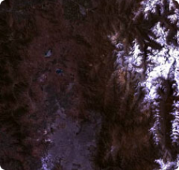
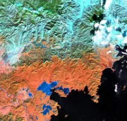
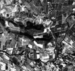
Satellite bands can be combined in multiple ways, depending on the feature that has to be highlighted in the image. Since human eyes can only see within the visible range, most images are made up of combinations of Red, Green, and Blue bands, to mimic the visible spectrum. This spectral band combination is known as the “true” or “natural” color.
When a particular surface feature needs to be highlighted in the image, satellite bands above and below the visible range are used. Raw data undergoes processing to reduce the noise in the image. The result is a so-called “false” color image that can highlight healthy vegetation, clouds, soil moisture, hot spots, and other features. Using specially developed mathematical algorithms, the highlighted features can also be measured to provide quantitative data. For example, we can calculate the amount of moisture in the soil, chlorophyll content in the leaves, and more.
To increase the precision of data retrieved from a combination of multiple spectral bands, a coefficient-based transformation can be applied to the image to produce an index.
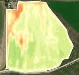
NDVI (Normalized Difference Vegetation Index) and EVI (Enhanced Vegetation Index) are indices commonly used to measure how healthy vegetation is. Other indices measure the degree of burn severity, presence of certain minerals, density of snow, water stress level, and more. New indices are continuously developed to generate more knowledge about our planet.
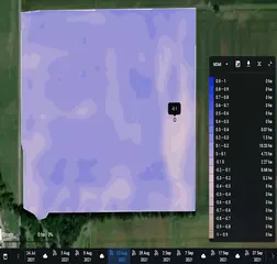
Select band combination
Natural Color
Natural Color, Pansharpen
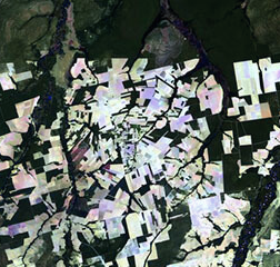
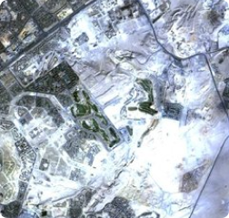
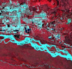
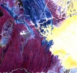
False Color Satellite Imagery
Color Infrared (Vegetation)
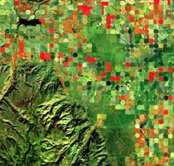
Agriculture (Healthy vegetation)
Index Stack (NDVI, NDWI, NDSI)
Atmospheric Penetration
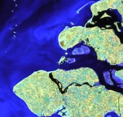
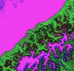
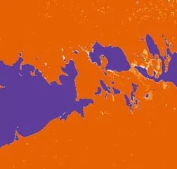
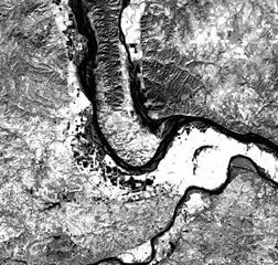
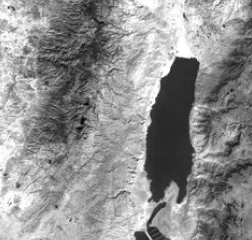
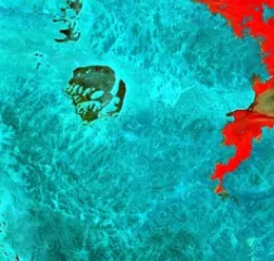
Land / Water
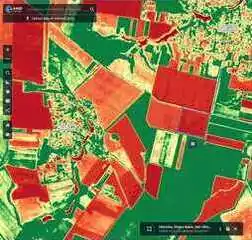
NDVI
Normalized Difference Water Index
NDSI
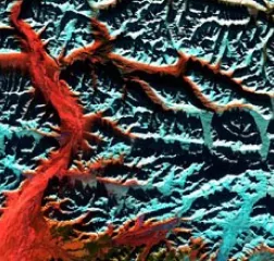
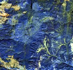
Shortwave Infrared
Vegetation Analysis
Thermal
Thermal Infrared 1
Thermal Infrared 2
Panchromatic And Pansharpened Satellite Imagery
Atmospheric Removal
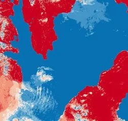
Snow / Cloud
Chlorophyll Index
NDMI (Normalized Difference Moisture Index)
Task us with custom solutions
Other advanced analytical techniques are employed to extract even more data from satellite imagery in different satellite bands:
- machine learning image classification is used to create new map-like categories;
- images of the same area of interest at different times can be compared to detect change;
- elevation of a given point on a map can be calculated by comparing images of the same area of interest, but taken at different angles, and so on.
The result is a map (elevation map, land cover type map, productivity map, crop classification map, thermal anomalies map, water stress map, and many other types) that visualizes data in a convenient way to generate valuable insights into a specific challenge to be solved.
At EOSDA, we possess all of the technological and human resources necessary for coming up with new advanced analytical satellite imagery solutions on request. Contact us to learn more about our custom projects.
Ready?

We’re here to help! Don’t hesitate to ask any questions or schedule a demo.