EOSDA Crop Monitoring Guide Search
Create an Account
A Gift Field

Adding a Field
Field Analytics
Monitoring Indexes
Historical Weather
Weather Forecast
Scouting
Field Leaderboard
Zoning
Field Activity Log
Data Manager
To have a more user-friendly and efficient experience with EOSDA Crop Monitoring, you need to know more about the following interface tools:
- filters
- sorting
- search
- field card
These simple tools will save you a lot of time!
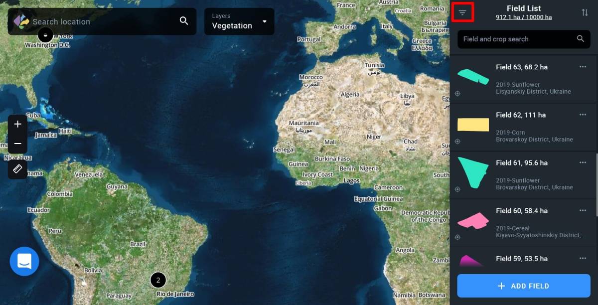
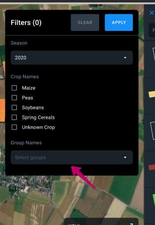
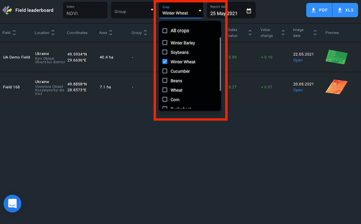
Filters
Filters are customizable search criteria. Your fields or scouting tasks (switch to the Scouting tab) can be easily filtered by crop names and group names. Simply check/uncheck the corresponding checkbox and click APPLY.
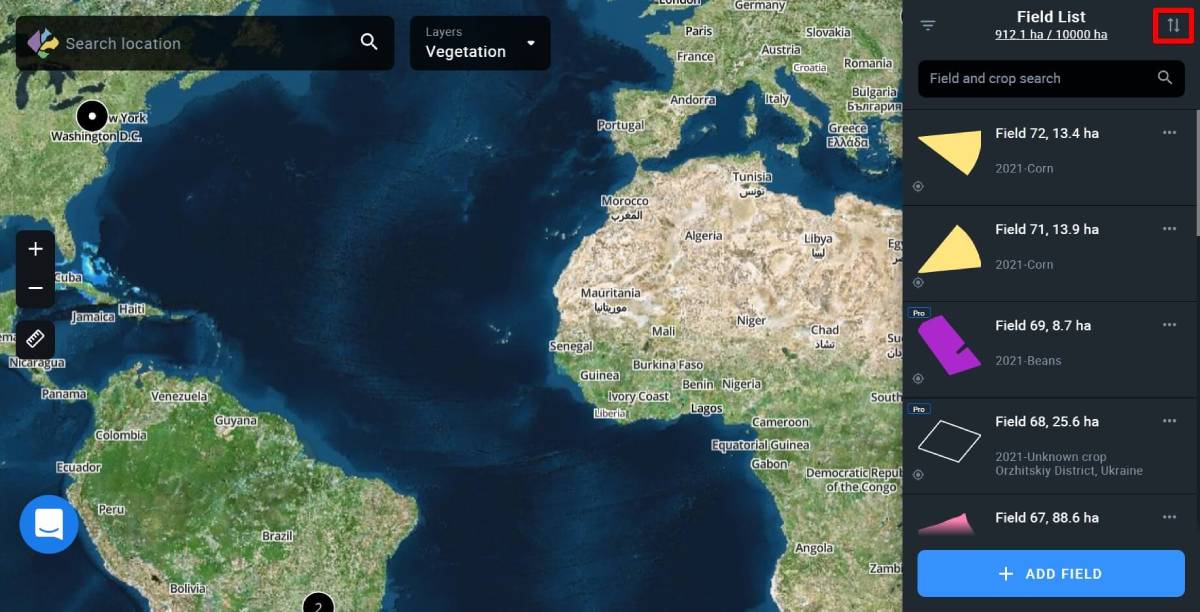
Sorting
In order to sort your fields or scouting tasks (switch to the Scouting tab), use the sorting option on the right. Currently, the following sorting orders are available: Newest, Oldest, by field name: ascending/descending, or field area: Low to High/High to Low.
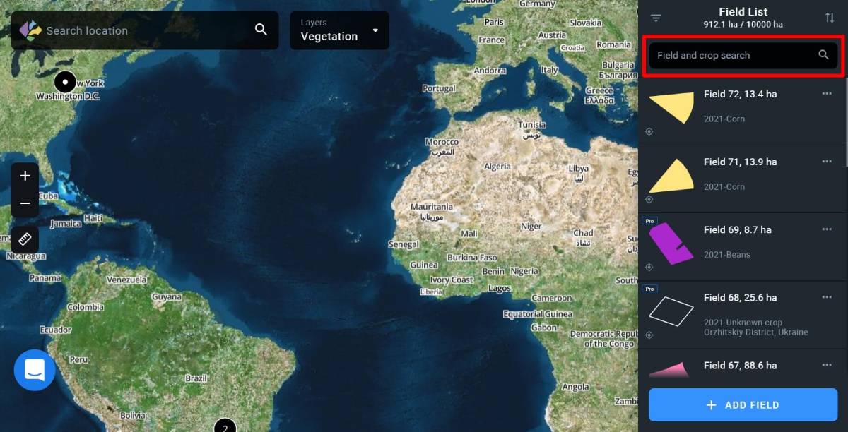
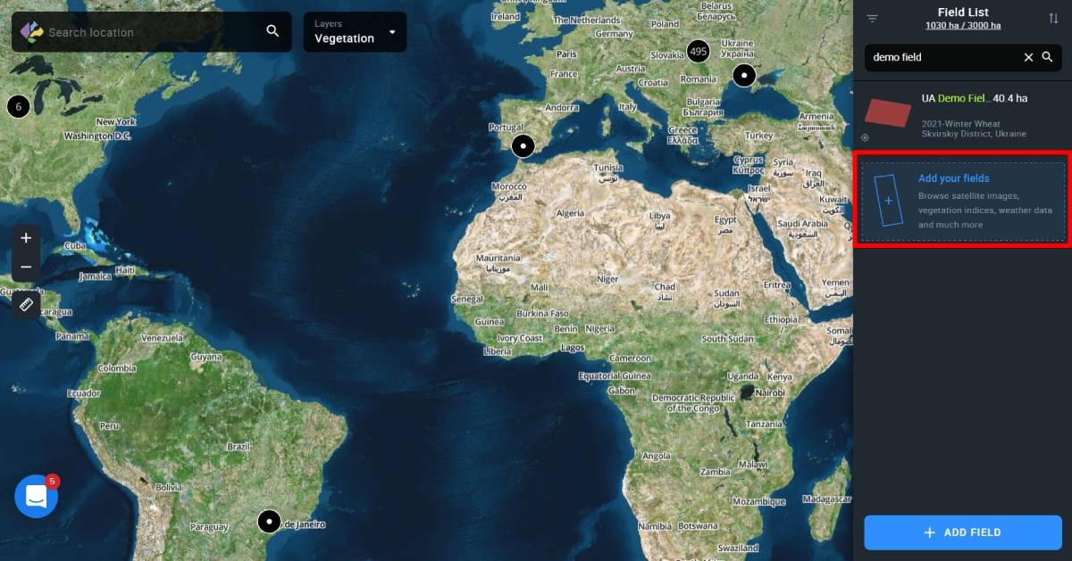
Field Search
Not to waste your time by scrolling through the list of existing fields or tasks (switch to the Scouting tab), you can simply find a specific one using the Field search option by entering the field’s name into it.
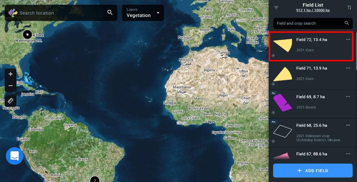
Field Card
Field card is a profile of a particular field, showcasing the most basic data:
– field name
– square (measured in ha)
– group (displayed if the field has been added to a group)
– crop (currently growing crop on this field)
– location (district and country)
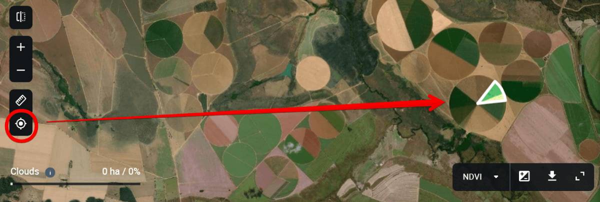
Find field button
The Find field button allows you to instantly zoom in on a field on the map.
By default, you are in the Monitoring tab where you can switch between different layers – My Crops, Vegetation, Water Stress, Vegetation Rating, and Crop Classification.
Pressing the Find field button, you get to view the field in any of these layers.
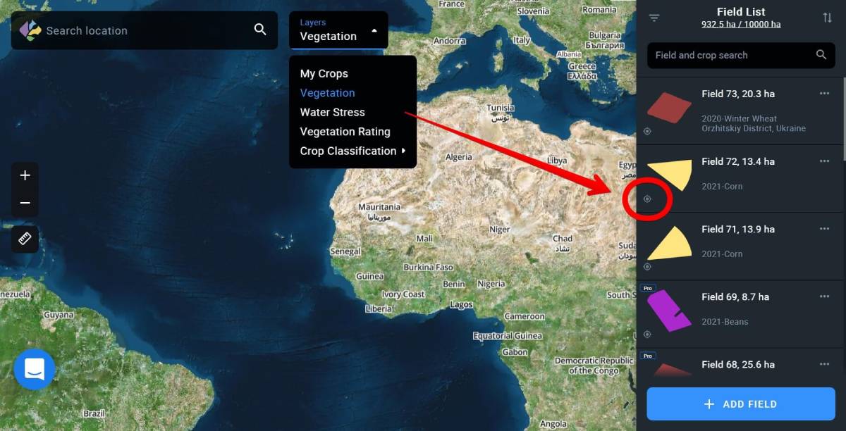
You can view several adjacent fields within your AOI (area of interest) at once, without opening their field cards one by one. This allows you to understand what is happening in your fields within this area at a glance. For example, if you need to view water stress levels of such fields, click on the Find field icon on the field’s card.
The tool also helps you to quickly get back to the field and zoom in on it on the map.
For example, if you opened the field card, zoomed out, or scrolled away, just press the Find field button to zoom in on the field again.
Find location
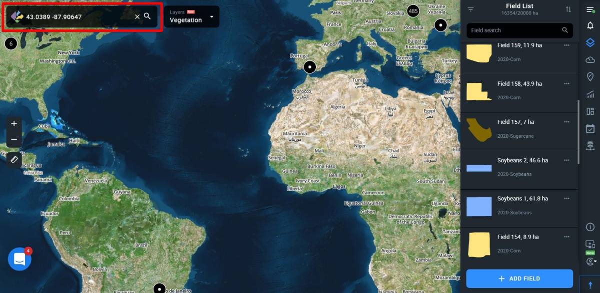
To get started with EOSDA Crop Monitoring, you need to find the Location first. Please choose one of the options:
1. Use Search box
Enter the geographical name of an object into the Search box.
2. Use coordinates
Enter the coordinates of an object into the Search box, longitude first, latitude last.
Note: For longitudes south of the equator, put a “-” (minus) before the number. Likewise, for latitudes west of the Greenwich Meridian, put a “-” (minus) before the number.
Zoom tool
Zoom in (“+”) and out (“-”) is for easier navigation (same functionality is allowed by using a mouse wheel).
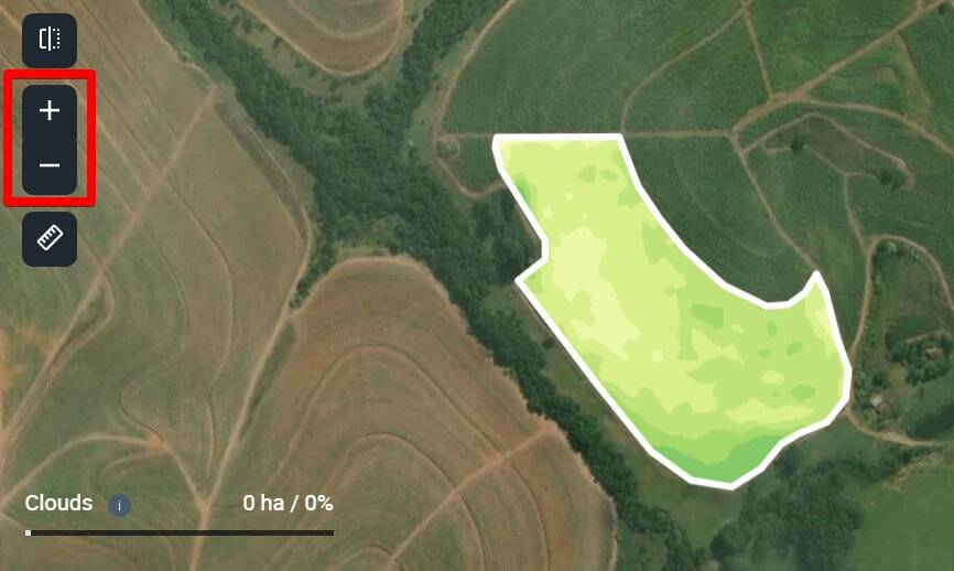
Distance and area measurements
The measure distance tool (left sidebar) is designed to calculate the total area of a field or measure distance between objects. Outline your field or measure the distance to get the result displayed at the bottom of the screen.

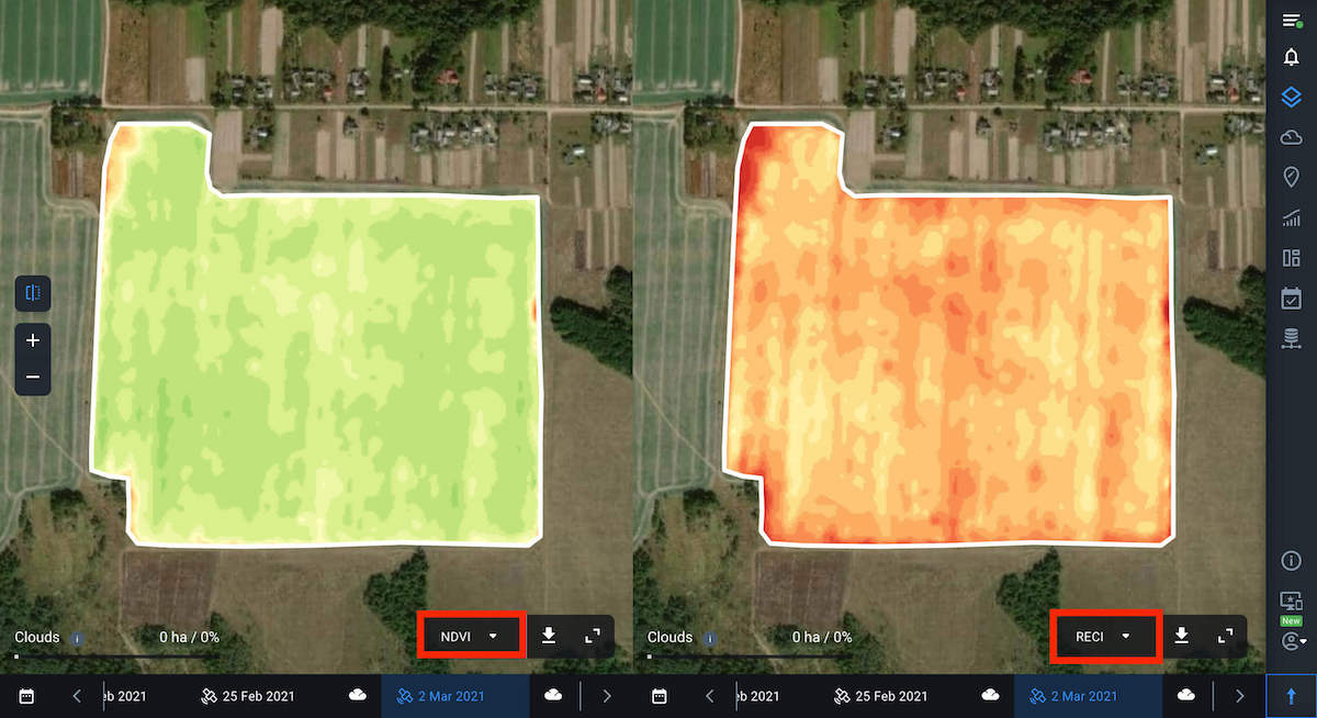
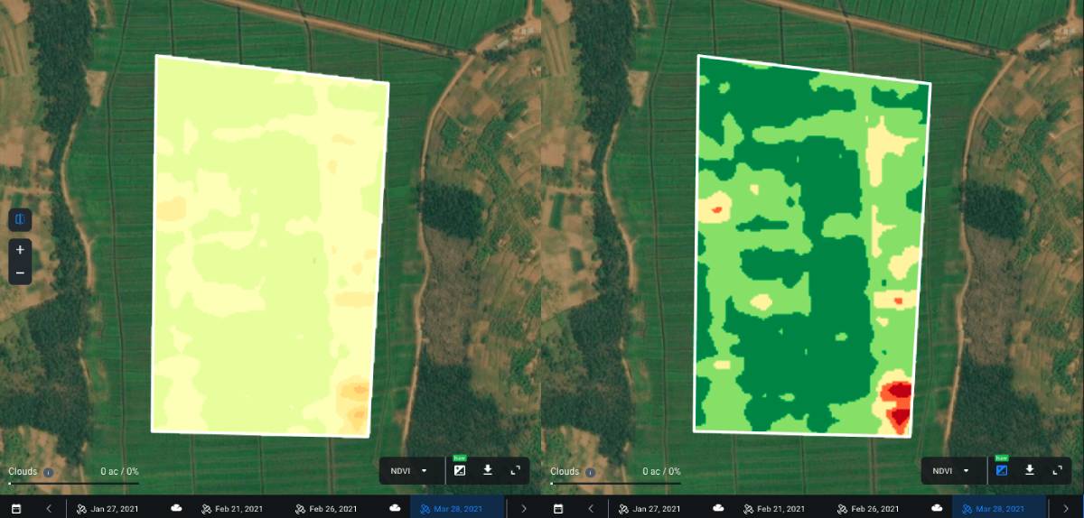
Split view
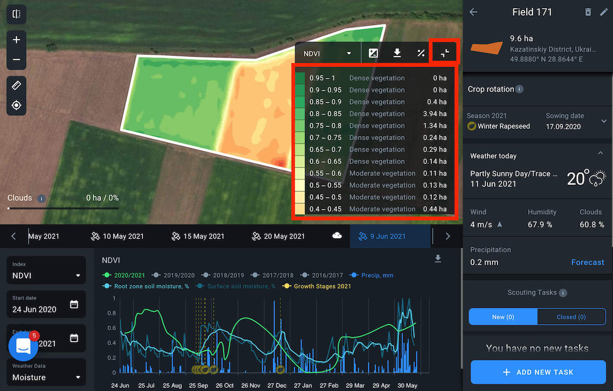
The Split view feature allows you to compare vegetation indices for the selected field for different dates. This provides an opportunity to track the change dynamics of the state of crops on the field over time, based on the values of 5 different vegetation indices to detect problems and plan field activities effectively.
To get started, select the field you want to analyze from your Fields list and click on the Split view icon on the left side menu.
![]()
Your screen will be split into two equal parts.
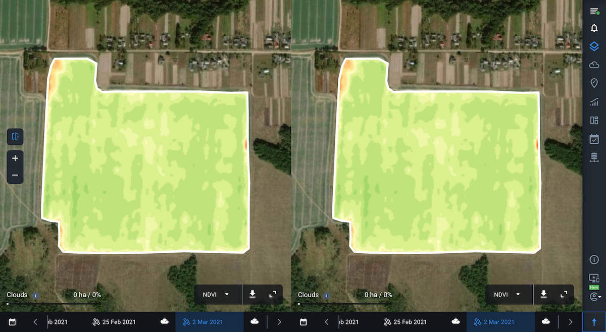
Now you can select indices and dates to compare the data. To do this, use individual timelines and the index switching panel.
If necessary, you can expand the legend to check the values for the selected index, just like in the single view mode.
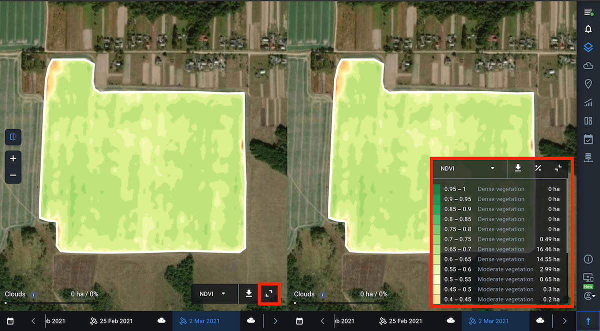
Note: By default, the NDVI values for the date of the last available image will be displayed for the selected field.
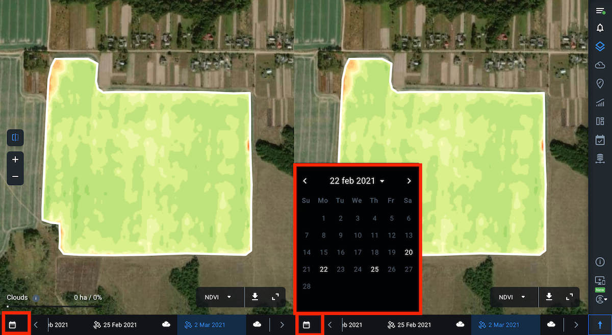
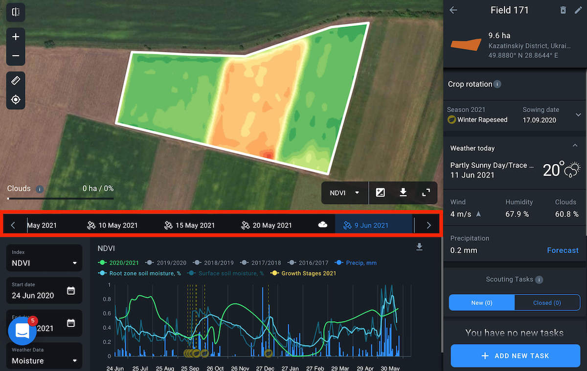
To select the necessary image date, you can also use the calendar, where the dates of available images are highlighted in white.
When you hover the cursor over any point within the field, the values of the selected indices for this point will be displayed on the map synchronously on both screens. This allows you to compare the index values for the same point within the field but for different dates.
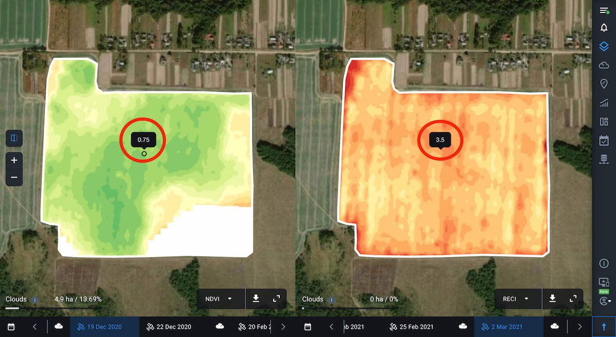
For example, to see how the vegetation has been developing on your field, select NDVI for both viewers and switch between dates in the timeline. This way you can identify areas of the field with the most or least uniform vegetation and identify areas that require your attention the most.
Note: The historical data on vegetation index values goes back 5 years.
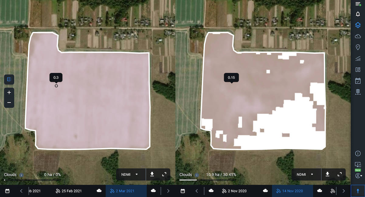
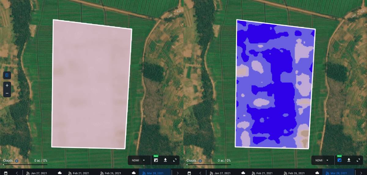
In the same way, you can track how the state of the vegetation on the field has been changing, based on the values of other available indices, including NDMI moisture index. With the help of this index, you can identify the threat of water stress and effectively plan out irrigation.
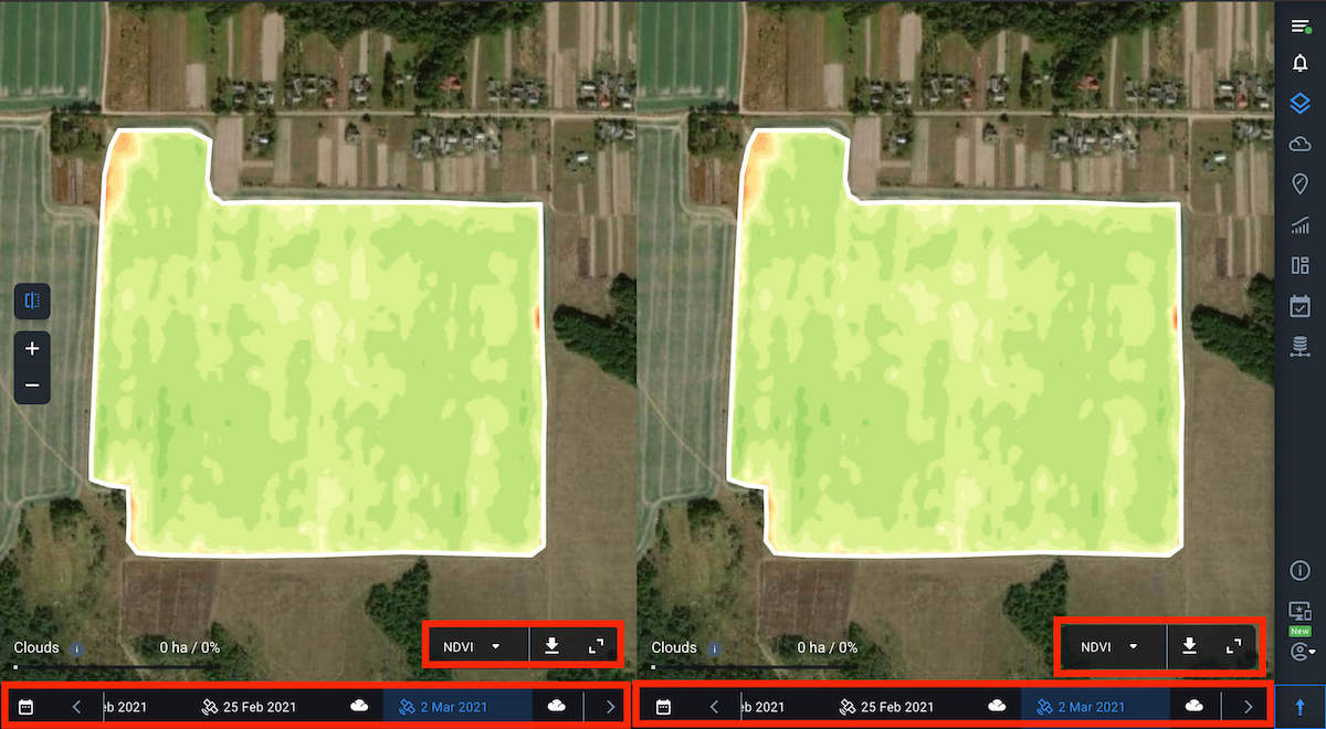
You can also select and compare different indices in each viewer. It’s helpful for more complex field analysis since to see a complete picture of your crop’s health, one index may not be enough. For example, at the early stages of crop development, the presence of bare soil can affect the accuracy of NDVI. Therefore, it makes sense to compare NDVI with other vegetation indices for the same field and date.
By comparing different vegetation indices, you can visualize and analyze the current state of crops, given the crop type and the growth stage.
For example, here you see two different vegetation indices for the same field and for the same date.
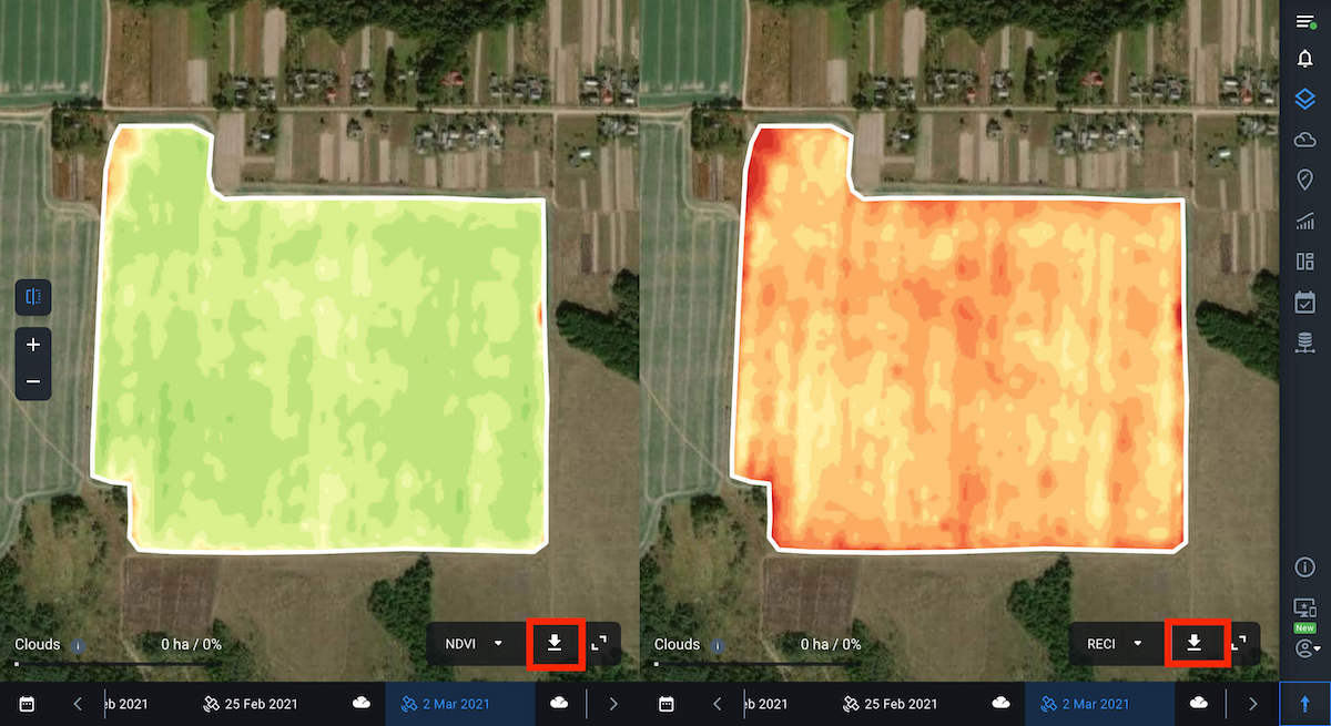
You can also download data by clicking on the download button next to the index name.
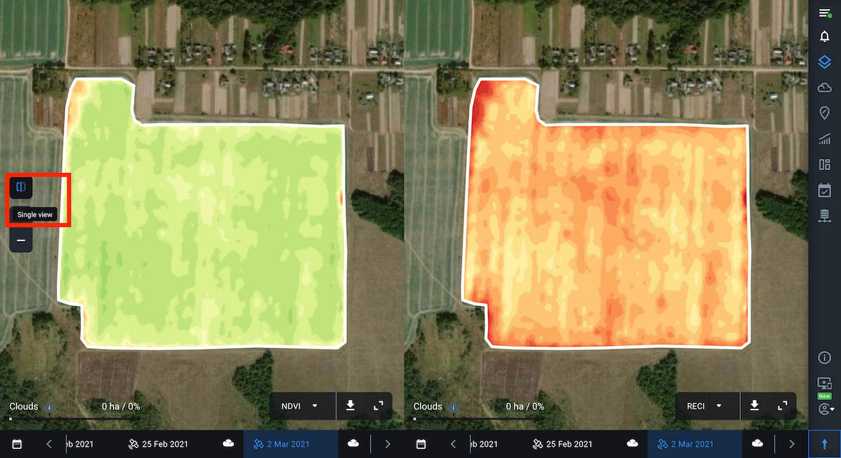
To return to single view mode, click on the corresponding icon on the left side menu.
Layers – an integrated analysis of crop health on one screen
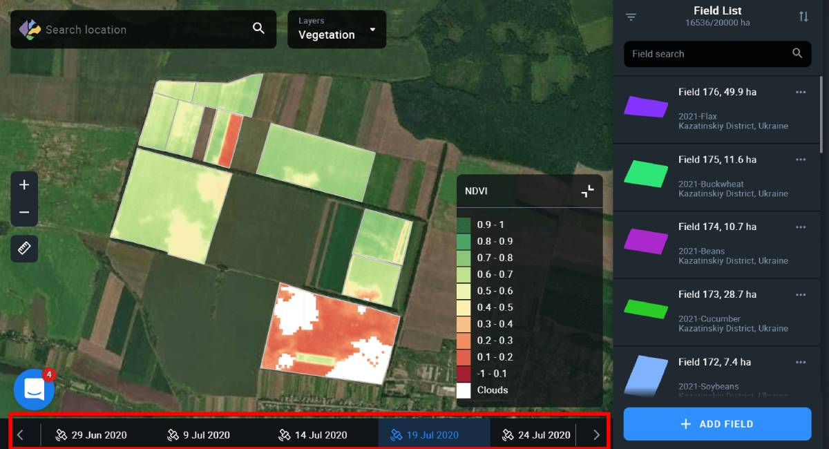
The Layers feature allows you to visualize and analyze the state of crops in all of your fields at the same time. To do that, you simply need to switch between 5 parameters or Layers – My Crops, Vegetation, Water Stress, Vegetation Rating, and Crop Classification in a convenient drop-down menu.
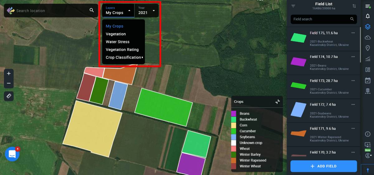
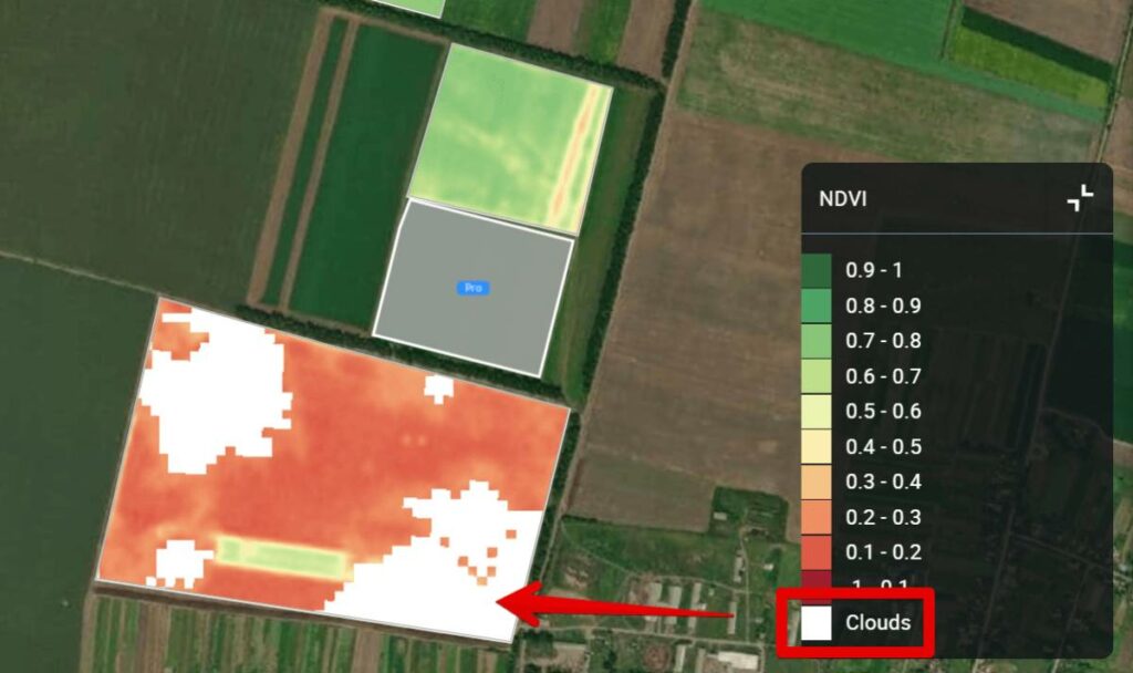
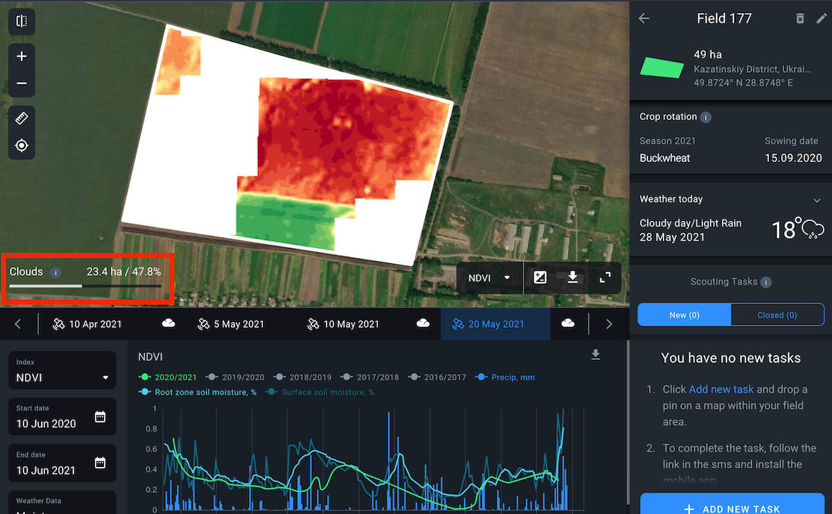
The system only selects images with less than 90% cloudiness depicting all of your fields. Cloudy locations will be marked with the corresponding mask. To see your fields, you need to zoom in and go from the pins to the fields’ outlines.
You can also sort the data by crop and year using the filter in the right side menu. This will give you the opportunity to analyze the history of the development of a particular crop in all of your fields at once over 5 years in terms of the selected layer. The obtained data will help you identify problem fields and make reliable decisions, as well as effectively plan crop rotation and field activities.
My Crops layer
The first layer on the Layers list is My Crops. When this layer is selected, the fields are displayed on the map classified by crops. This enables you to see an overall picture of crops distribution among your fields. Each crop is given a corresponding color, which is displayed in the legend in the lower right corner of the screen. By default, the map displays the most recently planted crops for all of the fields.
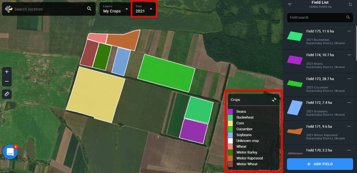
You can select the crop and the year by using a special filter.
Thanks to the visualization of crop rotation for the last 5 years on the screen, you can make better-informed planting decisions.
Vegetation layer
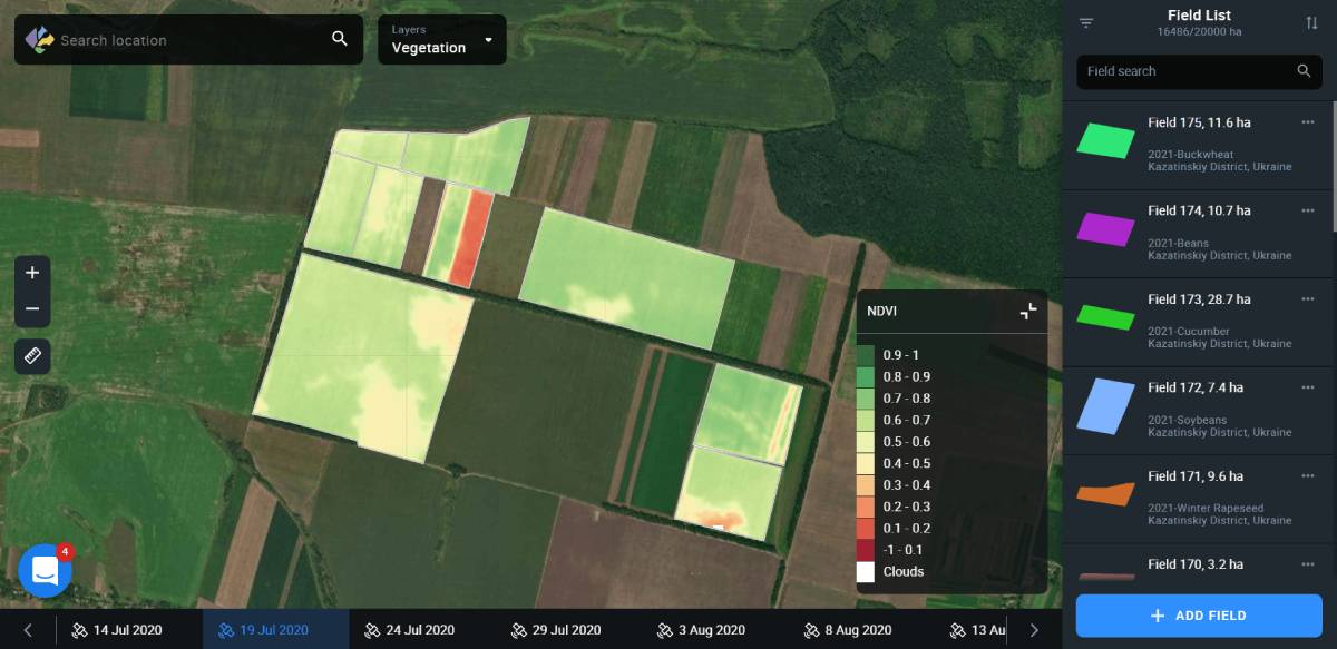
This layer shows the vegetation level in all of your fields at the same time, based on the NDVI vegetation index values. For each field, the system displays the average index value and highlights it with a specific color. Each color corresponds to one of the 10 specific ranges of values displayed in the legend in the lower right corner of the screen. Seeing these NDVI ranges on the screen allows you to comprehensively analyze the state of vegetation in all your fields at the same time, identify problem fields or a group of fields, and, overall, effectively plan actions for further monitoring.
If you want to analyze a specific field or group of fields, click “Select group” using the filter in the right side menu.
When you select a field on the map, you automatically switch to the monitoring view of this field according to the NDVI index values for the date you have selected.
Note: You can also create a new field group based on the vegetation data for different fields.
Vegetation data by default is displayed based on the last available field image.
Note: Available images are the images that have all of your fields at once. Cloudy locations will be marked with a corresponding mask.
To view any previous image, select the date in the timeline at the bottom of the screen.
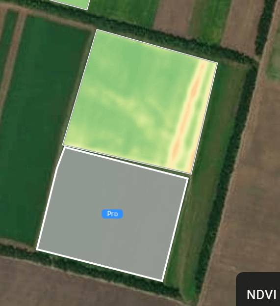
Note: Pictures taken over a year ago are available to Pro users only.
Note: If a field or group of fields has exceeded the field acreage limit of your subscription plan, these fields will be marked with a Pro icon.
While in the Vegetation layer, you can also use a special filter to select the crop and the year. This will allow you to analyze the fields both in terms of a specific crop and vegetation at the same time. This data will help you discover the relationship between the vegetation in the field and the crop it is planted with. This will enable you to make reliable decisions about field activities.
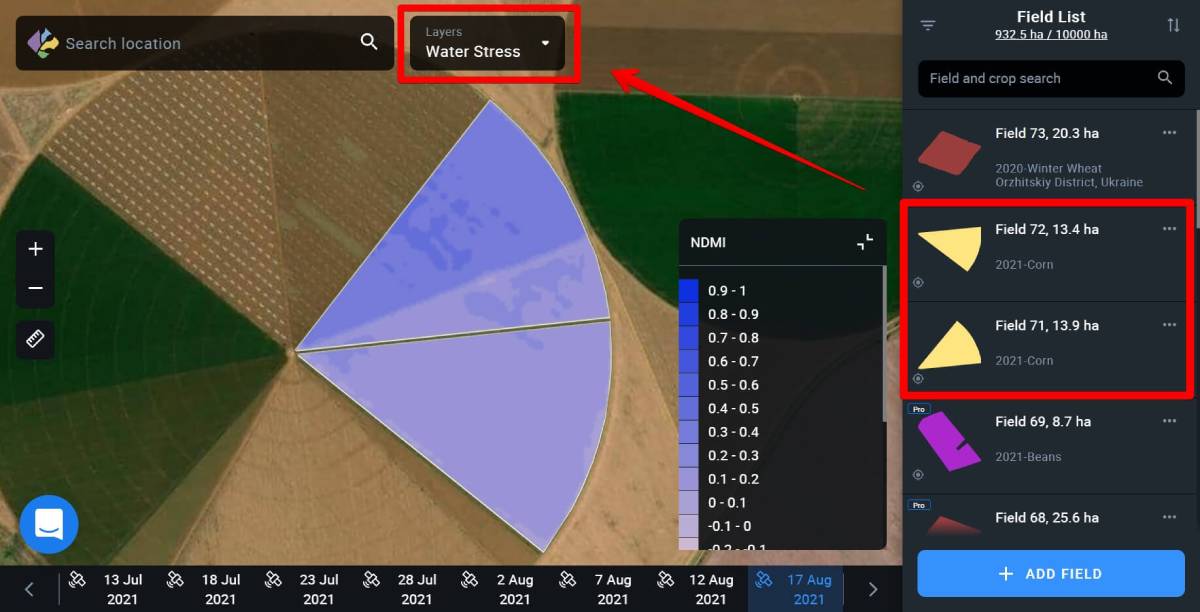
Water Stress layer
The Water Stress layer displays the moisture level in plants in all of your fields based on the NDMI values. For each field, the system displays the average value of the index and highlights it with a specific color. Each color corresponds to one of the 10 specific ranges of values displayed in the legend in the lower right corner of the screen. This makes it possible to analyze the moisture level for all of your fields at the same time, identify problem areas – lack or excess of moisture – and effectively plan irrigation in the future.
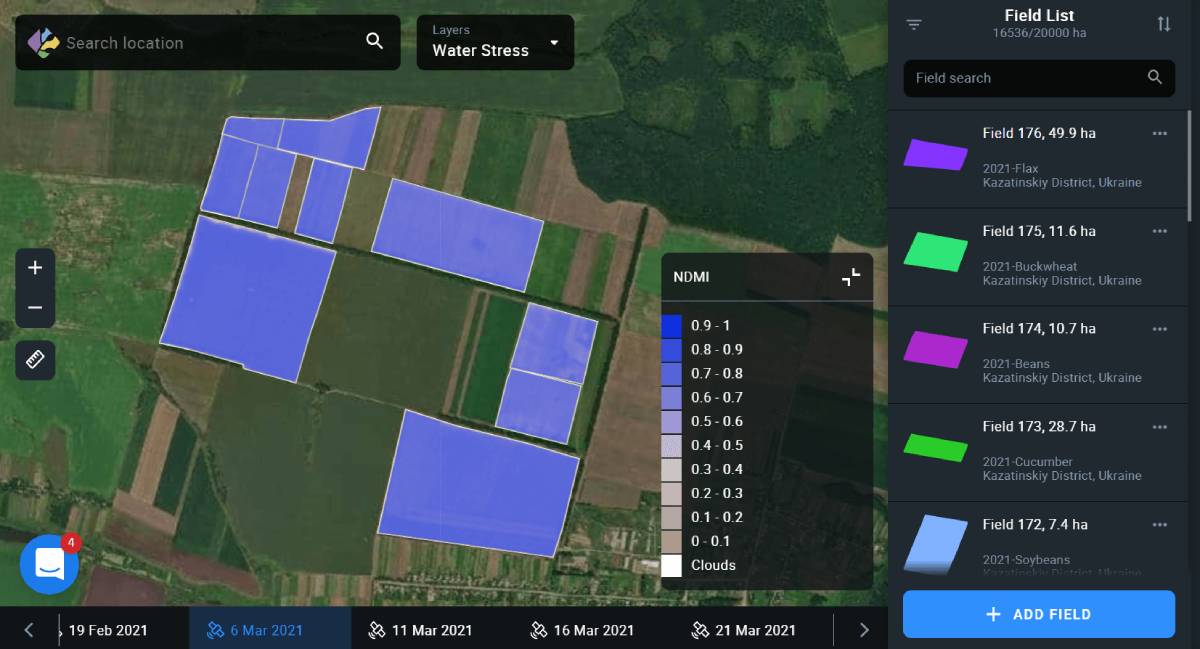
Use the filter on the right side menu to view moisture levels for a specific field, crop, and year.
When you select a field on the map, you automatically switch to the monitoring view of this field according to the NDMI index values for the date you have selected.
Moisture level data is displayed by default based on the last available field image.
Note: Available images are the images that have all of your fields at once. Cloudy locations will be marked with a corresponding mask.
Note: The Water Stress layer is available to Pro users only.
Vegetation Rating layer
The Fields Rating layer is analogous to Field Leaderboard. This layer displays all of your fields according to the average value of the NDVI index. This allows you to visualize the productivity data from all of your fields on one screen.
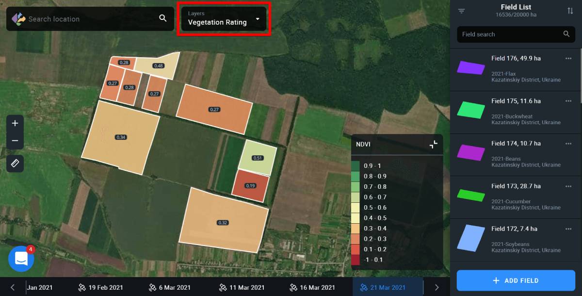
The data for average NDVI values is displayed by default based on the most recent field image available.
Note: Available images are the images that have all of your fields at once. Cloudy locations will be marked with a corresponding mask.
You can also select field, crop and year by selecting the necessary options from the right side menu.
Note: The Vegetation Rating layer is available to Pro users only.
Crop Classification layer
The Crop Classification layer is only available in Ukraine and displays the location of all the crops for the whole country, according to the classification map created by EOSDA. The list of available crops is displayed in the lower right corner of the screen, instead of the vegetation index legend.

Note: In the Crop Classification layer, you can filter out the fields only by season.
You can also add any field that appears on the map in this layer to your Field List. To do so, select the necessary field on the map and click on it.
Click Add Field to add the field to the system.
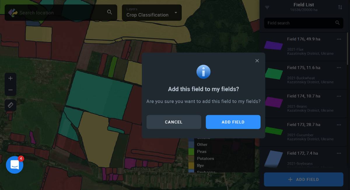
Note: Crop Classification layer is available to Pro users only.
Contrast view
Switch between Standard and Contrast views of the field on the map by clicking on the corresponding icon in the lower right corner of the map.
When the Contrast view is activated, the icon appears blue.
Standard VS Contrast view: What’s the difference?
Standard view is best applied when the values of a given index vary greatly across the field, covering almost a full standard value range. For NDVI*, it is -1 to 1. On the map, you will see smooth transitions of different shades of red, yellow, and green**, without much contrast, if any at all.
*Standard range can vary depending on the index.
**NDMI is represented by different shades of blue.
Contrast view, on the other hand, solves the issue of visualizing low variability of the index values in the field when there is a need to highlight the differences.
Each shade in the palette on the map corresponds to the available index value. In Standard view, low variability of the index values will be displayed as a collection of several similar shades. To better highlight the differences, and detect the problem areas in the field, you need to enable the Contrast view. In this case, instead of a collection of shades blending with one another on the map, you will see distinctly different colors, revealing previously unnoticed issues with crops.
Contrast view is applicable to all the indices available in our product, including the NDMI moisture index.
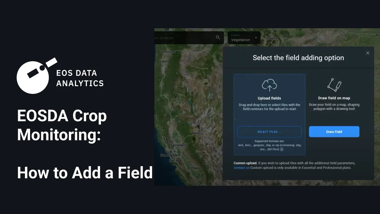
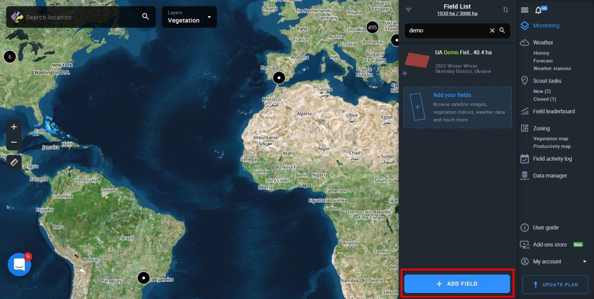
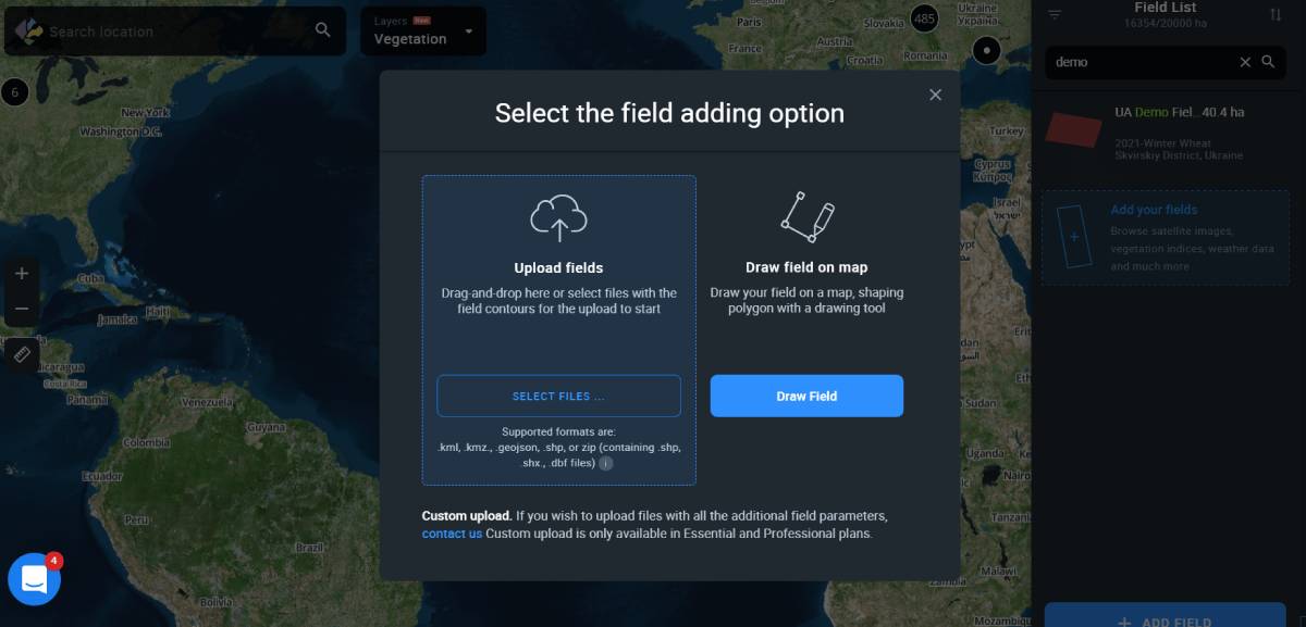
In order to access satellite images of your fields, get the weather forecast and other data, you need to add fields to your account first. There are several available options:
- Draw field on map
- Upload fields
- Custom upload (contact us)
Start by clicking +ADD FIELD located in the right bottom corner of your screen.
A window with available options should pop up.
Upload fields
This option allows you to upload files containing pre-drawn field contours to the system. Currently, EOSDA Crop Monitoring supports 4 different format types: .shp, .kml, .kmz, .geojson.
You can either drag-and-drop files onto the web page or click Add your fields.
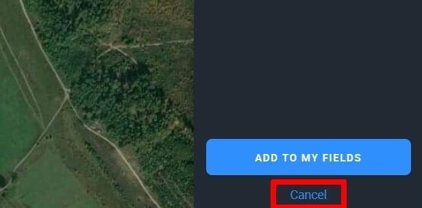
As soon as the field contours appear on the map along with the field card data in the right sidebar menu, click ADD TO MY FIELDS to complete the operation.
Or you can click Cancel (located just below the ADD TO MY FIELDS button) to abort.
A modal window will offer you two choices:
- SAVE AND CONTINUE. Press this button to automatically add the uploaded field to the list.
- DELETE AND CONTINUE. Hit this button if you don’t want to add the uploaded field to the list.

Add more information about the newly uploaded field to ensure maximum efficiency of monitoring.
- Field Name (for your convenience)
- Group Name (to better organize your fields in the list)
- Crop Rotation data* (to manage your fields by the crop name, sowing date, and season.
*Accurate monitoring of vegetation development depends on the correctness of crop rotation data.

Error types
The .prj file responsible for the coordinate system is missing, please add it and re-upload
The file cannot be uploaded because EOSDA Crop Monitoring cannot determine the coordinates for the fields in the file.
The .shp file requires a .prj file which contains the source product’s coordinate system type.
File format is not supported. Please use formats .shp, .kml., .geojson or zip archive containing the .shp, .shx, .dbf files.
Check the file format, you may be uploading an invalid format or there is an invalid file in the .zip archive
Overview of file formats that can be uploaded in the system:
- SHAPE FILE: A .shp is the main file where the field geometry is stored, it is mandatory. .shx is the index file where the index of the geometry of the fields is stored, it is mandatory. The .dbf file is a table that contains the attributes of the fields (field name, culture, etc.), it is mandatory. Equally important is the .prj file which stores information about the coordinate system.
- KML FILE: A .kml is a file that contains all the elements of a layer or map – object geometry, conventions, descriptions, attributes, images, and other valuable information.
Note that only the object geometry (polygon shape made of minimum 3 points) can be uploaded into EOSDA Crop Monitoring. - GEOJSON: The .geojson format can store primitive types of geographic object descriptions, such as: points (addresses and locations), lines (streets, highways, borders), polygons (countries, states, parcels of land). This file can also store the so-called multitypes which are an amalgamation of several primitive types. Note that, among all the objects contained within this file, only polygons can be uploaded into EOSDA Crop Monitoring.
- ZIP FILE: You can use a .zip archive to upload files that are part of the shapefile structure, specifically .shp, .shx, .dbf, .prj.
Polygons were not found in the file. Note that separate lines and dots are not supported. Only polygons are recognized by the system.
This error occurs when the file you’re trying to upload is not a polygon shape but alabel, a point, a photo, a line, a road or some other unsupported element.
On EOSDA Crop Monitoring, you can only upload the files containing a polygon shape, i.e. an object in which there are at least three connected coordinate points all connected to each other.
File size exceeds 10 Mb. Split it into smaller files
The error occurs when the file that’s being uploaded exceeds 10 Mb. You can solve the problem by archiving the file in .zip, if it is a shape file. If .zip, .kml or .geojson files exceed 10 Mb,, – the most likely explanation is that there are too many objects (fields) contained within the file, and it is better to re-save these fields from your source by distributing them among 2 or more files.
The field has intersecting contours which are not supported, please fix it
This error tells you that the contours of some of the fields contained within the file overlap (intersect or cross each other), which does not allow for polygons to be correctly created on EOSDA Crop Monitoring. You need to review your fields and their contours at the source from which you are exporting them.
The field exceeds 10,000 ha / 24,710 ac, please resize it or draw a new one
The error occurs when the area of the field whose contours you are trying to upload as a polygon shape is larger than 10,000 hectares or 24,710 acres. You need to edit the contours of the polygon at the source or draw the contours manually on EOSDA Crop Monitoring.
Draw field
The Draw polygon option is employed to contour and add your field to the map.
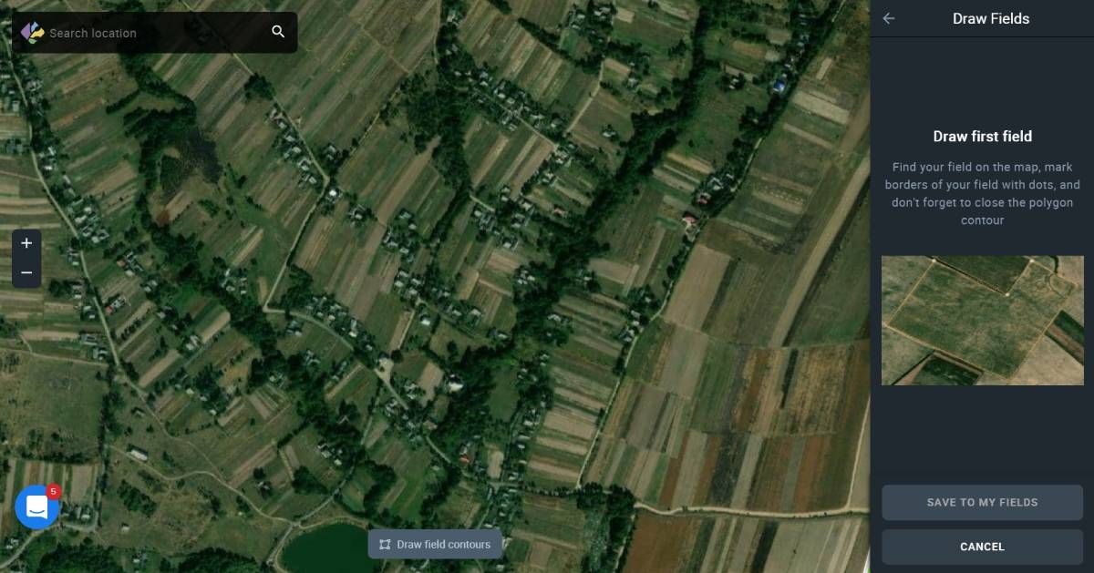
After it’s done, click the SAVE TO MY FIELDS button and give the new field a name, select crop name, sowing date, and season of its cultivation. Then click SAVE to add a field to your Field List.
Field right sidebar menu section
Utilize the field right sidebar menu section to track, review or change activities related to your field with the features designed in EOSDA Crop Monitoring which are Edit field, Crop rotation, Weather today, and Scouting tasks.
Edit field
You can edit your fields whenever you need by going to a three dots menu, then Edit on your Field List.
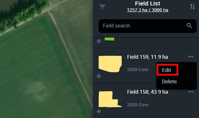
Or Edit on the right of the field card.
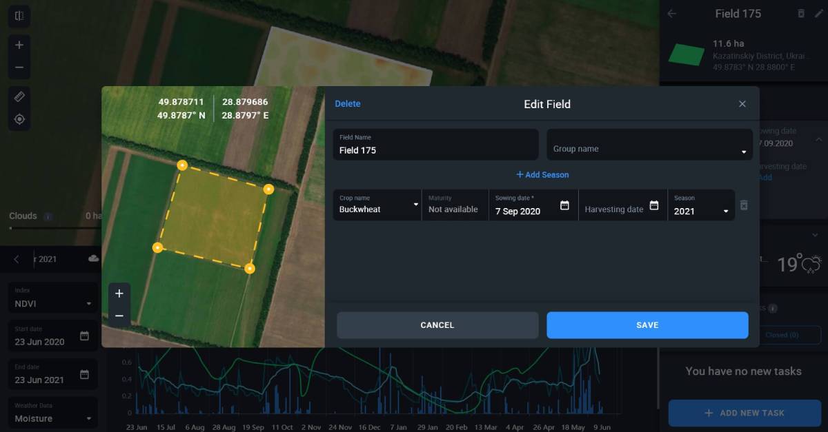
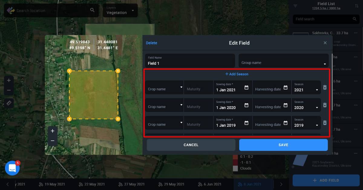
Crop rotation
Crop rotation data displays historical crop types that used to grow on the field as well as the current growing crop type. This information is extremely useful. For instance, sugar beet planted on the same field two years in a row can cause diseases of the crops that’ll grow there afterwards. Correct crop rotation data includes 3 components: name of the crop, sowing date, and the season when the crop was or is going to be harvested.
Note: It is necessary you click on the exact sowing date in the calendar box. Make sure the selected date looks blue in the calendar.
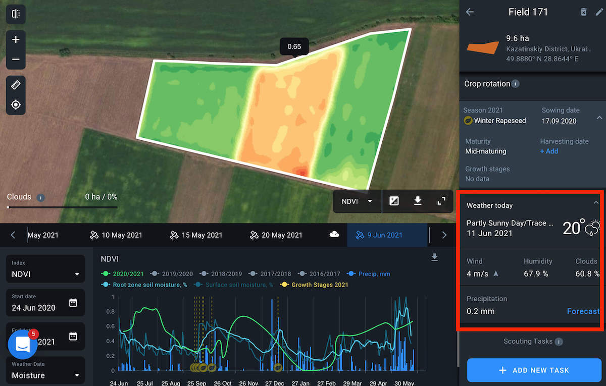
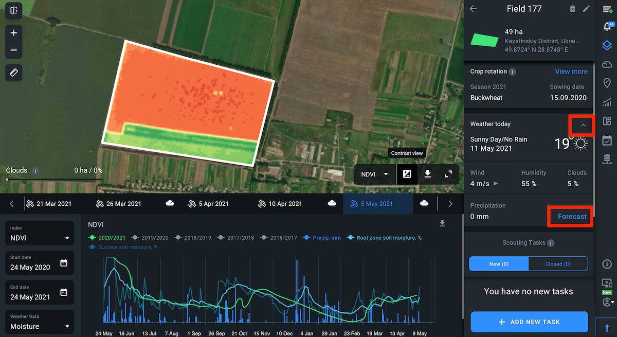
Weather today
Log in every morning to follow the weather:
- Temperature
- Wind speed and direction
- Humidity
- Clouds
- Precipitation
This will help you stay up-to-date and react to changes in a timely manner.
E.g. You’ve planned to apply fertilizer and it is going to rain.
Scouting tasks
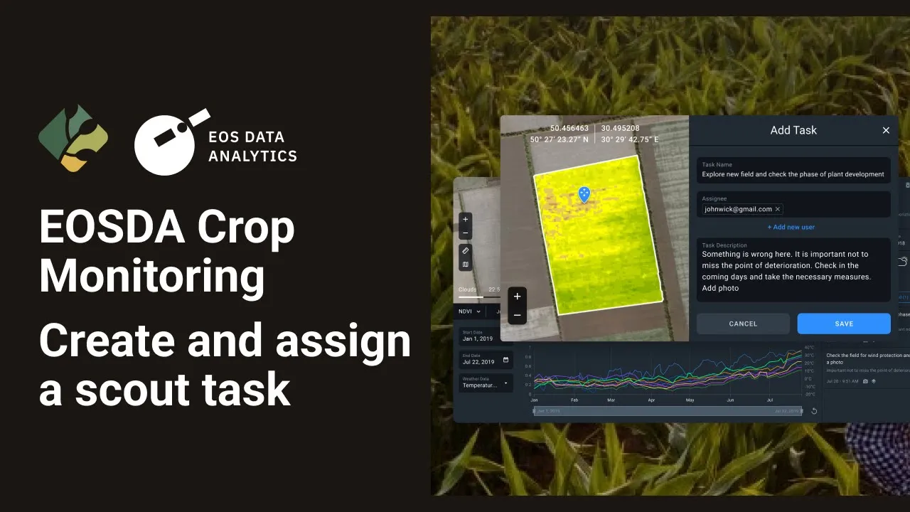
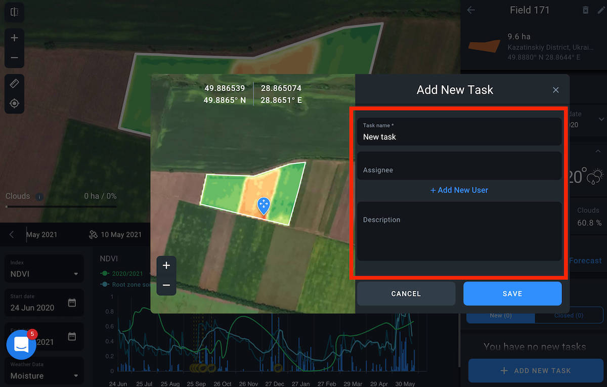
In order to send a scout to the field, you should create a scouting task. This task is automatically sent to the mobile application where a scout can pick it up for further execution. To perform the action, click the + ADD NEW TASK button at the bottom of the Task list or assign a task by selecting one of your fields.
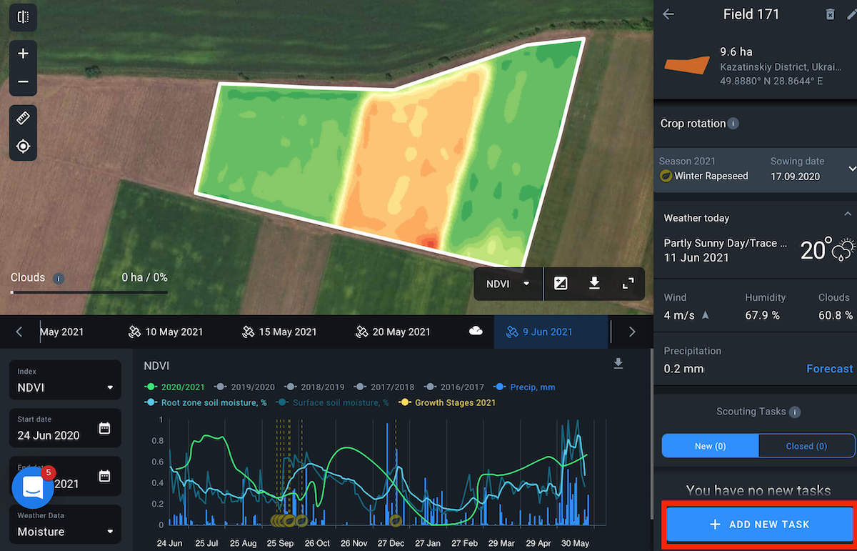
Drop a pointer on the area you want to inspect and the New task window pops up. It contains the preview of your field with a pointer and field coordinates. Fill in the appropriate boxes with Task name, Description, and Assignee, and click SAVE. Once it’s done, the task immediately appears on your task list, as well as on the mobile application connected to your account.
Raster image
Currently we use Sentinel-2 sensor and satellite images with no more than 60% cloudiness. In this way, the collected statistics includes representative selection and excludes outside factors.
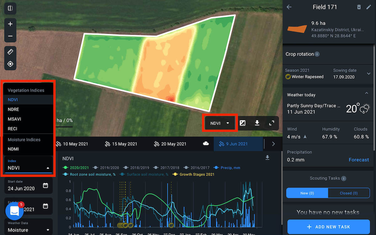
Indices
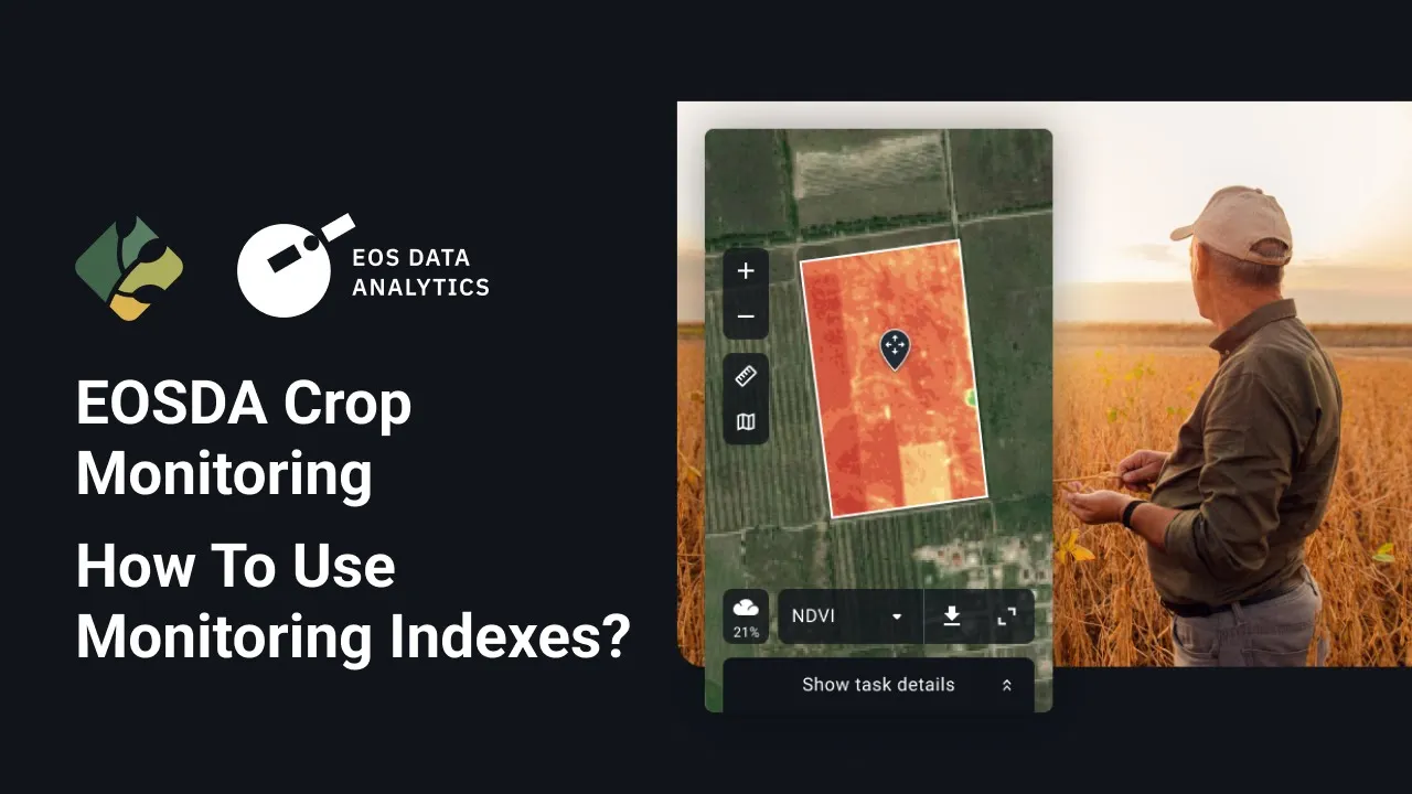
Below are the most commonly used vegetation indices that are presented in EOSDA Crop Monitoring:
NDVI or Normalized Difference Vegetation Index
NDVI is calculated according to the way a plant reflects and absorbs solar radiation at different wavelengths. The index allows for identification of problem areas of the field at different stages of plant growth for timely response. Pay attention to the areas where NDVI values differ considerably. For example, the areas of a field that have an extremely low NDVI rate may indicate problems with pests or plant diseases; and the areas with an abnormally high NDVI signalize the occurrence of weeds.
NDRE or Normalized Difference RedEdge*
NDRE is an indicator of photosynthetic activity of a vegetation cover used to estimate nitrogen concentrations in plant leaves in the middle and at the end of a season. It allows you to detect the oppressed and aging vegetation and is used to identify plant diseases. It also makes it possible to optimize the timing of the harvest.
*The red-edge band is a narrow band in the vegetation reflectance spectrum between the transition of red to near infra-red.
MSAVI or Modified Soil-Adjusted Vegetation Index
MSAVI allows you to determine the presence of vegetation in the early stages of emergence when there is a lot of bare soil. The index minimizes the effect of bare soil on the display of vegetation maps. Based on the index, you can build maps for differential fertilizer application in the early stages of crop growth.
ReCI or Red-edge Chlorophyll Index
ReCI is an index of photosynthetic activity of a vegetative cover, sensitive to the content of chlorophyll in leaves. Since the level of chlorophyll is directly related to the level of nitrogen in the crop, the index allows you to identify the areas of the field that have yellow or faded leaves, which may require additional fertilizer application.
Currently, one moisture index is available on the platform:
NDMI or Normalized Difference Moisture Index
NDMI describes the crop’s water stress level and is calculated as the ratio between the difference and the sum of the refracted radiation in the near-infrared and SWIR spectrums. The interpretation of the absolute value of the NDMI makes it possible to immediately recognize the areas in which the farm or field is experiencing water stress. NDMI is easy to interpret: its values vary between -1 and 1, and each value corresponds to a different agronomic situation, independently of the crop
NDVI, NDRE, MSAVI, ReCI, NDMI are indices that can be selected either from the left drop-down menu or the three-dots menu on the small panel above the analytics window.
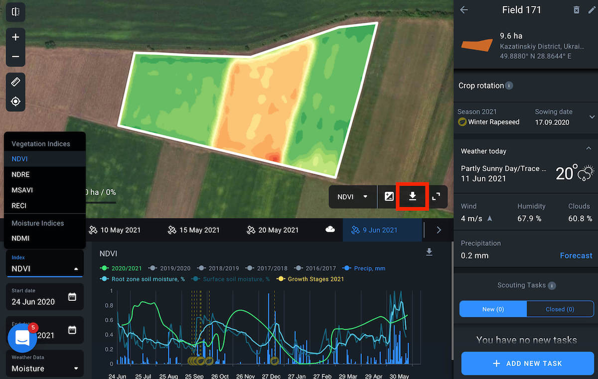
Download
Using a small panel above the analytics window, you are able to download e.g. the NDVI map in .tiff or .shp formats. Shape format gives you the pixel-by-value NDVI at each point and TIFF format shows a regular image with the NDVI applied.
Statistics
To expand the statistics to check the index of your field, use the small panel above the analytics window. Statistics can be displayed in hectares or percentage.
Cloudiness
We do not upload satellite images with more than 60% cloudiness. When using an index, there should be no outside factors that can influence the whole picture. With this said, we consider the possibility of getting value from 60% cloudy images as a positive one. Statistics displays in ha and percentage. Clouds are displayed as a white mask over the field.
Date line
Shows all images that are less than 60% cloudy. When you pick a date, you see a satellite image with an index applied for that day.
Note: You can see an image preview by hovering over the date on the timeline.
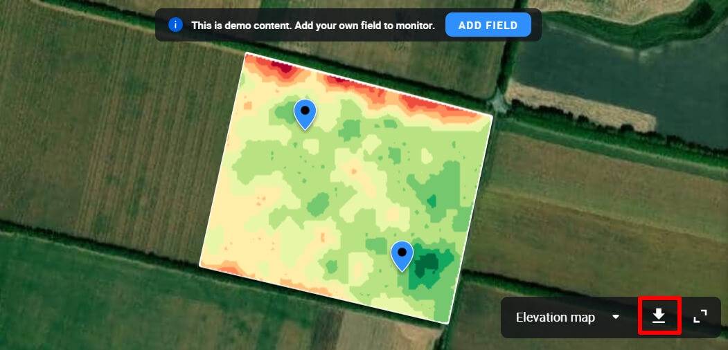
Basic Layer: Elevation map
Elevation map is a digital model that visualizes differences in elevation across your field. The model allows agronomists to detect potentially problem areas of the field:
- flood hazards
- limited access to water
- erosion risks
and other types.
Combined with other data (NDVI, productivity map, and others), elevation map helps to identify and eliminate factors which impede vegetation development.
This model also allows you to measure field area with more accuracy. It is crucial to know the exact area of your field to correctly calculate the amount of seedlings, fuel, and time required to perform field activities.
How to find the elevation map?
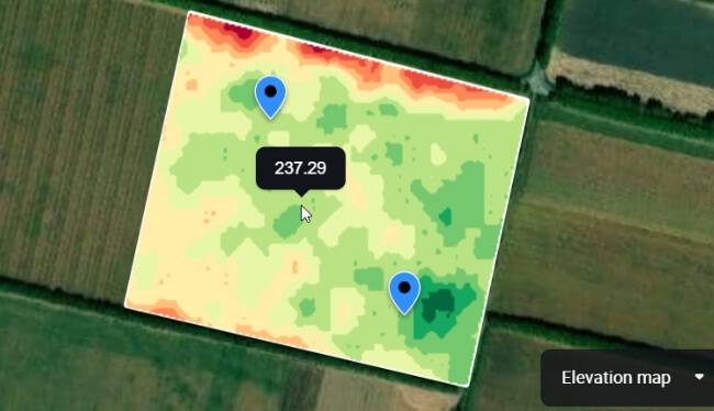
By default, you see the NDVI values of your field on the map. In order to see the differences in elevation, click on the index panel and select the elevation map from the drop-down list.
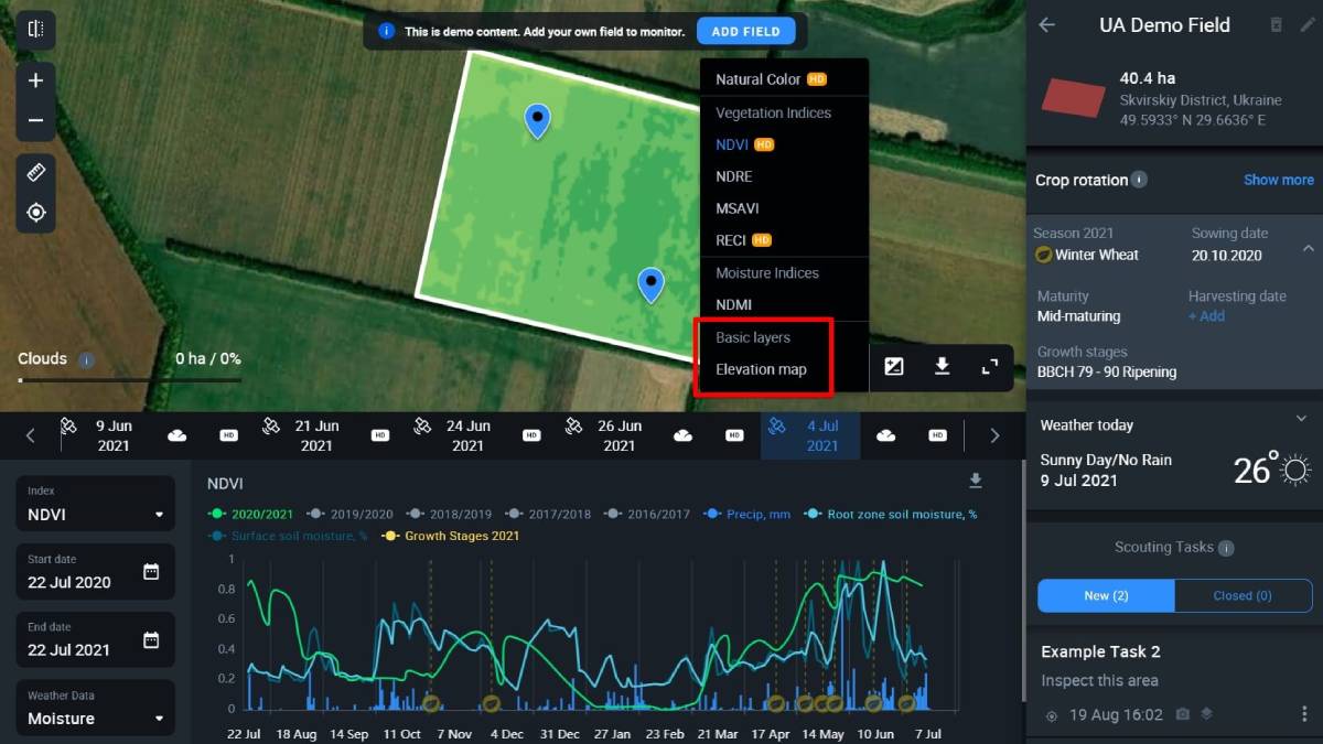
Now you can see the differences in elevation across your field.
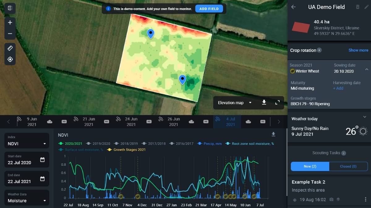
Elevations are visualized as different hues, from dark-green low areas to dark-red high areas. Moreover, by hovering over the map, you will be able to see the actual altitude of any point on your field as meters above the sea level.
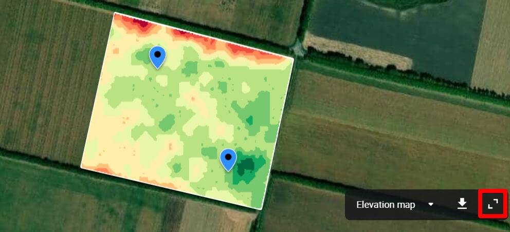
To better understand the elevation variations of your field, check how the color scheme correlates with the elevation values. Just click on the expand icon in the lower right corner.
Now you see how much area a corresponding elevation takes up on your field and which color hue is used to represent it.
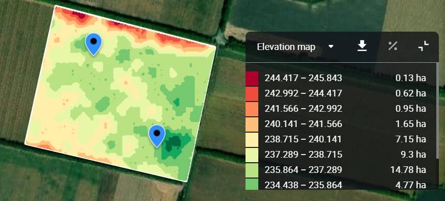
In addition, you can also download the elevation map as a .tiff file by clicking on the download icon in the lower right corner.
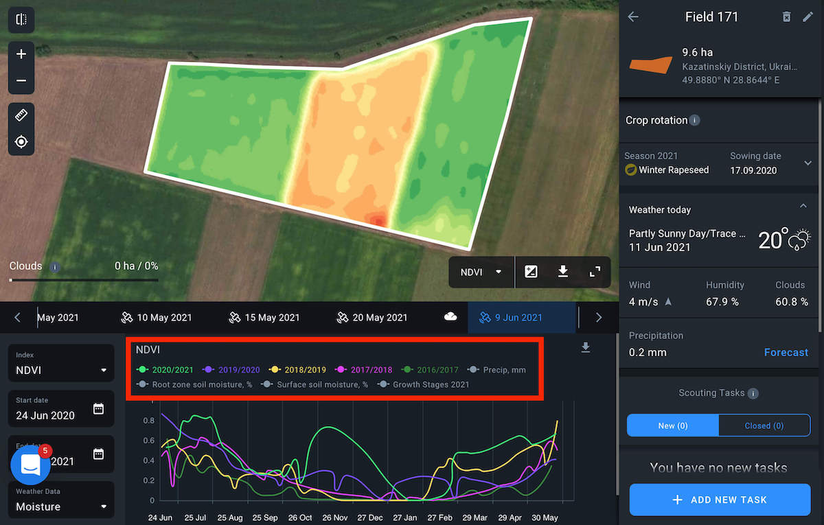
Graphic
The analytics window automatically unfolds on the bottom of the screen by selecting the field.
Graphic legend
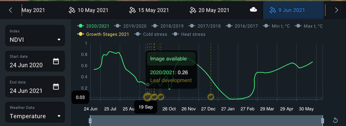
Graphs that display a representation of NDVI (normalized difference vegetation index) are in the center of this window.
There is also the possibility of years comparison, thus you can monitor how your crop is developing compared to data collected in the past. To visualize the data for the specific date, hover over the curve.
Vegetation season indices
Each curve can be disabled by clicking the corresponding colored buttons on the legend. This allows you to disable the unnecessary items and compare indices for years of interest.
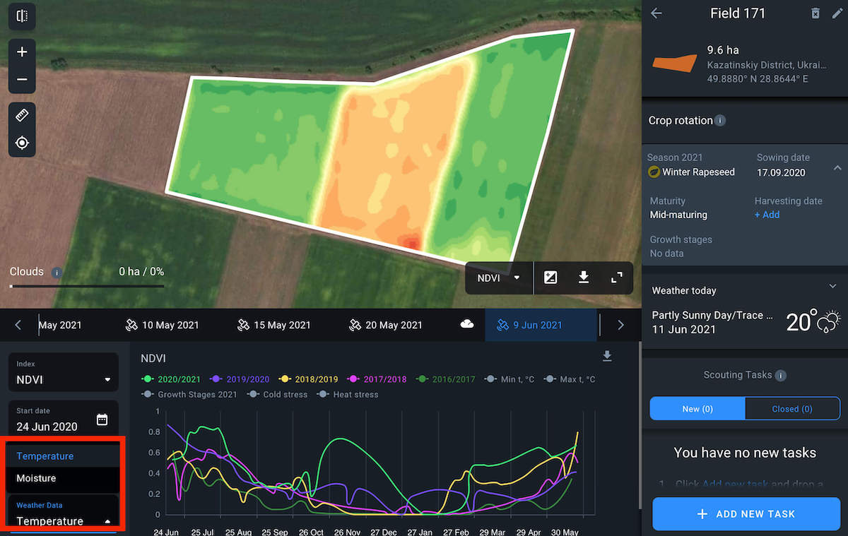
Weather graphs
To view weather data on the graph, select the required data type from the Weather data drop-down list.
Temperature data includes:
- Min/Max t °C
- Cold/Heat stress
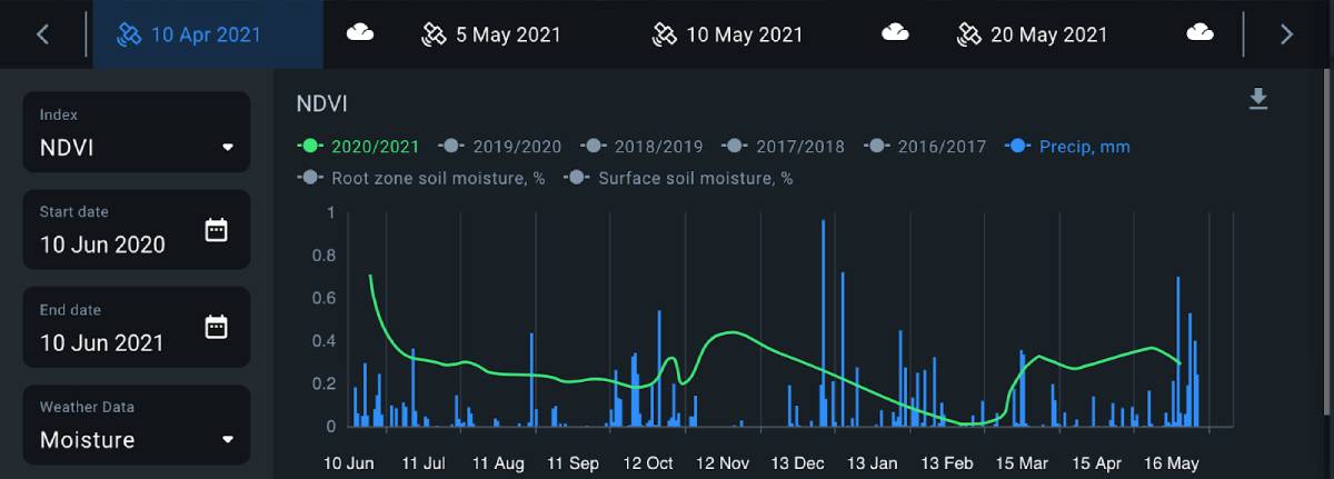
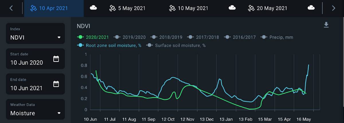
Moisture data includes:
- Precipitation in mm
- Root zone soil moisture in %
- Surface soil moisture in %
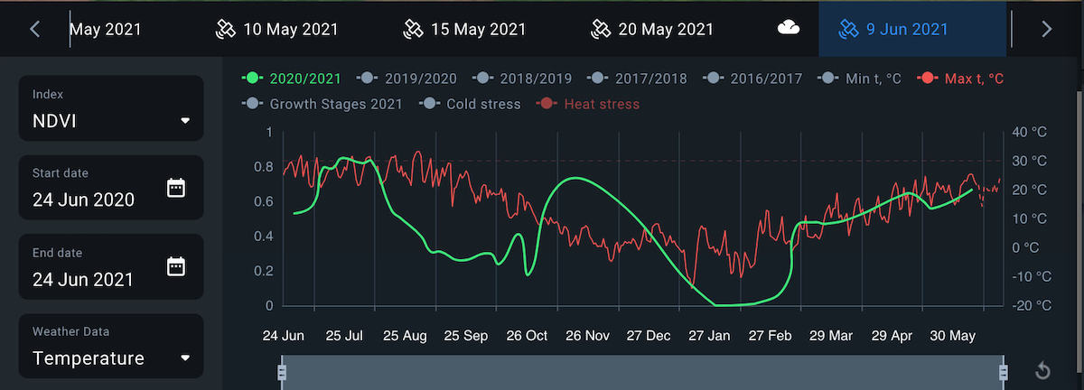
Temperature
Min temperature curve shows the history of minimum temperatures occurring in your field over a period of time. Whenever this curve crosses the Cold stress mark at -6°C, your winter crops are at risk of damage or failure. Track the curve and react when it is approaching the cold stress. Over time, you can build trends based on this graph to better protect your crops.
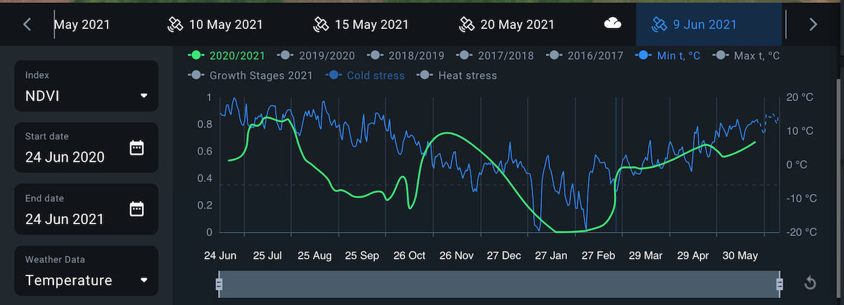
Max temperature curve represents the history of maximum temperatures in the field over a period of time. Whenever it crosses the Heat stress mark at +30°C, your crops are at risk of experiencing drought conditions. Track the curve and react when it is approaching the heat stress. Over time, you can build trends based on this graph to better protect your crops.
Moisture
Precipitation graph reflects the history of precipitation on the field measured in mm. You can build trends based on this graph and adjust irrigation and fertilization planning to increase efficiency.
Surface soil moisture curve represents the change in the amount of water in the top few centimetres of the soil over time. Based on this data, you can make better-informed decisions on irrigation.

Root zone soil moisture curve shows the change in the amount of water available to crop roots over time. Improve your water management by making decisions based on this data.
Growth stages
Use Growth Stages to get to know what stage your crop is on right now. If not needed, you are always able to hide the curve from being displayed by clicking on the Growth Stages.
Note! You should add info about crop rotation to see growth stages of your crops.
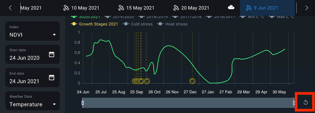
Period intervals
By default, it shows one year period or the date range selected on the calendar.
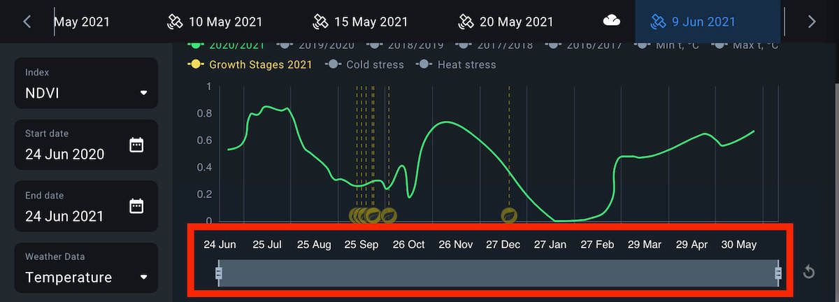
If you set a date range and want to get the default year period view, click Update.
Simply click Forecast to be redirected to the Weather page in case Weather today data is not enough for you or comparison with other vegetation periods is required.
You can get all this information using the Weather analytics tab on the right sidebar as well.

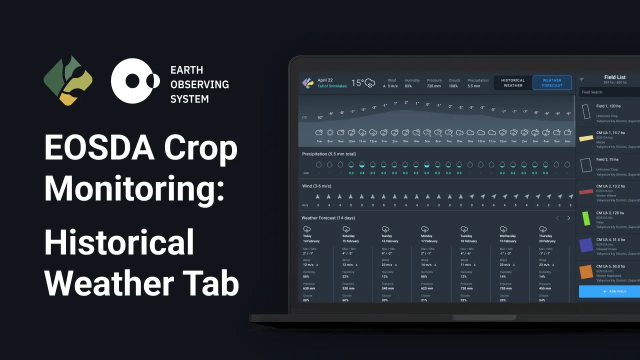
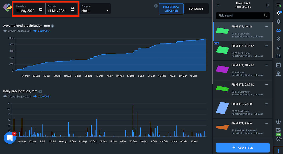
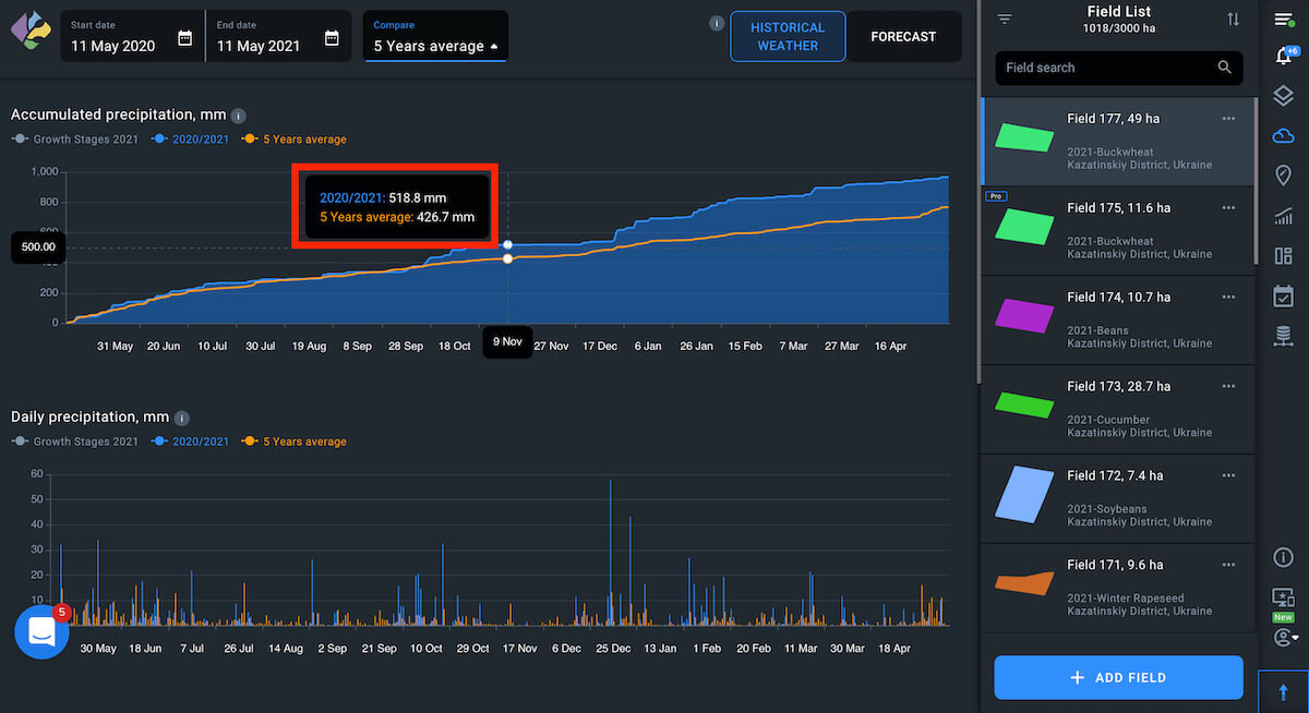
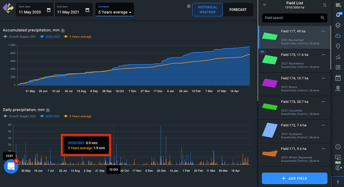
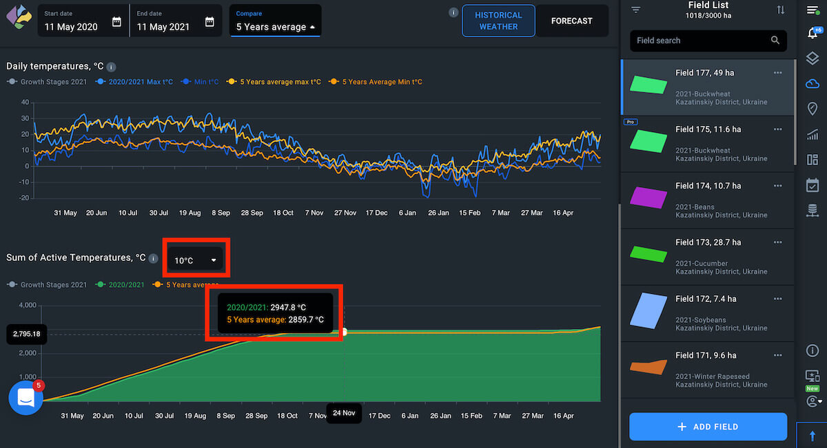
Historical Weather
Historical Weather is archived temperature and precipitation data. To set the vegetation period, choose the season you are interested in (available from 2008) and its start and end dates using the calendar. By default, the Growth Stages curve shows on all the graphs. In case there were no stages during the selected time frame, the pointer will be disabled. You can disable it manually at any time if it is not informative for you.
To add a curve displaying the data for the past five years, activate the Compare with 5 years average option.
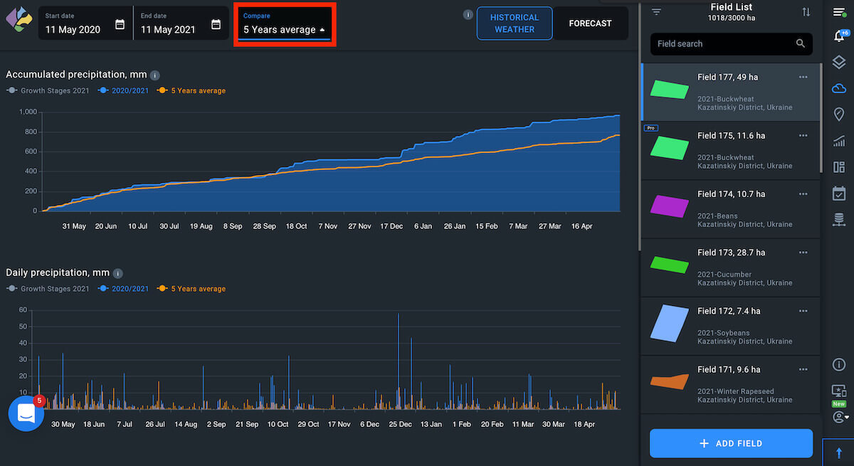
Accumulated And Daily Precipitation Graphs
Once 5 years average is enabled, you will be shown the average for the current period and the last 5 years precipitation levels on graphs to visualize collected information for further analysis.
Accumulated Precipitation graph
Daily Precipitation graph
Daily Temperatures
The graph shows min°C and max°C as well as 5 Year Average min°C and max°C if the 5 Years Average option is selected.
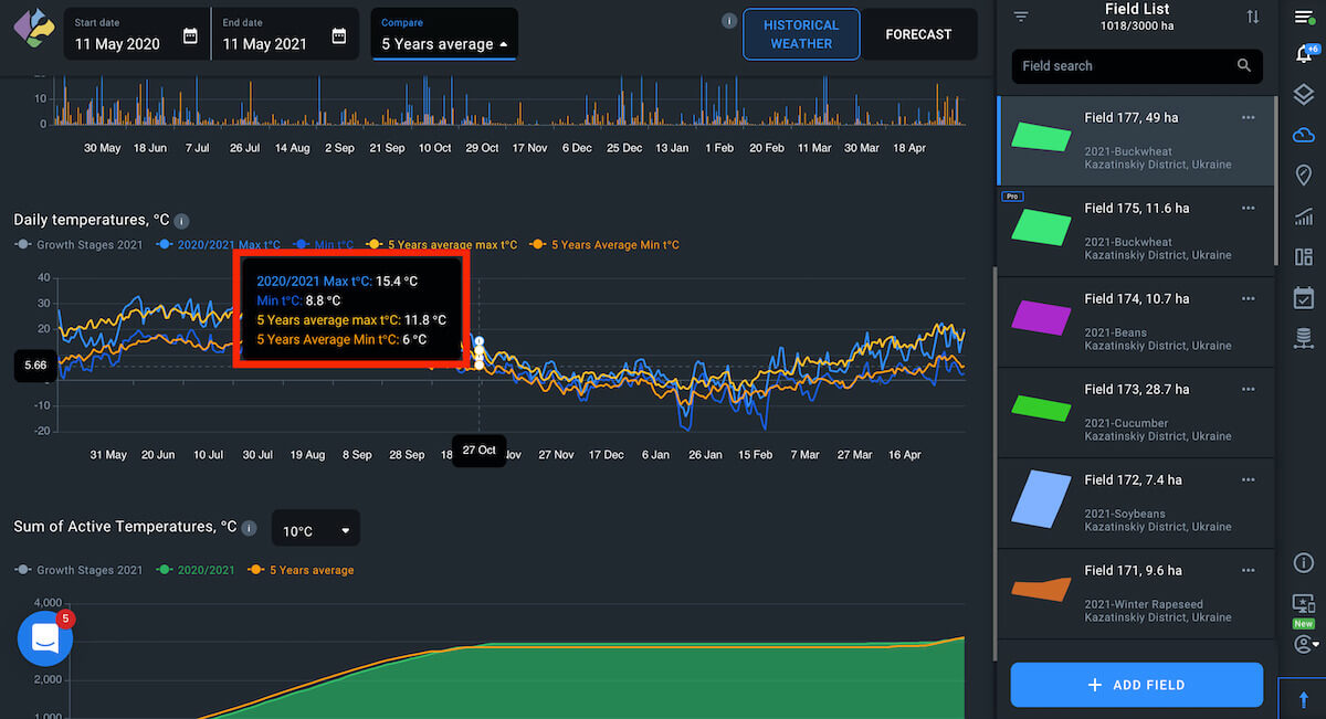
Sum Of Active Temperatures
The drop-down menu has three options that can be chosen: 0°C (1°C to 5°C), 5°C (6°C to 10°C) and 10°C (11°C to more). So if you pick the date range from 6°C to 10°C that is a 5°C filter option on the list, you will see the sum of these temperatures.
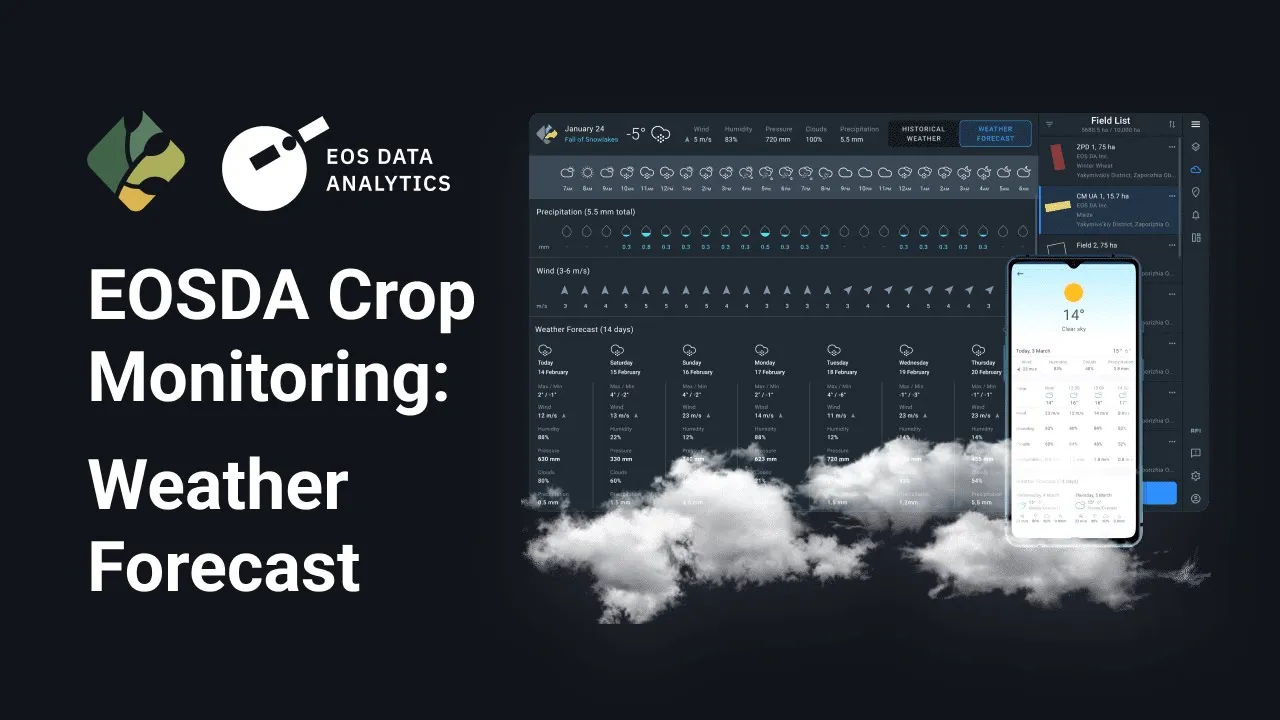
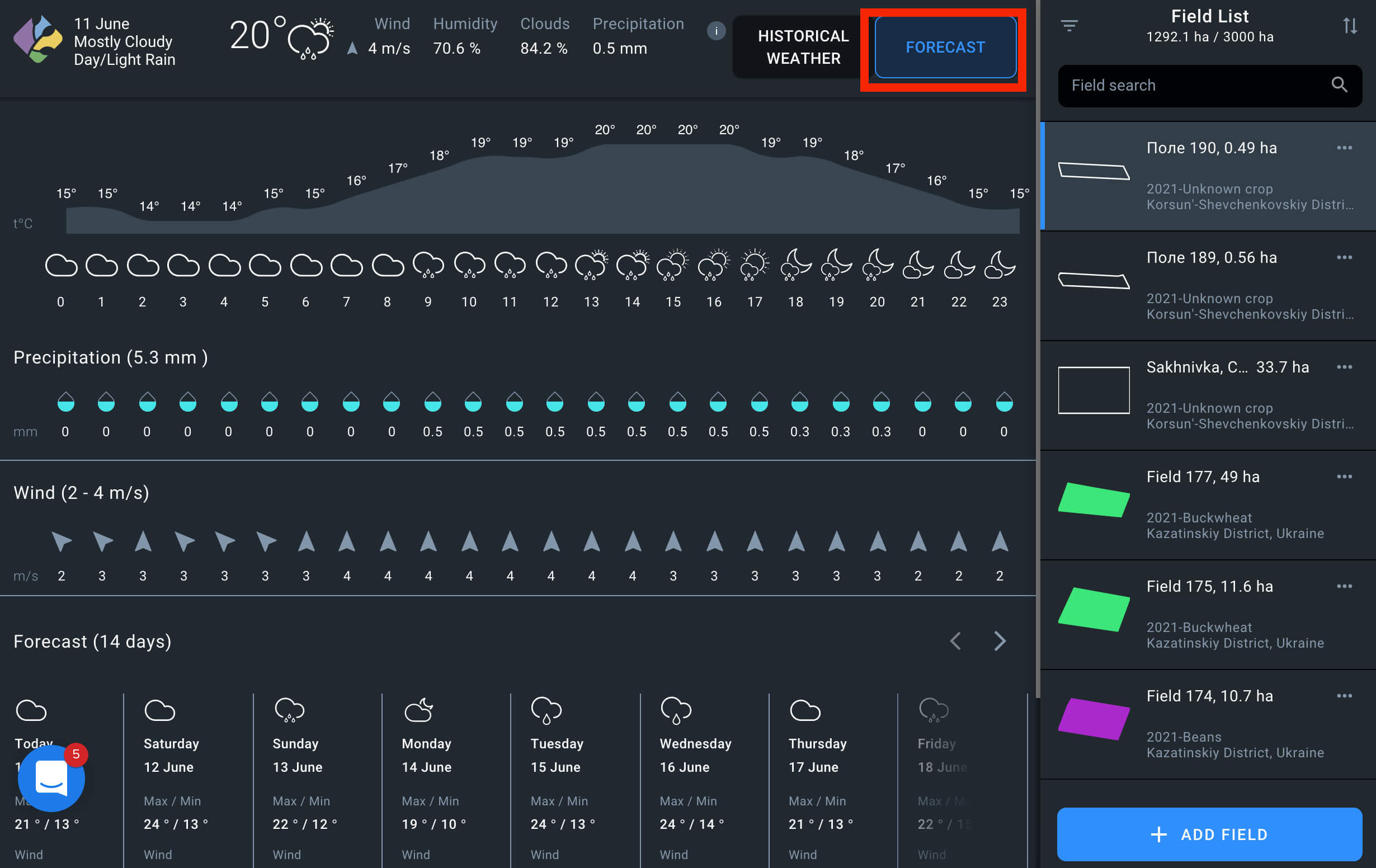
Weather Forecast
The Weather Forecast option provides you with access to the 14 days weather forecast. Wind speed, humidity, cloud coverage and expected precipitation are also shown on the screen.
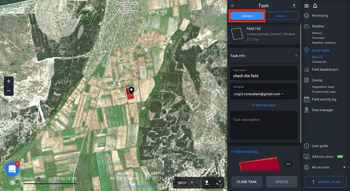
Task Description
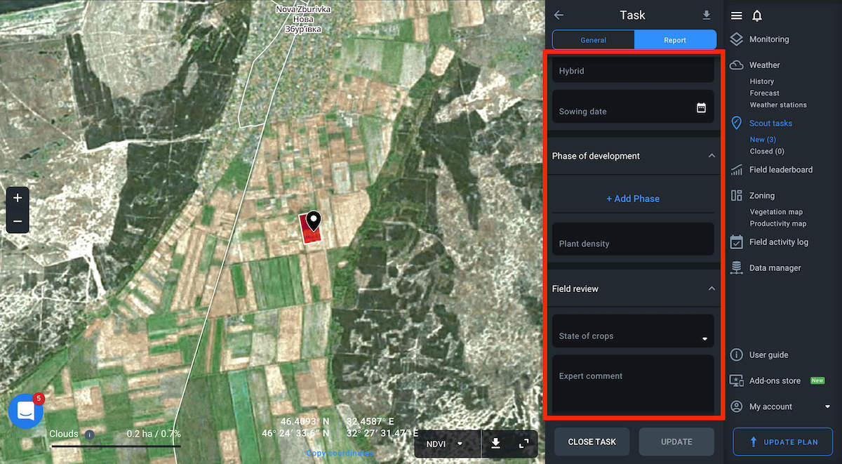
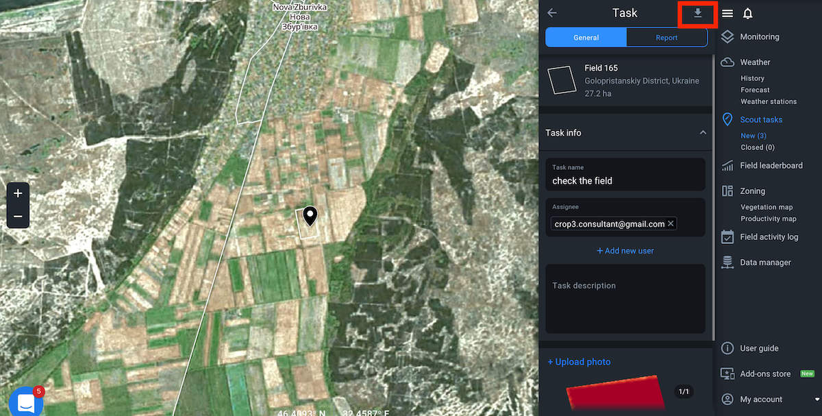
To get a more detailed description of the task, select it on the Scouting tab that is divided into General and Report.
General
General is for the one who sets the task. It allows changing the name or description, uploading a photo of the field or closing a task in case it is completed.
Report
The Report tab is for scouts. Scout selects the date when the field was inspected, fills in the name of a client e.g. the owner of the field, and the number of the field, changes the field area and crop name, hybrid and sowing date using this tab.
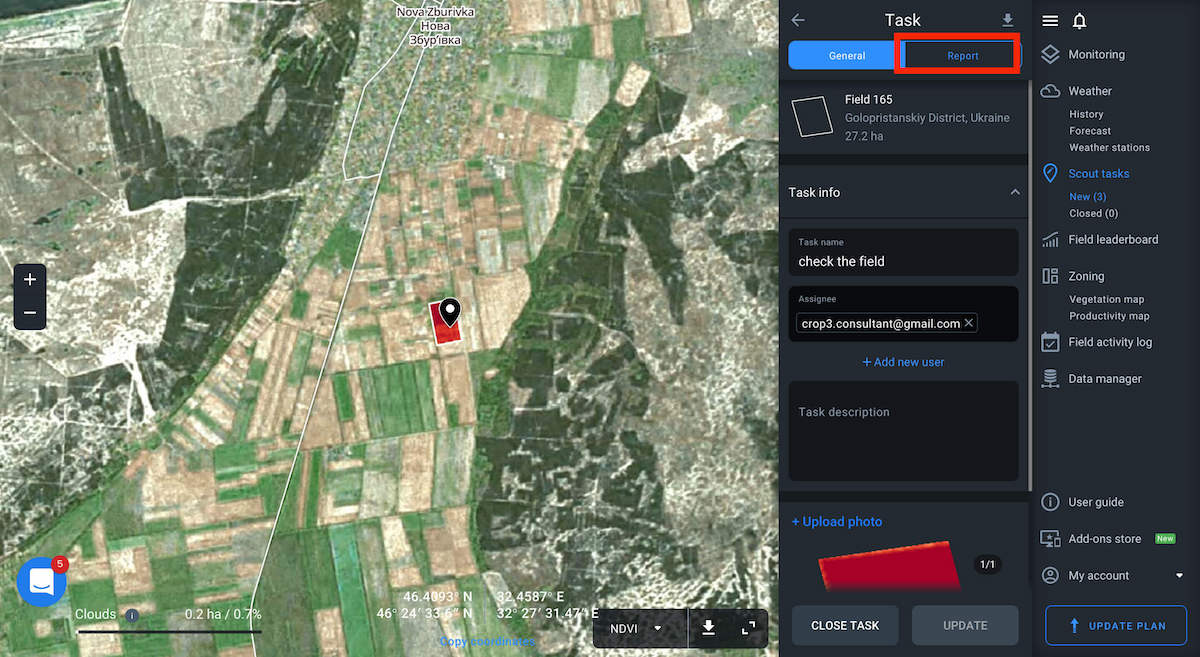
With the help of this tool, scout adds developmental phases indicating the root thickness and the amount of leaves, sets the density of plants and makes a final review of the field indicating the state of crops and leaving an expert comment. After making all the necessary changes, the assigned person closes the task if it is completed or updates the task if needed.
Download
In case you need to download the report in the form of a spreadsheet, click the Export button at the top of the Task tab to be processed automatically.
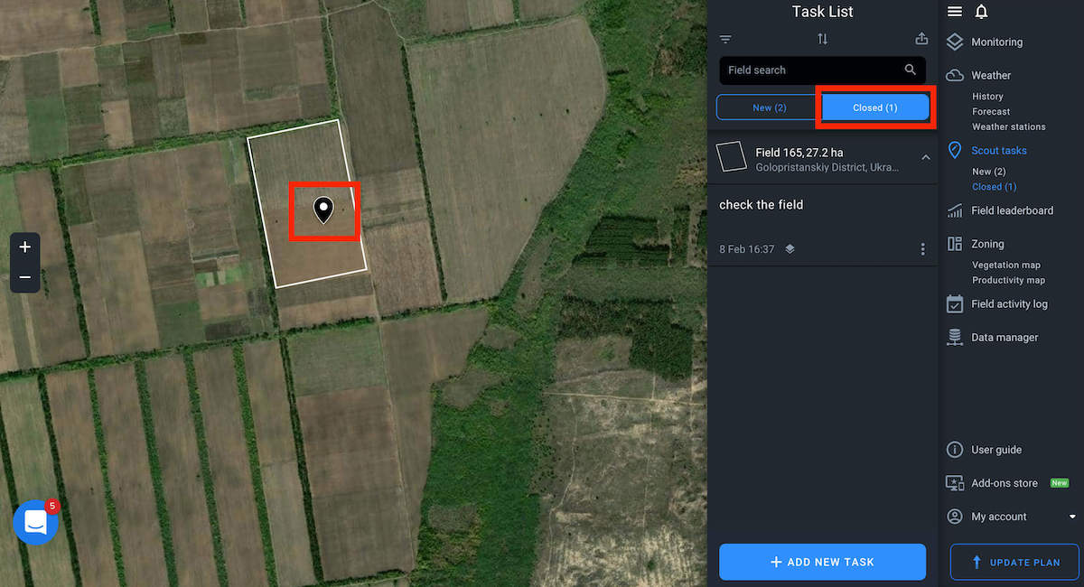
Closed Tasks
When you complete the task, it’s automatically moved to the Closed tab of the Task list to be displayed as closed on the map.
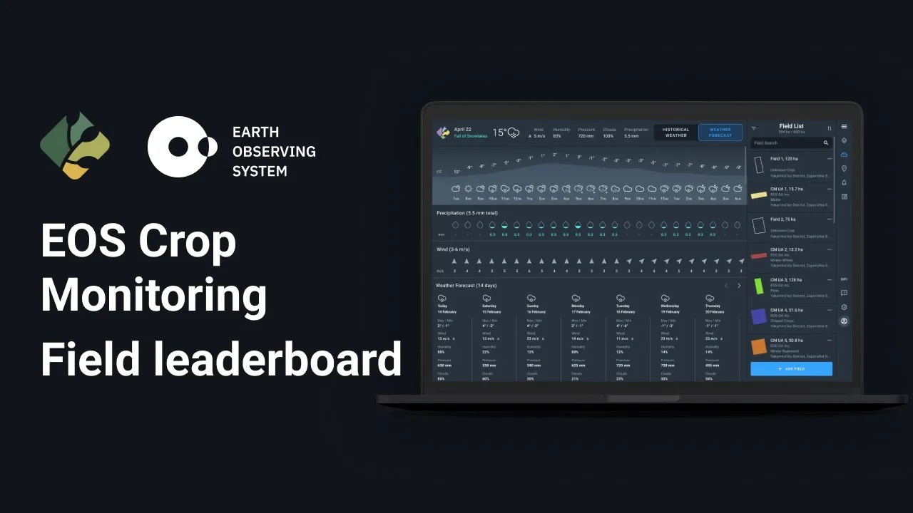
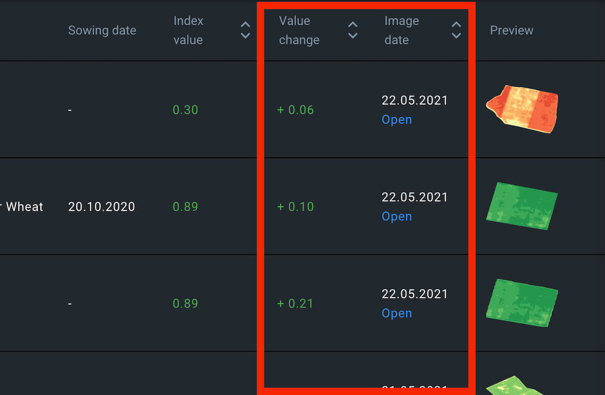
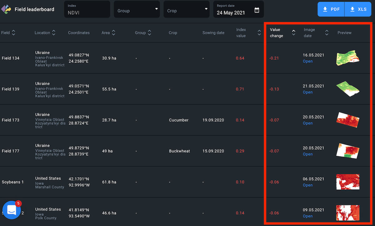
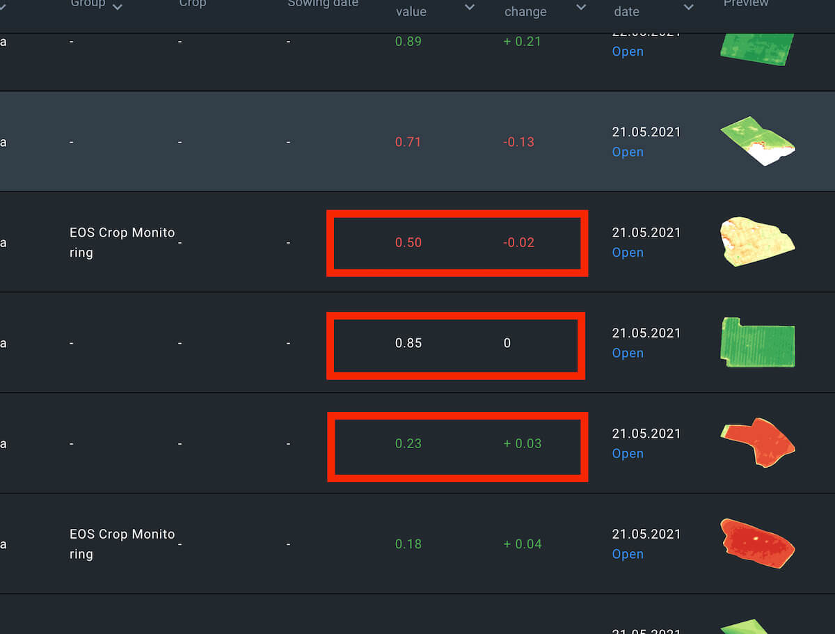
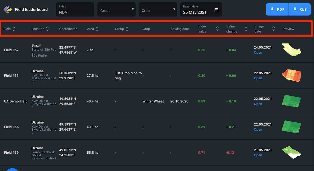
Field leaderboard has been designed to help users prioritize their field management tasks according to the NDVI value change. Leaderboard also arranges all of your fields in one place according to 1 of 8 different categories:
- Name
- Location
- Area
- Group
- Crop
- Index value
- Value change
- Image date
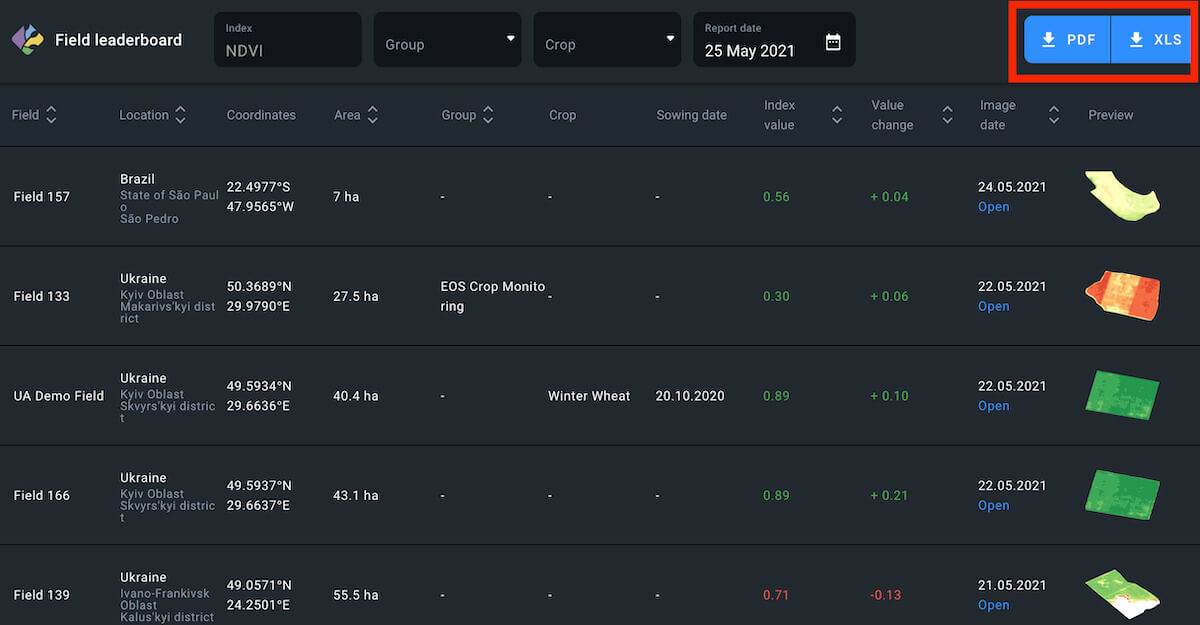
Each arrangement appears as a list of fields sorted and ranked accordingly and can be exported as a PDF file and/or .xls spreadsheet.
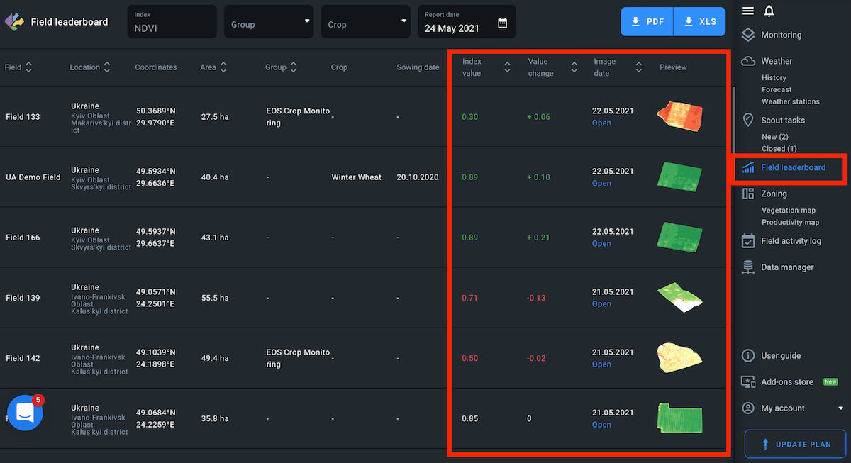
Default
By default, the leaderboard shows your fields arranged according to the latest available image and the most negative NDVI value change.
Note: the field with the latest available image may have less of a NDVI value drop compared to another field with an older available image. This allows you to focus on the most urgent issues first.
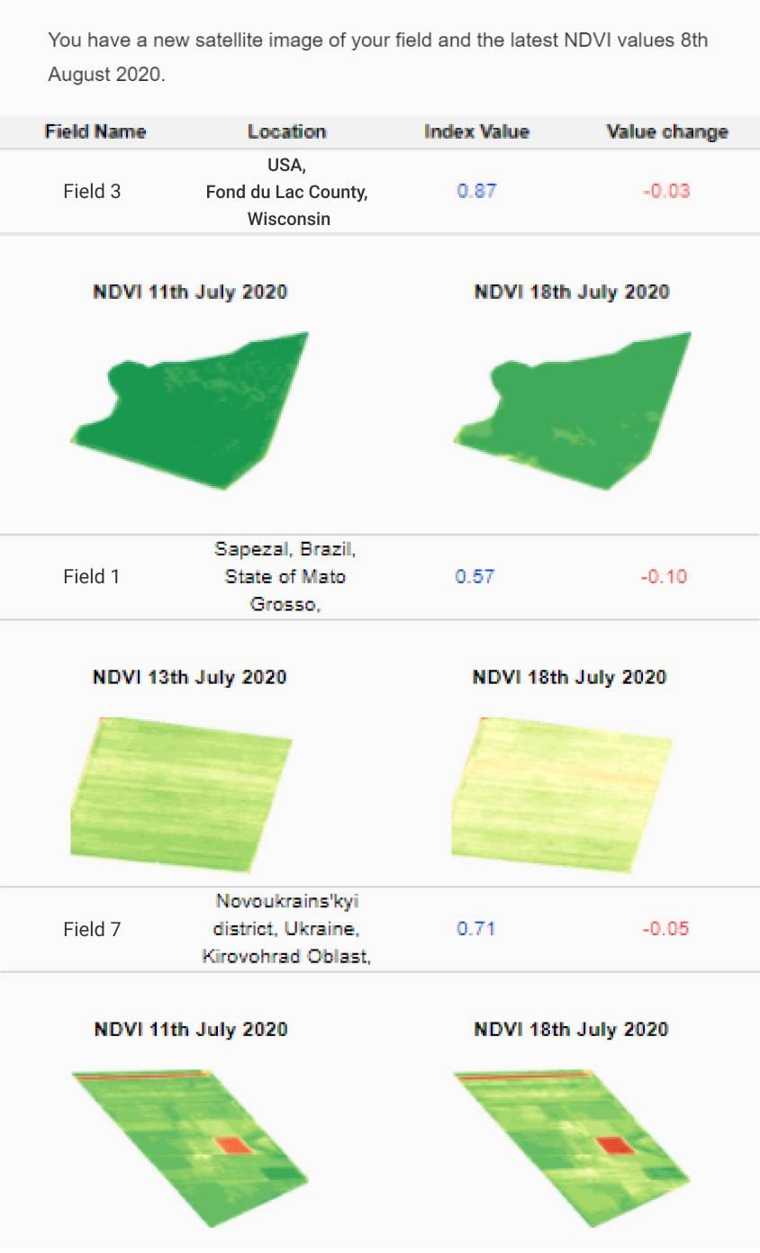
Notifications
Every time there are new satellite images of one, several, or all of your fields, Leaderboard gets updated. You will automatically get notified about each update via email.
The notification email will contain the following data:
- current index value for the field
- value change compared to the previous image
- field name (the one you have assigned to it)
- field location
- new image date
- previous image date
Every notification email may contain the data for up to 3 of the fields that are currently at the top of the leaderboard.
NDVI Drop
You can rearrange the leaderboard to show your fields ranked only according to the NDVI value change. The field with the largest NDVI value drop automatically moves up to the top of the leaderboard. On the contrary, the field with the largest NDVI value rise gets sorted to the bottom of the list.
Parameters
To rearrange the leaderboard, click on the appropriate sorting parameter above the leaderboard.
The parameter should light up.
Note: you can always tell which category arrangement is currently on the leaderboard by checking the parameter. Only one parameter can light up at a time.
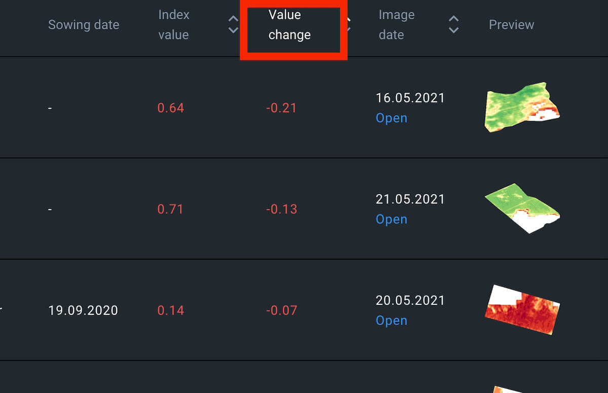
Color Code
NDVI value drop is marked by the red color and a minus “-” symbol, while the rising NDVI value appears green, with a “+” sign. If there has been no change over the period in question, NDVI value appears white.
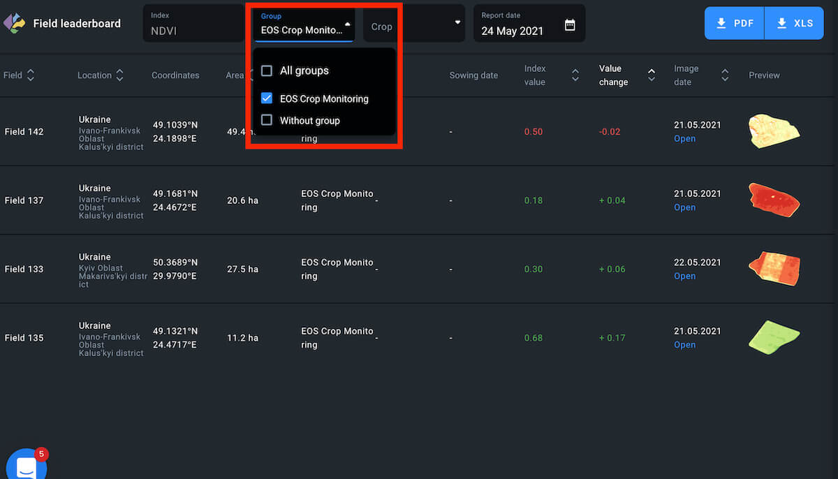
Group
You can sort fields according to the group. To view all fields at once, select All groups.
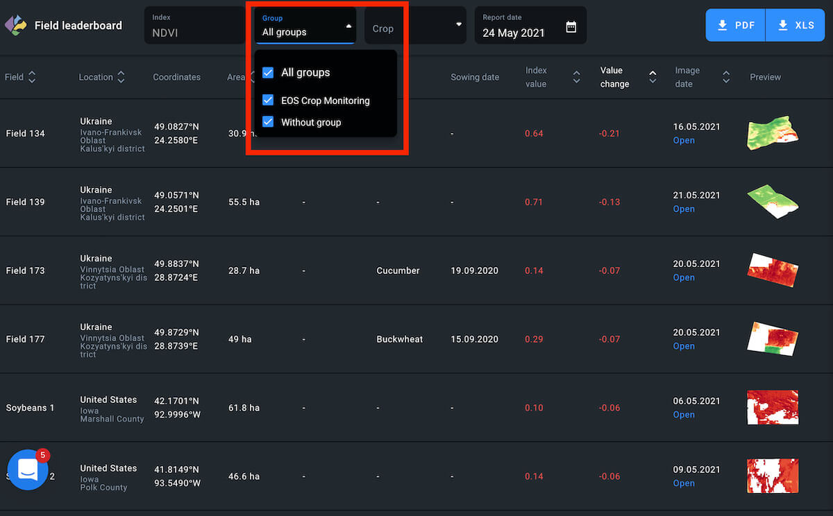
To view fields that do not belong to any group, tick the appropriate checkbox.
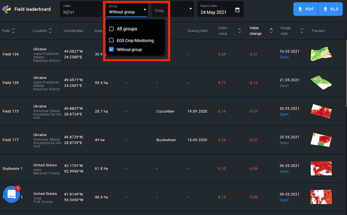
Another option is to view only the fields that belong to a specific group.
Crop
You can also arrange fields according to their currently growing crop type.
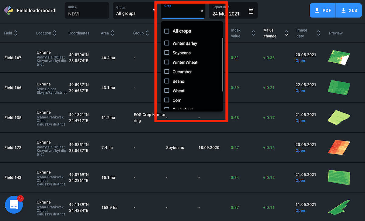
To view the fields with a common growing crop, click on the appropriate checkbox.
Note: Fields without added crop rotation data cannot be arranged according to crop type.
Download
You can rearrange the fields on the leaderboard in 9 different lists and download them as PDF file and/or xls. spreadsheet.
The download begins automatically as soon as you click on the PDF or XLS button.
Select Date
You can select a date to view the NDVI change for the period between two available images of the same field (3-5 days).
1. Find the Report date field right above the leaderboard.
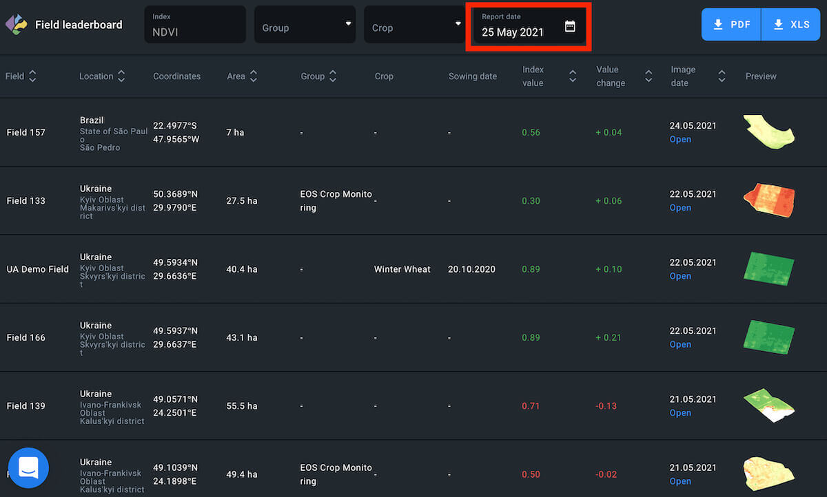
2. Click anywhere on the Report date field
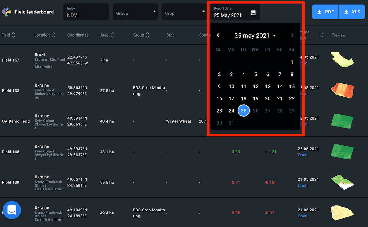
3. Select the date in the pop-up calendar in 1 click
The leaderboard will automatically refresh to show you the data for the period between two images closely preceding the selected date.
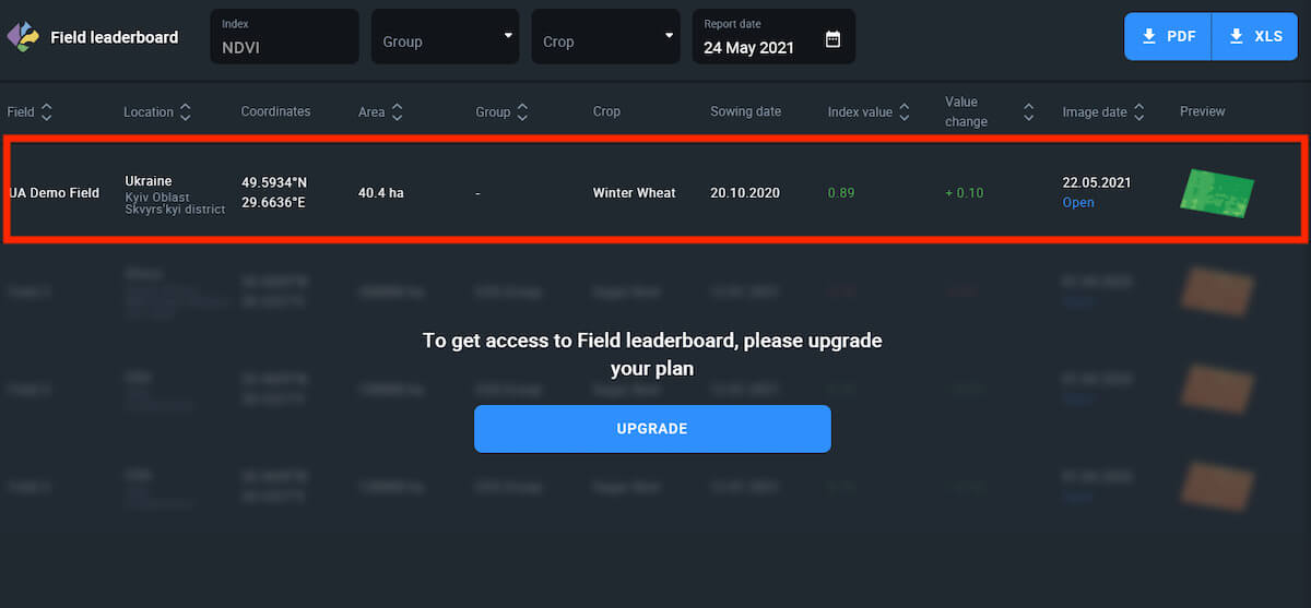
Free Account
To access the Field leaderboard, you need to update your pricing plan to Essential or Professional.
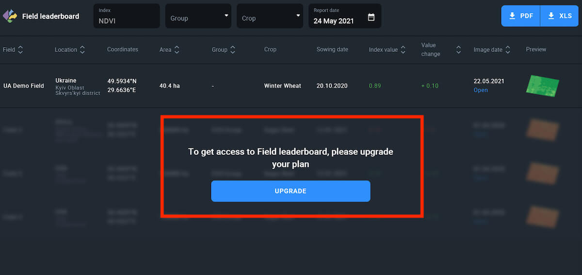
You can try out the Field leaderboard feature on your Demo field in the Free Account.
Note: Only the Demo field data will be accessible.
Sort
Additionally, you can sort fields within the leaderboard based on 7 different attributes:
- Name (in the alphabetical order)
- Location (in the alphabetical order)
- Area (least to greatest and vice versa)
- Group (1 group/some groups/all groups/without group)
- Index value (least to greatest and vice versa)
- Value change (difference between two images)
- Image date (oldest to newest and vice versa)
You can create 7 different leaderboards with fields arranged differently and download each leaderboard as either a PDF file or xls. spreadsheet.
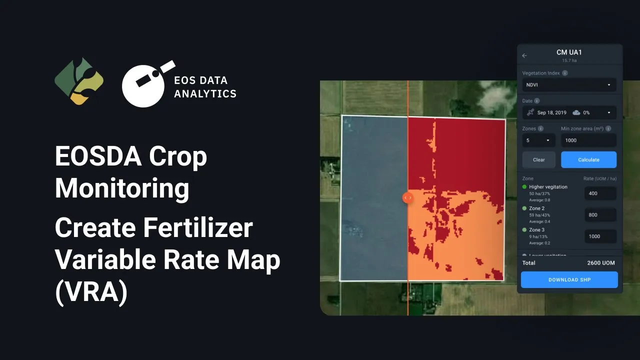
Zoning is an effective tool for carrying out the variable-rate application of seeds, fertilizers, differential irrigation, and differential crop rotation, as well as for determining optimal zones (areas) for precision soil sampling. Based on the in-zone data measured using a vegetation index, a map can be created on the platform and imported to the agriculture equipment. The equipment can then follow the map as a script, applying the precisely calculated amount of seeds and/or fertilizers to specific zones (areas) within a field. Variable-rate application of inputs and precision soil sampling are highly cost-effective since they allow you to allocate resources more rationally. VRA of inputs is also more sustainable as it can help prevent the overuse of nitrogen, phosphorus, and potassium fertilizers, as well as of crop protection substances.

Getting started with Zoning
1) On the right sidebar menu, click Zoning.
2) You will be directed to the list of fields.
3) Select the field you want from the list by clicking it.
4) You will be directed to the page where maps are created.
5) Here, you can create:
- Multilayer map for variable-rate application of inputs based on combined data of multiple selected layers, e.g. vegetation index and elevation.
- Vegetation map for variable-rate nitrogen fertilizer application.
- Productivity map for variable-rate potassium and phosphorus fertilizer application, variable-rate seed planting, and for soil sampling.
6) For more details, refer to the Create multilayer maps, Create vegetation maps and Create productivity maps sections.
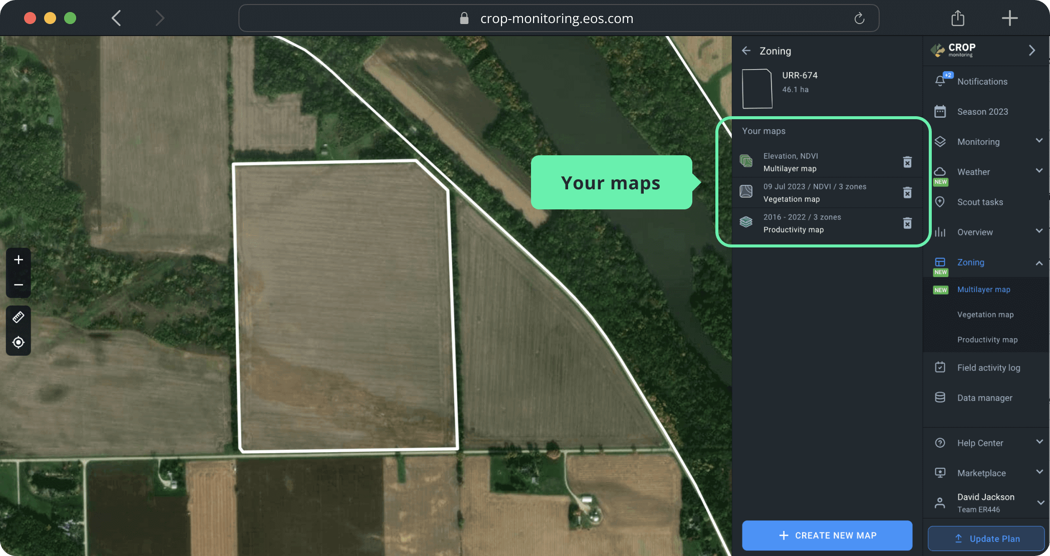
7) If you’ve already created maps for this field, you will see a list of maps “Your maps”. For more details, refer to the section Save the created maps.
Create multilayer maps
Slopes, hills, and pits are among the factors causing humus leaching and changes in the chemical soil composition, which might decrease field productivity. Field elevation also influences vegetation growth and, therefore, determines the amount of fertilizer, seed and/or pesticide to be applied.
A Multilayer map allows combining the vegetation and elevation layers to create an optimal VRA map and improve productivity.
Create map
You can create a Multilayer map in a few simple steps:
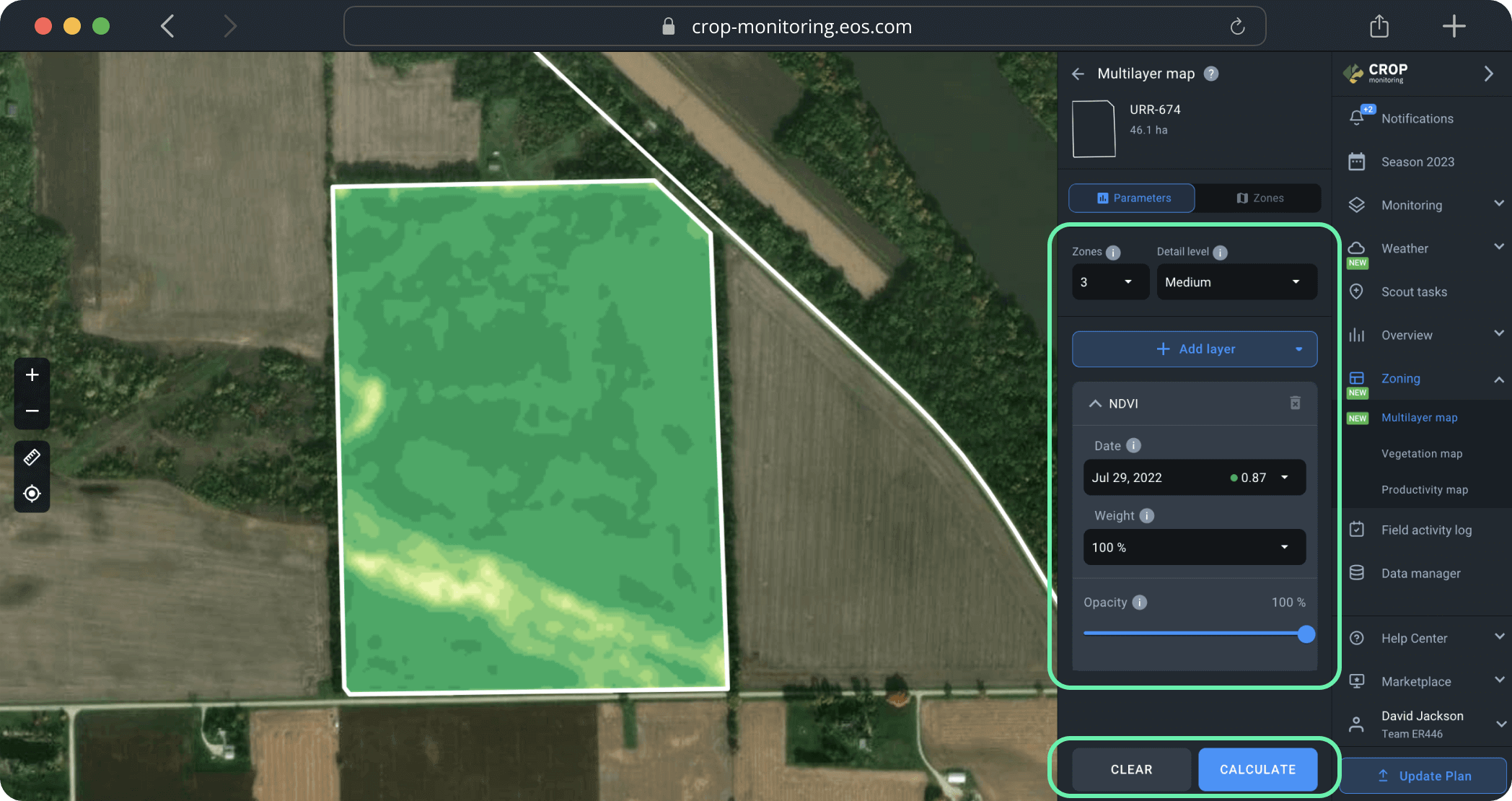
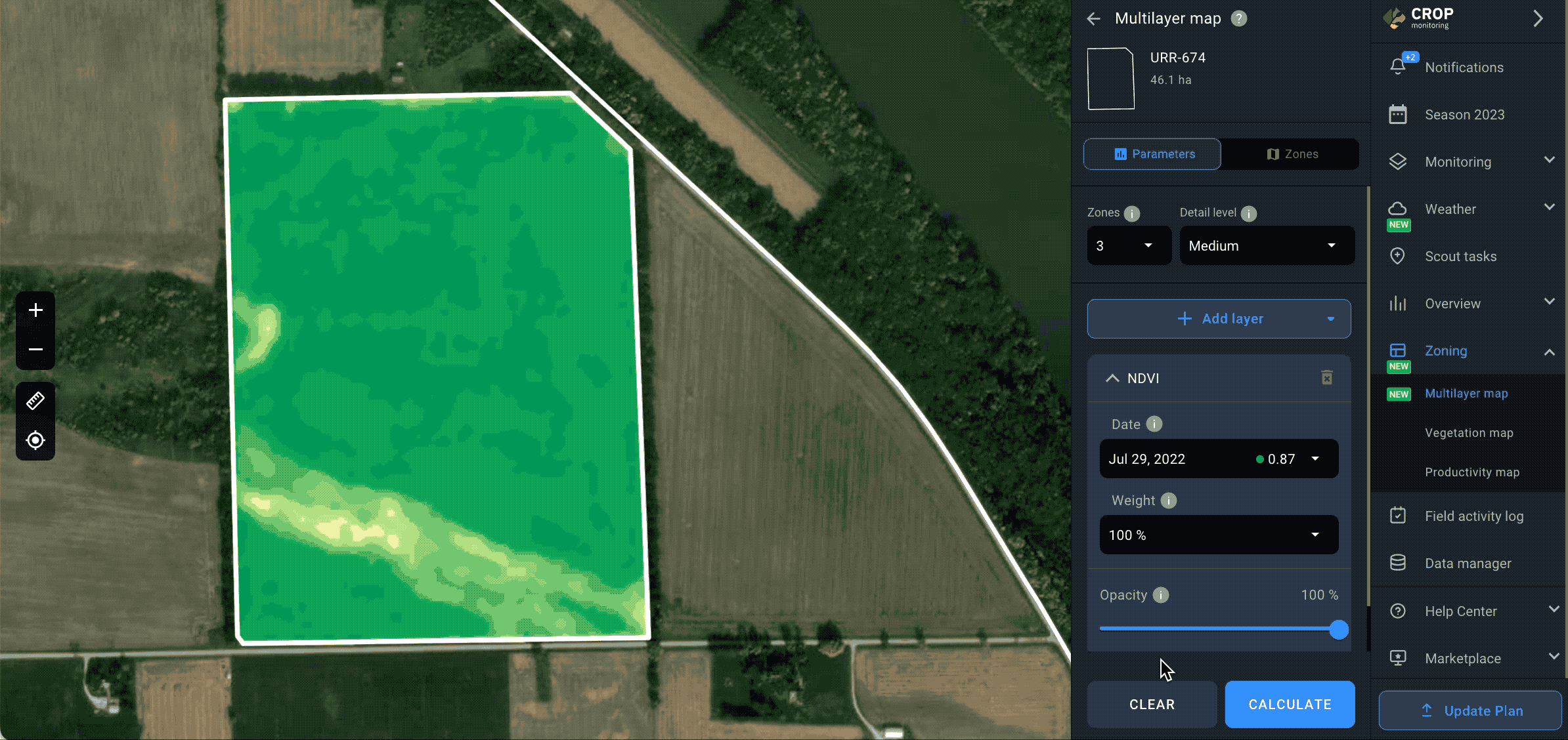
Step 1. Set the parameters needed to create zones on the map:
1) Number of zones
You can choose between 2 and 7 zones on EOSDA Crop Monitoring, according to your needs (e.g. field area). For most fields, 3 to 5 zones are an optimal choice.
2) Level of detail
You can also manage the level of detail the map will show you.
Tip: Use high to maximum detail for small fields and medium to low detail for large fields.
Step 2. Pick the layers to build the map by clicking +Add layer and choosing from the drop-down list of available layers*:
1) Vegetation indices
- NDVI
- NDRE
- MSAVI
- RECl
2) Moisture indices
- NDMI
3) Elevation map
You can select up to 5 different layers. To preview all the layers you’ve added, scroll down below the +Add layer button.
*This list will also show you any custom indices available in your account.
Step 3. After you’ve picked the layers, select a date of a satellite image the map will be based on. You need to pick the date for each individual layer.
Note: Elevation map layer does not require a date of a satellite image.
Step 4. Select the image weight.
Weight indicates how much each layer will count in calculation. For example, NDVI weight set at 100% and Elevation map weight at 50% will generate a map where the NDVI parameter relates to the Elevation parameter as 2:1.
We also recommend using Opacity tool at this stage.
Opacity enables the comparison of map layers. For example, you can compare vegetation and elevation to determine how they correlate with each other. Opacity does not affect calculation and the resulting map.
To work with Opacity more conveniently, you can collapse the layer by clicking on its name.
After you’ve selected all the needed parameters within the layers, click “Calculate”.
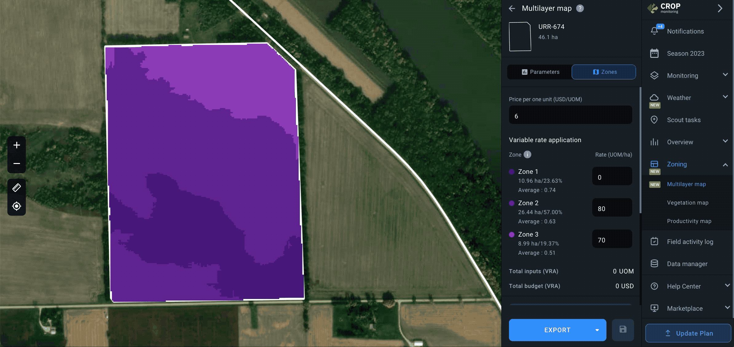
The calculation of zone distribution across the field takes just a few seconds. The result is the map you can see on the left and the zones for variable rate application of inputs on the right. To apply fertilizers according to the Multilayer map, you will need to manually input the amount of fertilizer per 1 hectare/acre for each zone. The system will automatically calculate the total amount to be applied in each zone as units of measurement (UOM).
Note: Zone 1 will have the highest values.
By switching to the Parameters tab, you can review the ready map and compare it with the selected layers, e.g. to see how elevation affects a certain area (zone) of a field. This information will help you adjust the fertilizer amount for more effective results.

Export map
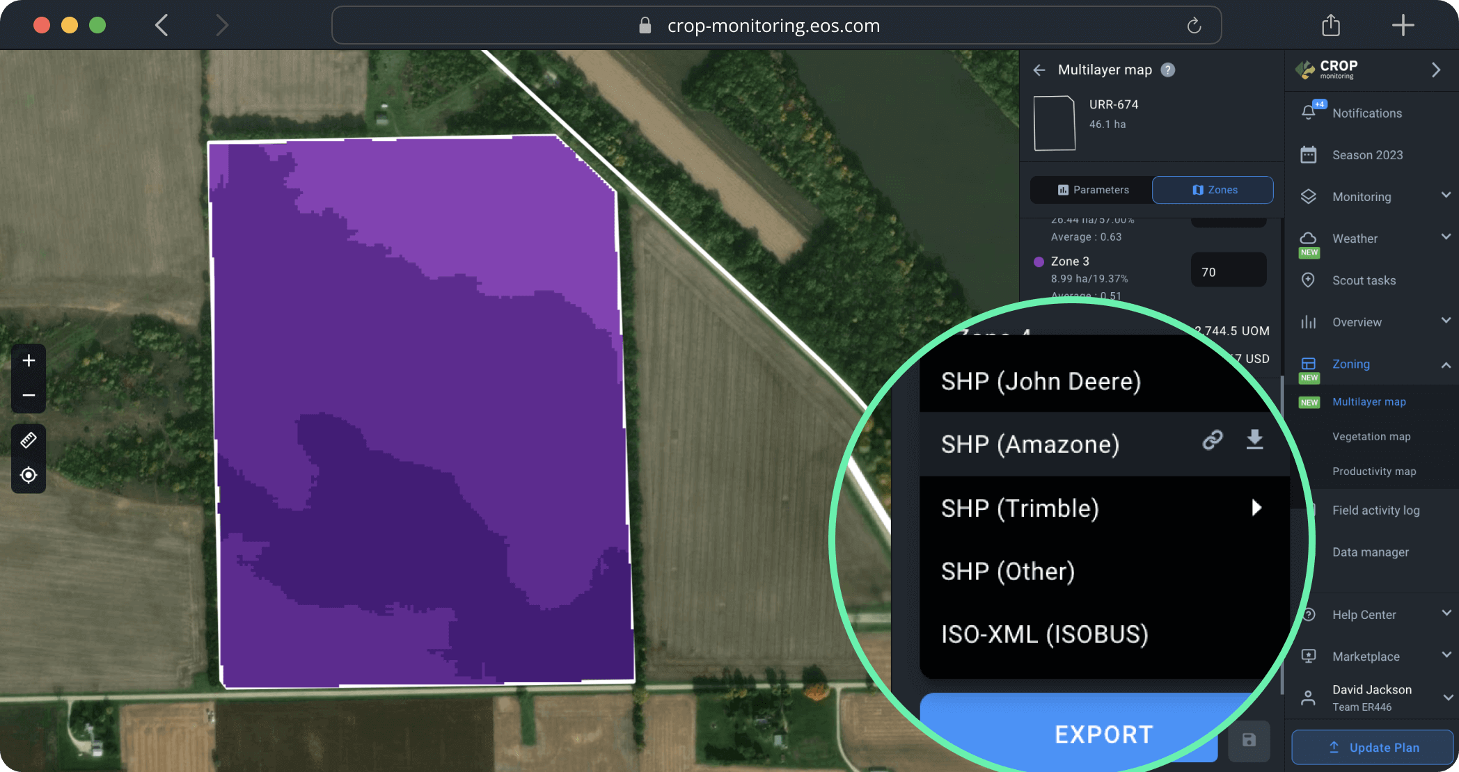
The final step is to export the map from the platform by clicking EXPORT below.
Once you click the EXPORT button, you will need to choose the file format from the drop-down list. Learn more about different file formats for the agricultural machinery available on the platform here.
Select the file format that suits you best and click on it. The download will start automatically. You can also hover your mouse over the file format and choose between two options:
1) Get link to this map. The link to the map will be saved to the clipboard*. You can share this link with anyone.
2) Download this map. The Multilayer map will be saved to your device as a file.
*The link is only valid for 10 days after being copied.
Create vegetation maps
The vegetation map allows you to determine the areas within a field with variations in the state of vegetation (low to high) and adjust nitrogen fertilizer application, irrigation, and crop protection activities accordingly. We use a color grade scheme to visualize the variations in the state of crops across the field. The red color may indicate the poor state/health of the crops that are growing in this area of the field, while the green area usually indicates well-performing crops. The decision on the amount of N fertilizer, irrigation method, and proper crop protection also depends on the physical characteristics of a field, such as elevation differences and others.
Create map
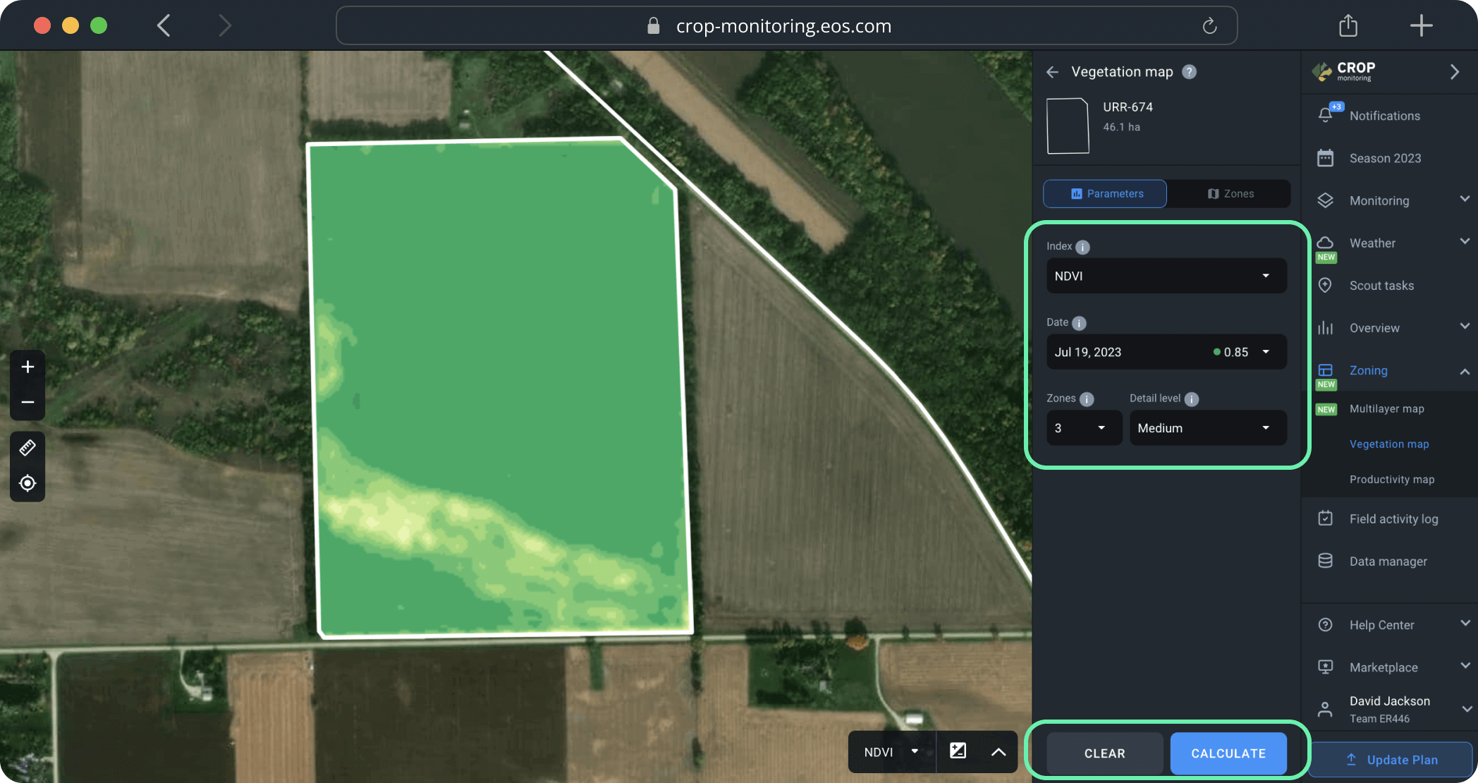
You can create a vegetation map in just a few simple steps.
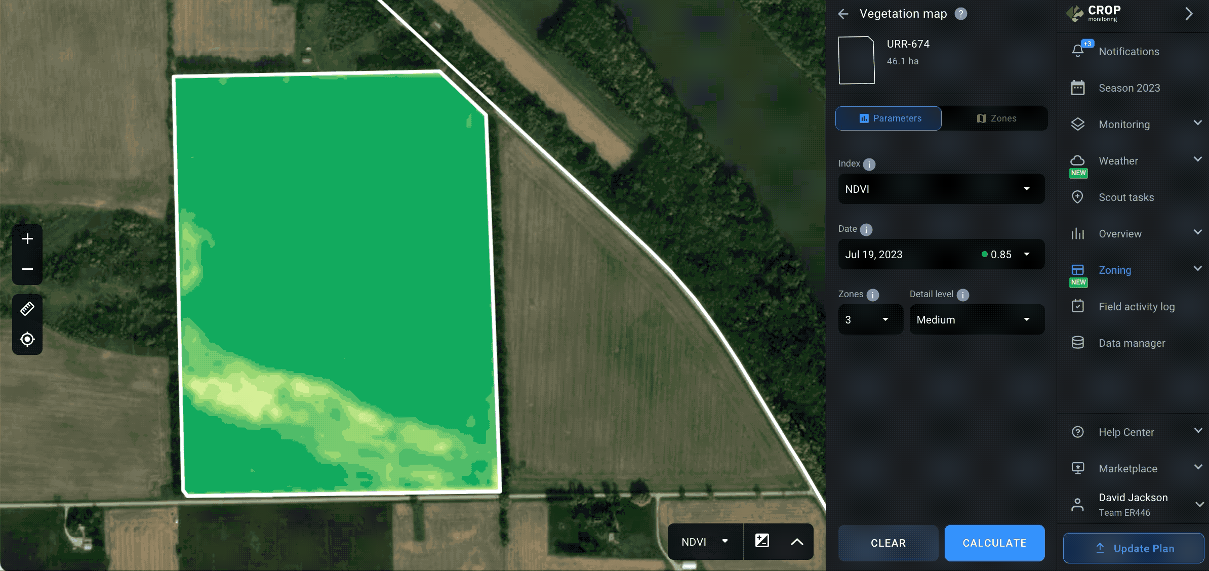
First, select an appropriate vegetation index in the drop-down menu. The map will be based on all the different index values detected across the field.
Next, select a satellite image in the “Date” field. For the vegetation map, you will need one of the latest available images.
Tip: You can preview a satellite image while selecting the date or index before you create the vegetation map. This will allow you to settle on the right image without the need to check each one, saving you time.
Finally, select the number of zones and the detail level.
Tip: Maximum detail level works best for small-scale fields, providing you with highly detailed maps. Decrease detail level for larger fields: medium for average-size fields; minimum for larger fields.
Now, all you need to do is to click CALCULATE.
The calculation of zone distribution across the field takes just a few seconds. The result is the map you can see on the left and the zones for variable rate application of inputs on the right.
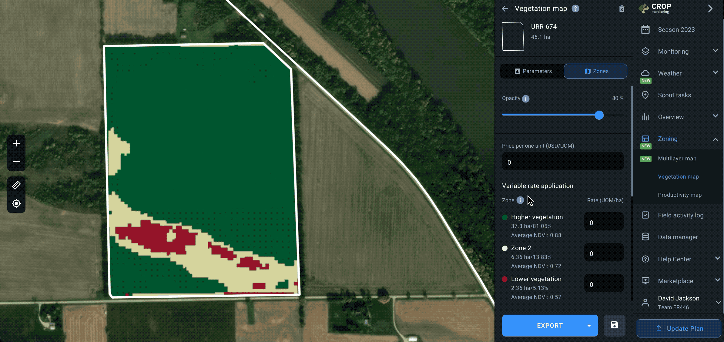
Make sure there haven’t been any anomalies in the satellite image the map is based on by moving the Opacity slider.
Opacity is set to 80% by default for any obstructions/anomalies to show up in the image overlapping with the vegetation map. Moving the slider all the way to the left (0%) will allow you to see the natural view. If no anomalies are to be seen, you can move the Opacity slider all the way to the right (100%), to switch to the vegetation map view.
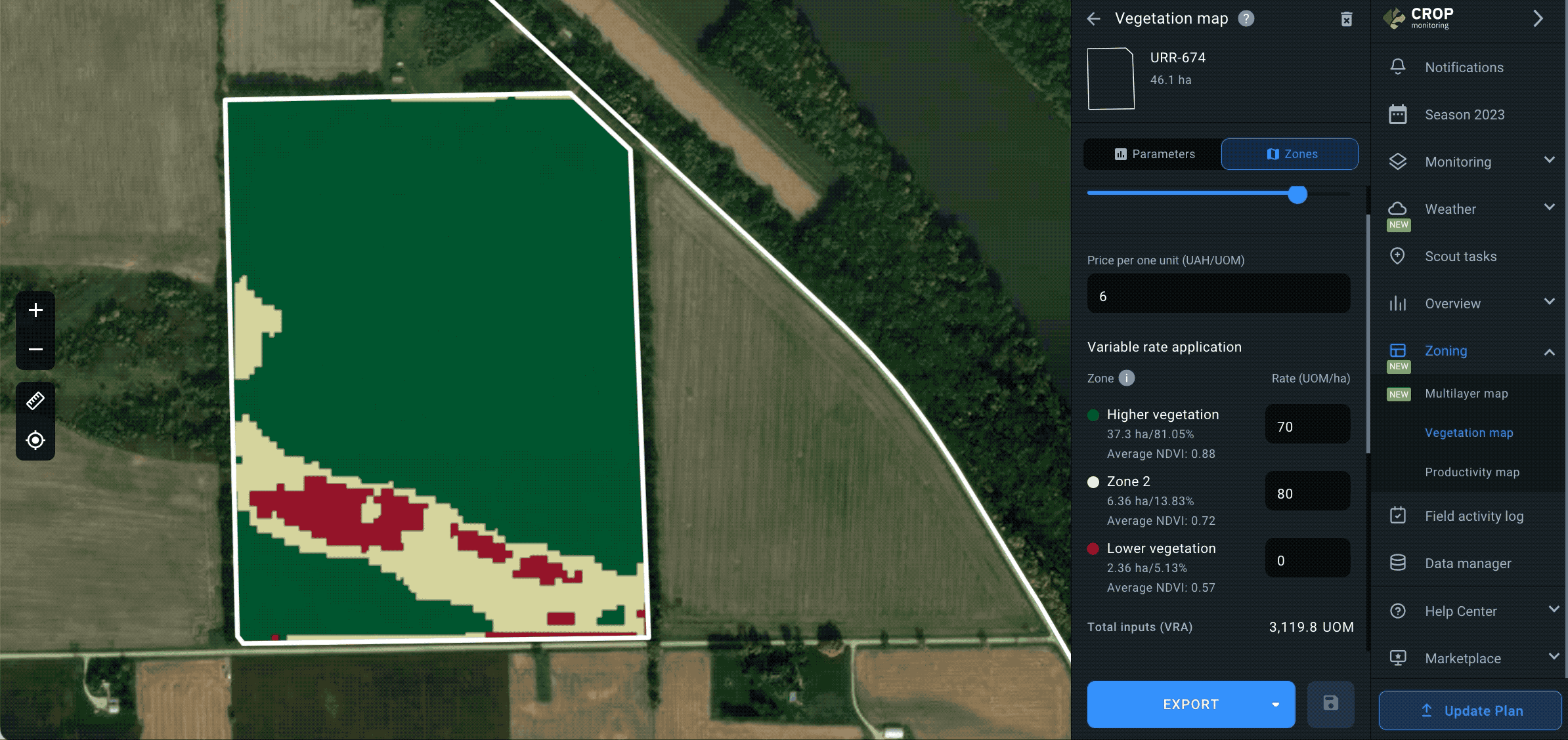
To apply fertilizers according to the vegetation map, you will need to manually input the amount of fertilizer per 1 hectare/acre for each zone. The system will automatically calculate the total amount to be applied in each zone as units of measurement (UOM).
Note: the green and red colors on the maps stand for relatively higher and lower vegetation.
Export map
The final step is to export the map from the platform by clicking EXPORT below.
Once you click the EXPORT button, you will need to choose the file format from the drop-down list. Learn more about different file formats for the agricultural machinery available on the platform here.
Select the file format that suits you best and click on it. The download will start automatically. You can also hover your mouse over the file format and choose between two options:
1) Get link to this map. The link to the map will be saved to the clipboard*. You can share this link with anyone.
2) Download this map. The vegetation map will be saved to your device as a file.
*The link is only valid for 10 days after being copied.
Create productivity maps
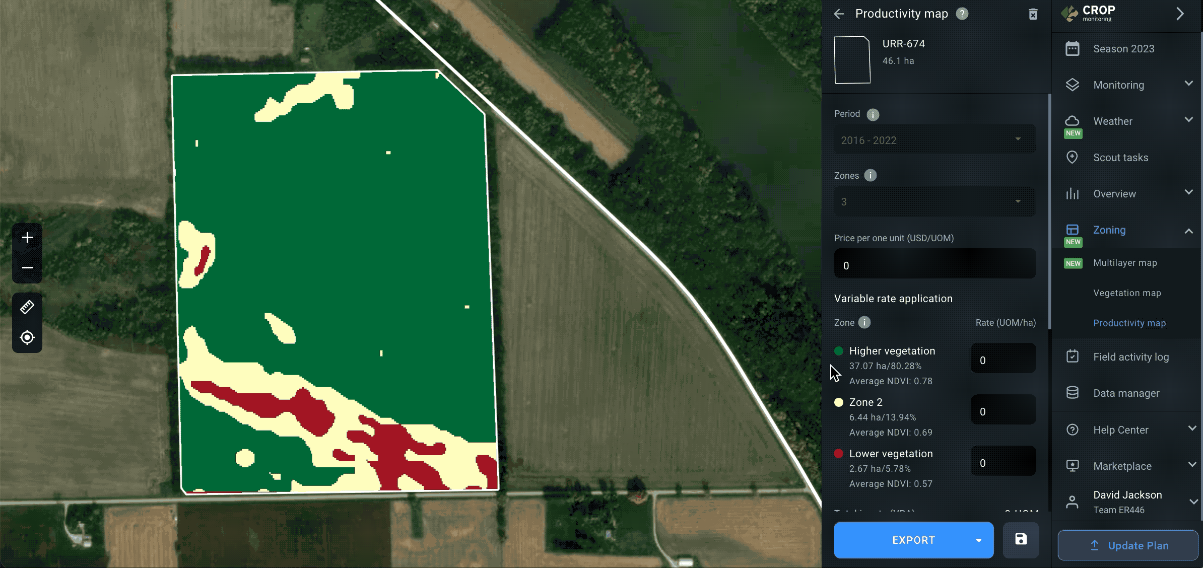
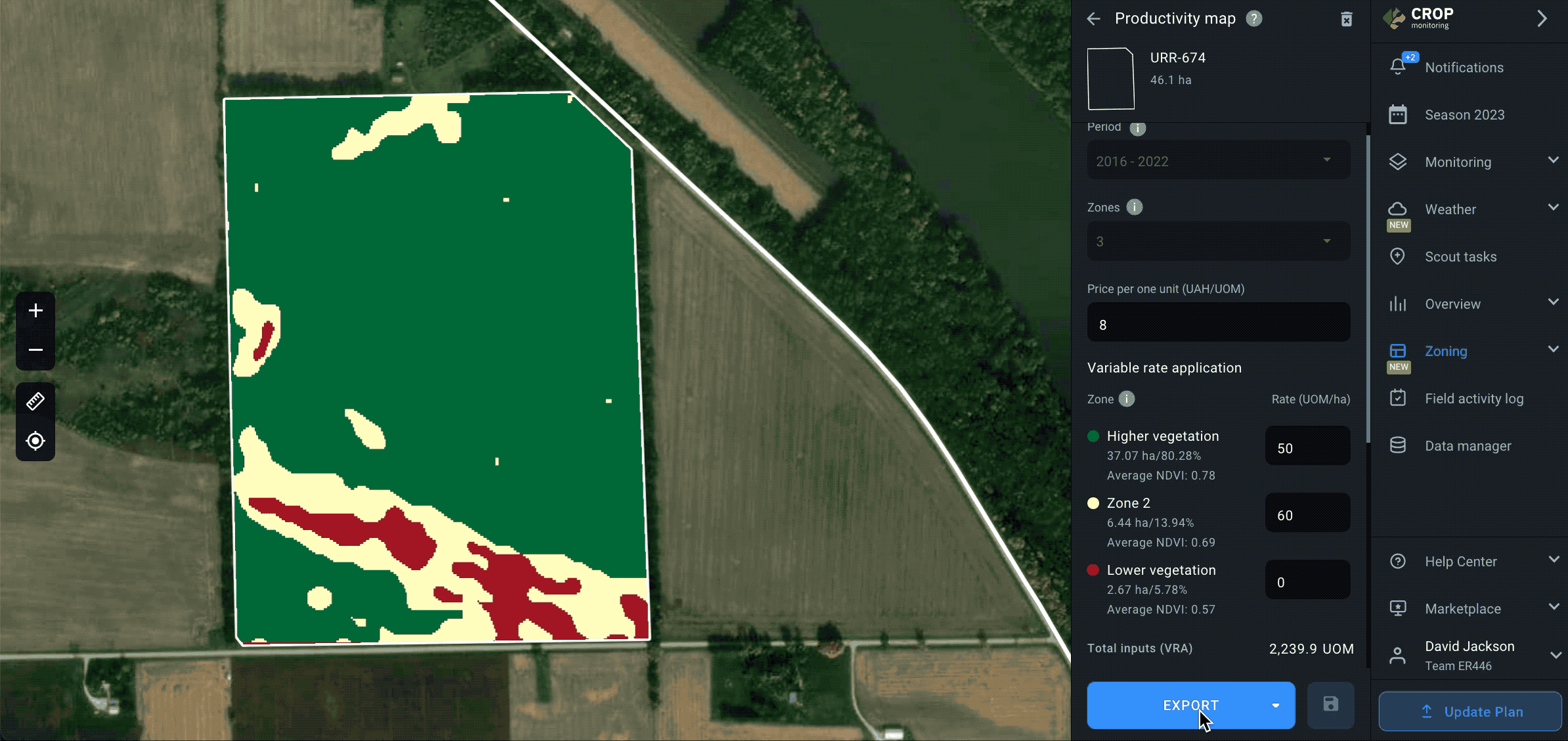
A productivity map is your guide to the variable-rate application of potassium (K) and phosphorus (P) fertilizers, differential sowing, and precision soil sampling. The map is based on the NDVI values for the field measured over a selected period of time. The red color usually indicates low productivity of soil, while the green areas stand for higher productivity.
The productivity map’s algorithm analyzes all the cloudless satellite images available for the selected period. It makes sure that any anomalies are excluded from the calculation of the map to achieve the highest possible precision.
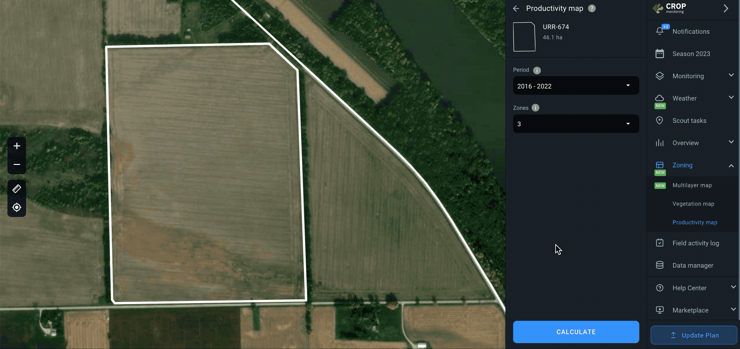
Create map
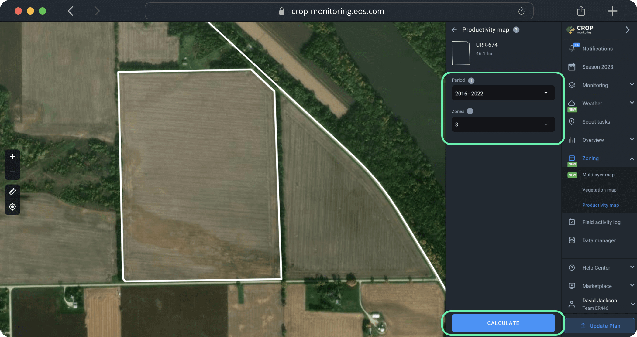
To create a productivity map, you need to select a period of time that you think is the most representative of the field’s soil’s average productivity over time. Currently, you can select a period that starts as far back as 2016.
Tip: We recommend using the maximum possible range of dates for the most precise evaluation of average productivity.
Next, select the number of zones. The default setting is 3 zones, but you can choose between 2 and 7 zones depending on the size of the field and your needs.
After you’ve selected the time period and the number of zones, click CALCULATE.
Tip: To ensure the accuracy of the calculations, do not select the current year if the field has not been harvested yet.
The calculations will take no more than a minute.
Use the productivity map to increase yield by applying fertilizers and seeds more efficiently and performing more cost-effective soil sampling.
To apply fertilizers or seeds according to the productivity map, you will need to manually input the amount per 1 hectare/acre for each zone. The system will automatically calculate the total amount to be applied in each zone as units of measurement (UOM).
Export map
The final step is to export the map from the platform by clicking EXPORT below.
Once you click the EXPORT button, you will need to choose the file format from the drop-down list. Learn more about different file formats for the agricultural machinery available on the platform here.
Select the file format that suits you best and click on it. The download will start automatically. You can also hover your mouse over the file format and choose between two options:
1) Get link to this map. The link to the map will be saved to the clipboard*. You can share this link with anyone.
2) Download this map. The productivity map will be saved to your device as a file.
*The link is only valid for 10 days after being copied.
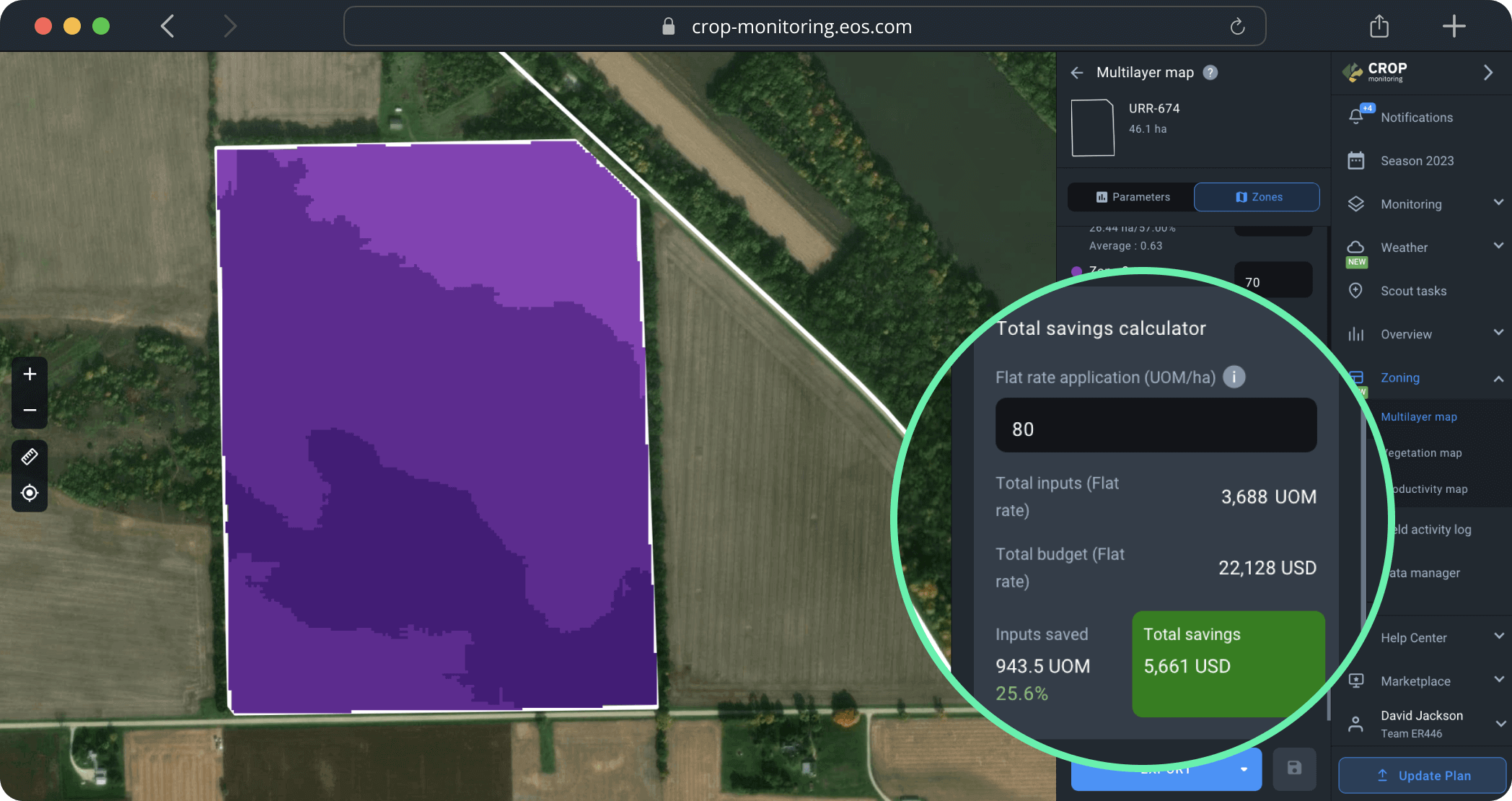
Calculate savings on variable-rate application
Zoning allows you to avoid waste of inputs (seeds & fertilizers alike), which is good for your budget and for the environment.
Use the total savings calculator tool to see exactly how much you save on variable-rate application of inputs vs flat-rate application of inputs moneywise and in terms of resources.
Note: You can calculate savings after you’ve created a VRA map.
1) Enter the price for one unit of measurement of inputs (UOM) in the “Price per one unit” field. The currency for your location automatically applies.
2) Next, enter the amount of inputs that will go in each zone as UOM per ha/ac.
To calculate your savings thanks to variable-rate application of inputs, first calculate the cost of the flat-rate application of inputs and their amount. When that is done, you can calculate savings by comparing them to the flat rate data.
1) Now, you need to scroll down to the “Total savings calculator” section.
2) Enter the data for flat-rate application of fertilizer as UOM per ha or UOM per acre, depending on your preferences. This is the amount of inputs you would apply in a traditional way (without using Zoning).
3) The system will automatically calculate the amount of fertilizer saved using the VRA application method and the total savings in money.
The total savings calculator will show you:
1) Total amount of fertilizer is the amount of fertilizer you would have applied using the traditional flat-rate method.
2) Total budget is the sum of money that would have been spent on the flat-rate application of fertilizer (without the help of Zoning).
3) Fertilizer saved is the amount of fertilizer saved thanks to preferring the variable-rate method to the flat-rate one.
4) Total savings is the sum of money you have saved by applying fertilizer with precision using the Zoning tool.
All of these figures will show you exactly the benefit of opting for the variable-rate application of inputs via Zoning.
Supported formats for agriculture equipment
You can download Multilayer, Vegetation and Productivity maps as either SHP or ISO-XML files.
1) SHP format is supported by John Deere, Amazone, and Trimble. We also offer a universal SHP format to match other brands of farming equipment.
– SHP for Trimble is compatible with various display types:
- CFX 750 (FM-750), FmX (FM-1000)
- CFX-350 (XCN-750), GFX-750 (XCN-1050), TMX-2050 (XCN-2050)
2) ISO-XML format is compatible with ISOBUS equipment.
To download a file in the format that suits you best, simply select it from the drop-down list. After you click it, the download will start automatically.
Save the created maps
After you’ve created, saved, and/or downloaded a Multlayer, Vegetation or Productivity map, it will appear in the “Your maps” list on the field’s page.
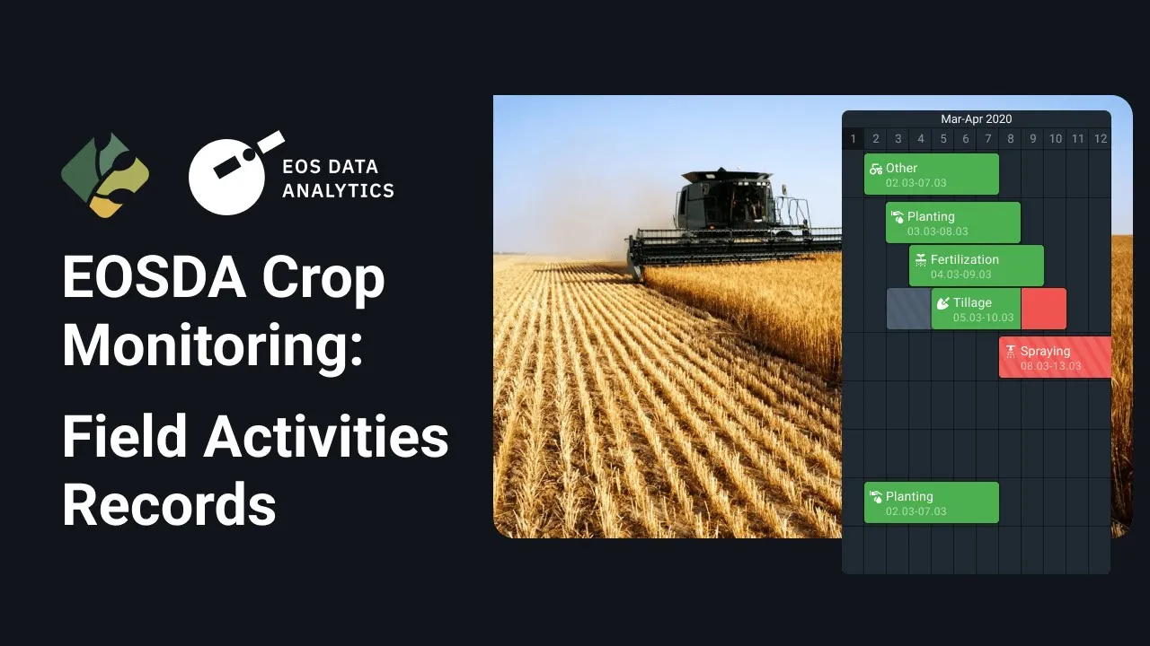
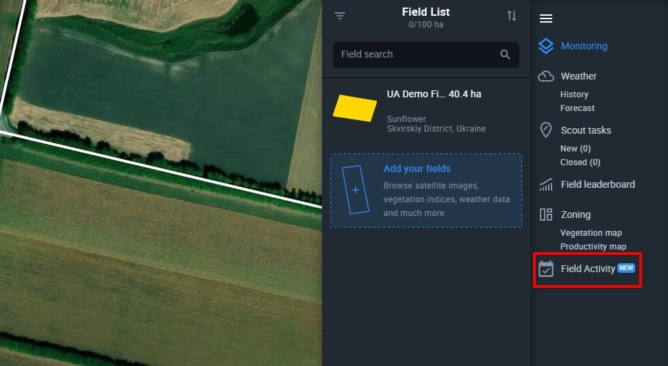
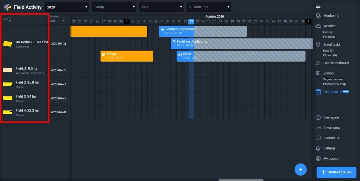
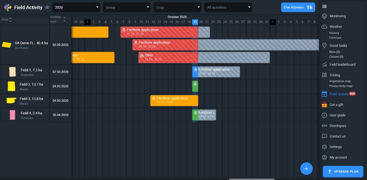
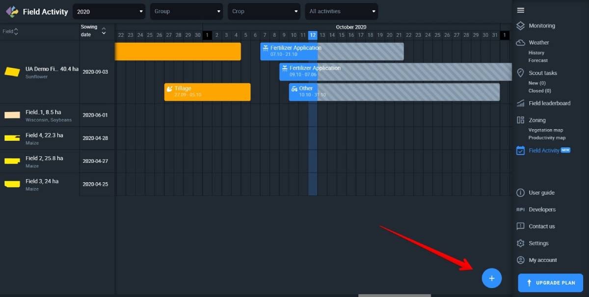
Field Activity Log is an efficient way to plan and monitor all of your field activities for one, several, or multiple fields on one screen. You can add planned and completed activities to an interactive calendar and conveniently edit the information before, during, or after the completion. With this feature, you can also plan and compare costs of your farming activities, such as fertilizing, tillage, planting, spraying, harvesting, and others.
Location
The Field Activity Log is located in a separate tab on the sidebar menu.
Demo Field
If you haven’t got any fields of your own yet, you can use Demo Field to learn how Field Activity Log works on EOSDA Crop Monitoring.
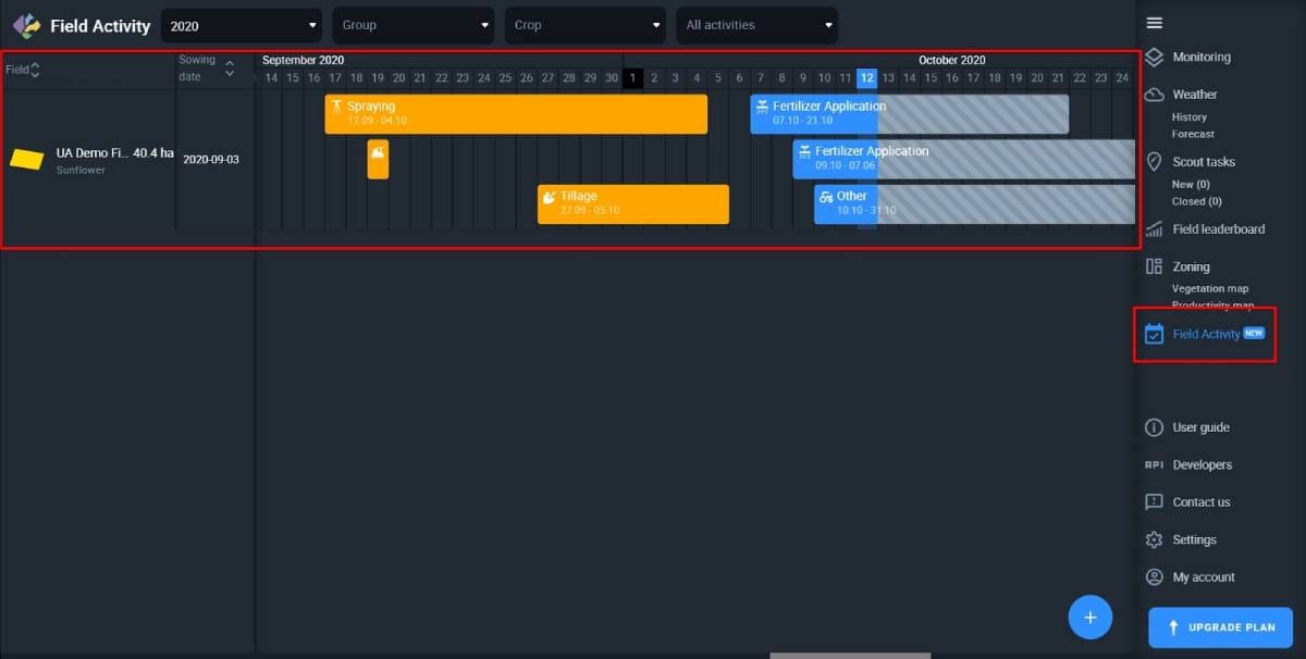
Log Structure
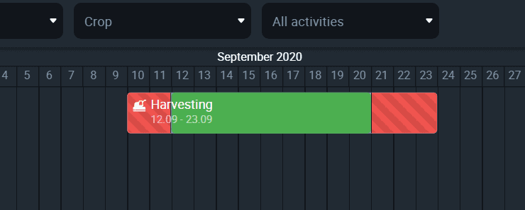
On the screen, all the necessary information about your field activities is organized in three columns: Field, Sowing date, and Activity calendar.
Field column
Your fields will appear on the left side of the screen, in the Field column.
You can sort fields by their name from A to Z or from Z to A.
Sowing Dates
The column shows the most recent sowing date for every field in the list.
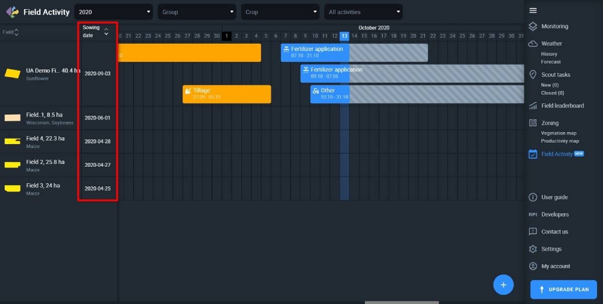
You can sort sowing dates from earliest to latest.
Activity Calendar
The third column from the left, which takes up most of the screen, is an interactive calendar displaying completed and planned activities that you have already added to the log.
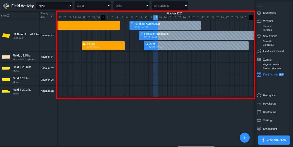
The calendar is always divided in half by the column that represents the current date. All the completed activities are in the left half. Similarly, all the planned activities are on the right.
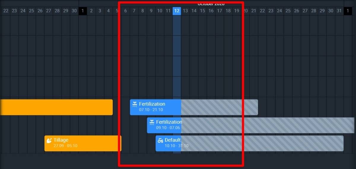
Activity status and color
Activities are indicated by different colors, according to their completion status.
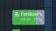
Single-day activities
You can add an activity that starts and ends on the same day. If that day is still in the future, it will appear gray with stripes.
As soon as your current date “catches up” with the planned start date, it automatically changes from gray to red.
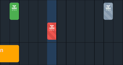
This means the system does not yet have a confirmation that an activity is already in progress.
How can you change that?
Simply add the Start and End dates of the completion period.
Click on the activity and select the + symbol in the top left corner of the window.
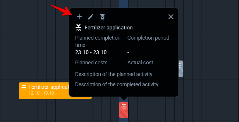
Now select the Start and End dates and click Save.
Once you’re done, red will change to green. Now the activity is officially completed.
Multiple-day activities
Monitoring their status is a little trickier but the same principles apply. As soon as you actually start the completion process, add the start date of the completion period so the system knows the activity is already in progress.
Use the same algorithm as for the single-day activity. Click on the activity and select the +symbol in the top left corner of the window.
Then select the Start date of the completion period and click Save.
Now, individual day cells on the calendar will be automatically changing color from gray to blue one by one.
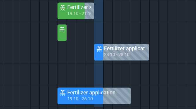
Make sure to add the end date of the completion period when you are actually done with the activity. Blue will change to green for the whole completion period.
Behind or ahead of schedule
You may start your multiple-day activity one or several days later than planned. In this case, the planned start date will not correspond with the completion period start date. Days you have missed will stay red on the calendar.
Similarly, you may finish your activity several days later than planned. As soon as you add the actual date of completion to the log, these extra days will turn red to show you that you missed your own deadline.
On the other hand, if you complete an activity one or several days before the deadline, the extra days will remain gray on the calendar.
Note: If you decide to start completing an activity before its planned start date, you will need to add a new activity to the log. The start date of a completion period cannot be earlier than the planned start date.
Completed activity
Finally, you can add as many activities completed in the past as you like. They are assigned a distinct color, yellow. This way you can distinguish scheduled activities from unscheduled.
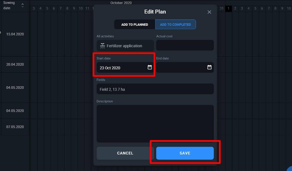
Add activity
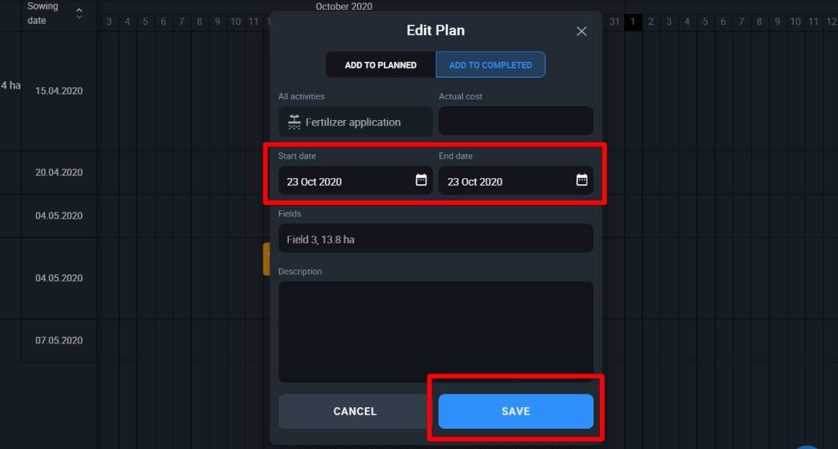
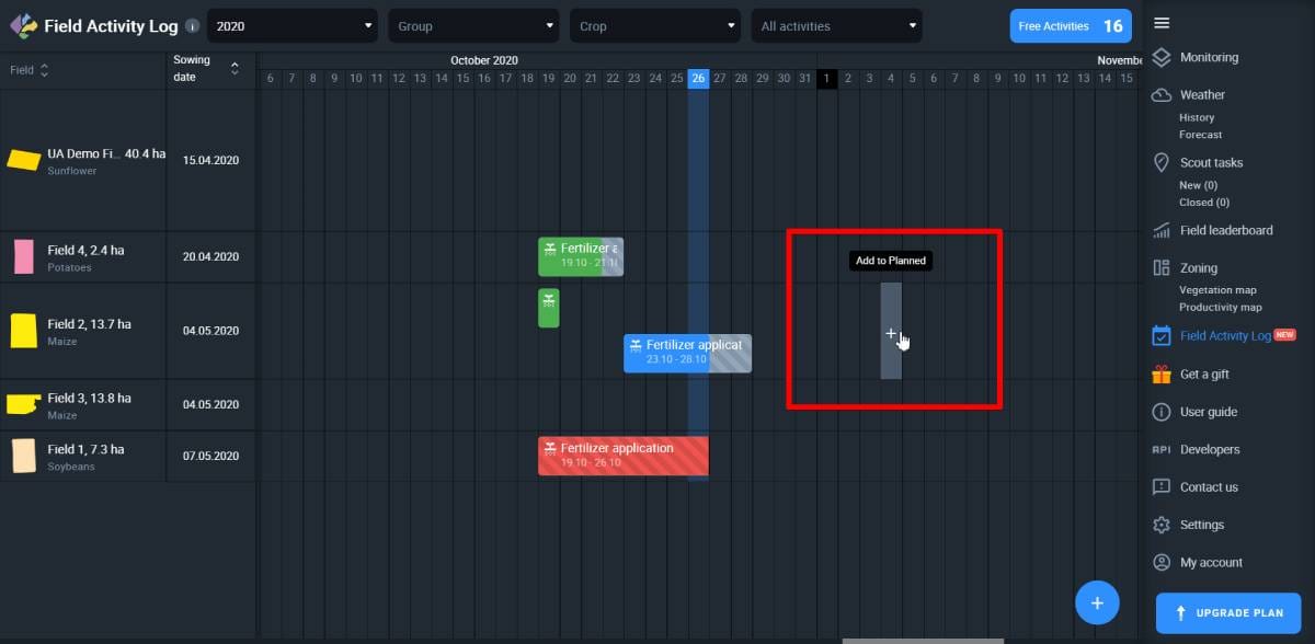
There are two ways to add an activity to the log.
One option is to click on the “+” button in the bottom right corner of the screen.
In a window that pops up, choose between completed and planned activity.
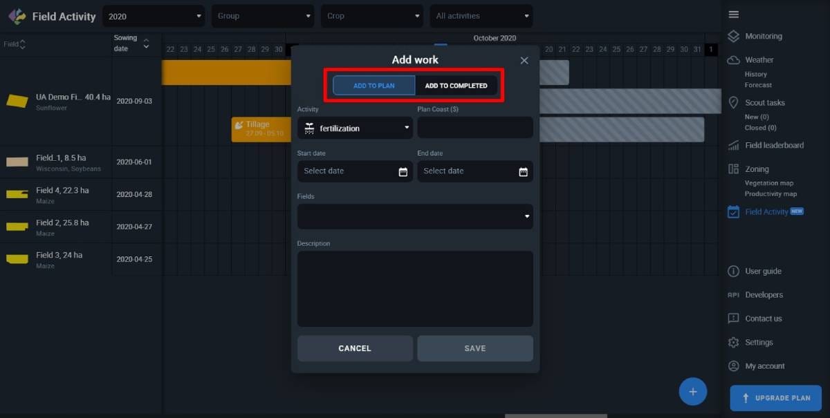
Tip: You can add activities that were completed anytime between January 2016 and the current date.
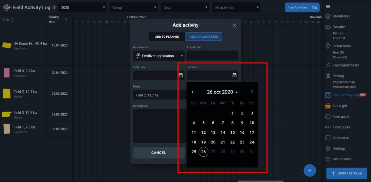
Select the type of activity and its planned start and end dates.
Note: The planned start and end dates will “book” the space on the calendar.
For planned activities, the system won’t allow you to select any past date.
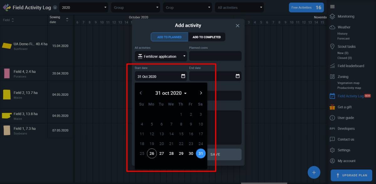
Similarly, future dates are not available if you wish to add a completed activity.
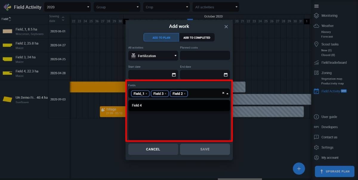
Multiple fields
You can add one activity for multiple fields at once.
In the cost field put the estimated cost for a planned activity or the actual cost for the completed one.
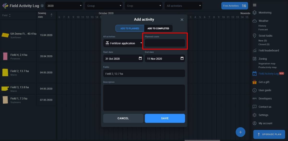
Note: You can compare estimated and actual cost and plan your activities more efficiently in the future.
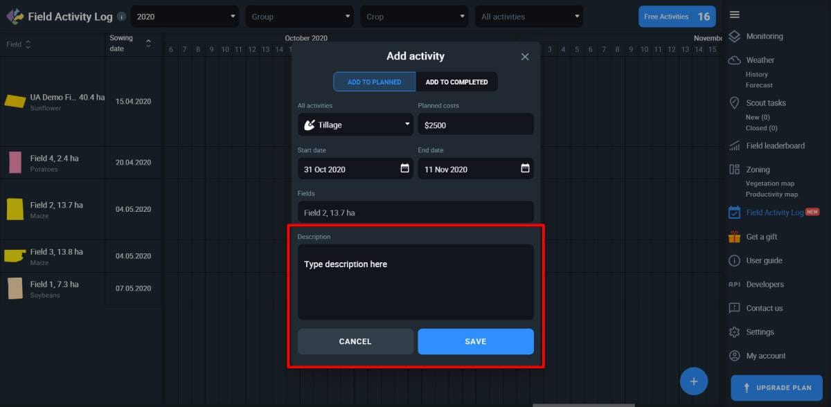
Adding a description to the activity is optional but it allows you to keep a more detailed record of your field activities.
Click Save to finish adding the activity.
Use the calendar
You can also add activities directly on the calendar.
Pick the start date for your planned or completed activity, find the appropriate cell and click on it.
Organize activities
You can filter logged activities according to years, field group, crop type, and activity type.
These filters are located in the uppermost bar of the screen.
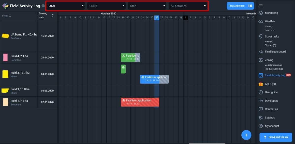
Click anywhere on the filters to select year, group, crop type, or activity type to organize your activities accordingly.
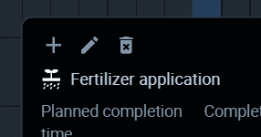
Edit acitivty
To edit activities, click on them, and then click on the pencil icon.
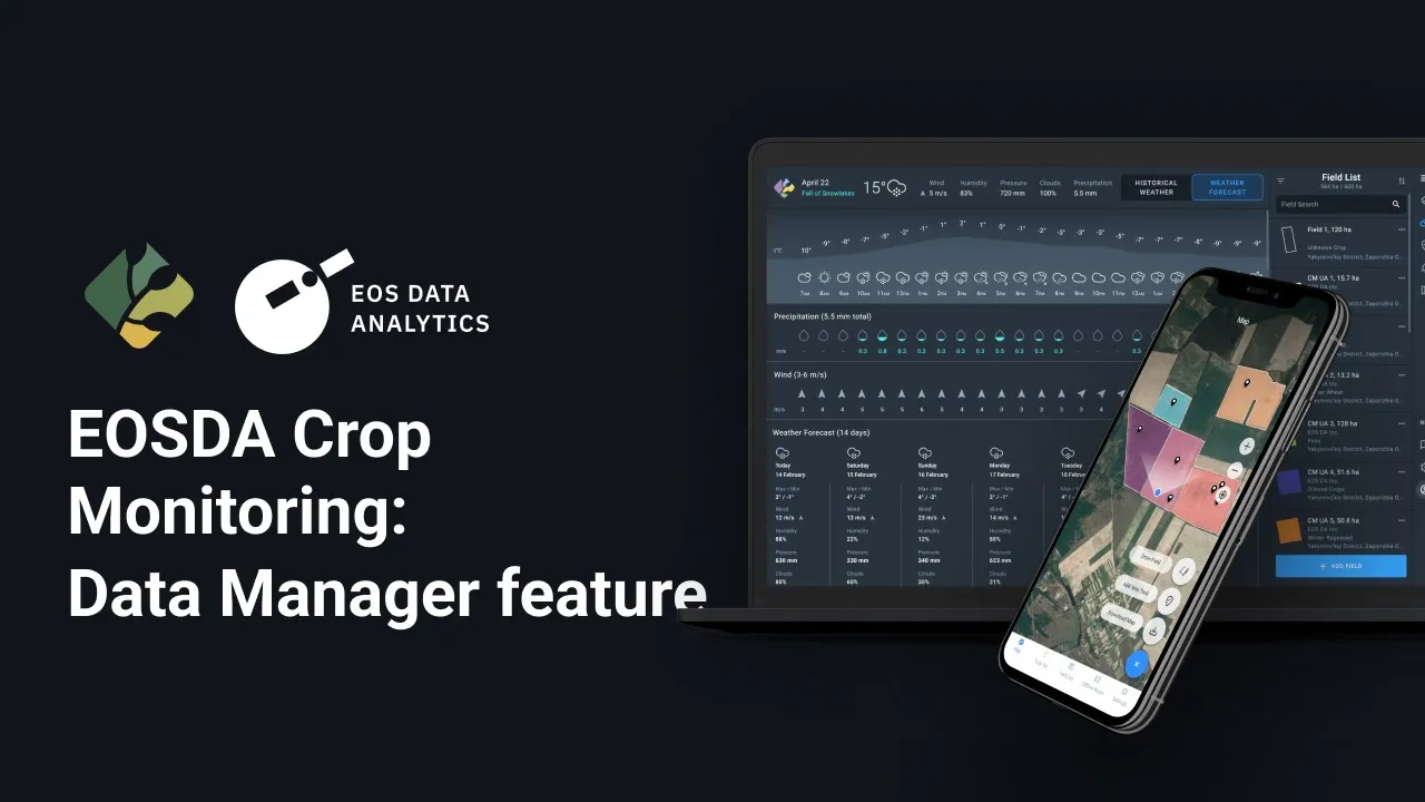
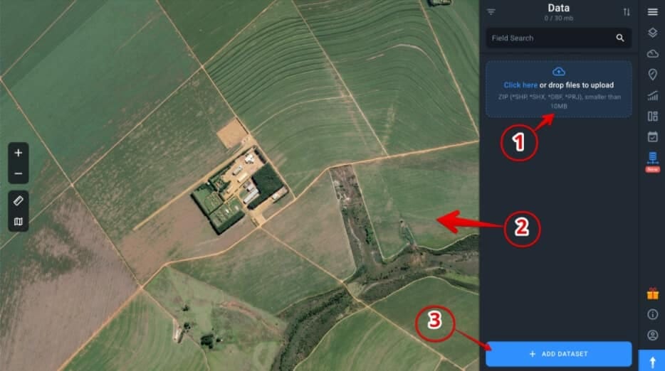
Data Manager is your opportunity to upload data on harvesting, fertilization, spraying, planting, and any other activity from your vehicle to EOSDA Crop Monitoring. To do this, you have to save this data as a standard shapefile first. Depending on the settings of the on-board computer of your vehicle, you can visualize the uploaded data in the form of maps that display yield, moisture, sowing density and other technological parameters that were recorded by your equipment while working in the field.
Visualization of this data helps you control the quality of field activities completion: the application rate of different crop products, seed rate, tracking the amount of the harvested crop and its moisture, and much more.
Navigation
The Data Manager is located in a separate tab on the sidebar menu.
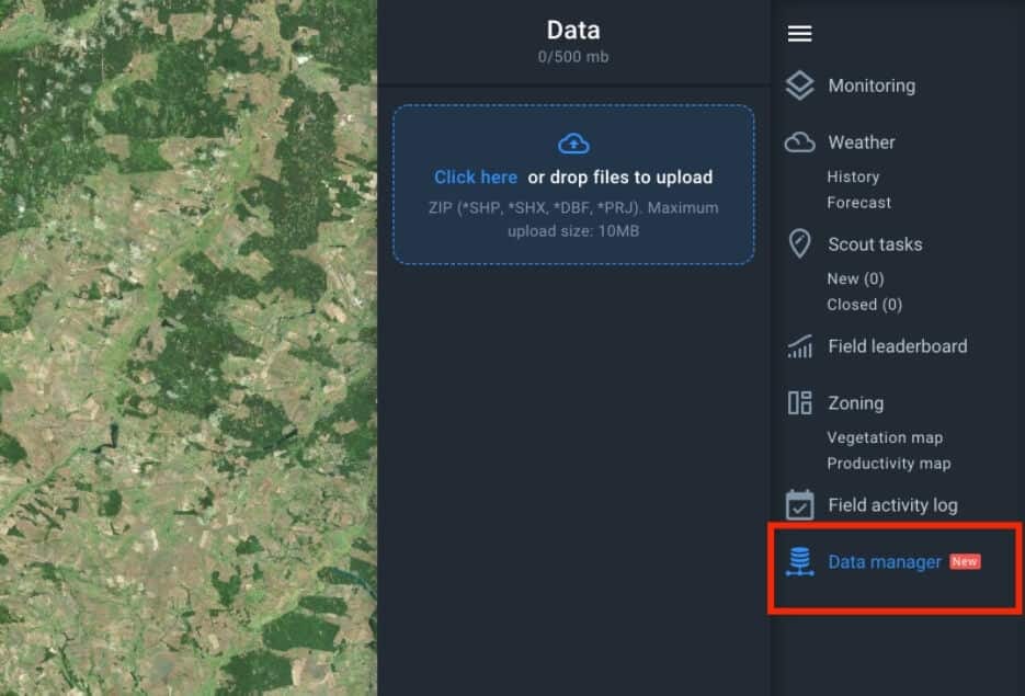
Uploading Datasets
The data you want to upload should be saved as a ZIP archive. The archive should contain data in the SHP format. Use the full dataset of the format (* SHP, * SHX, * DBF, * PRJ).
Note: The absence of a * PRJ file is acceptable.
There are three ways you can upload data to Data Manager:
1. Drag and drop the file with data to the Data field
2. Drag and drop the file with data to the viewer
3. Click on Add Dataset and select the file on your computer
Dataset Processing
Processing data will take some time before it’s fully uploaded. In the meantime, you can continue working with other features of EOSDA Crop Monitoring.

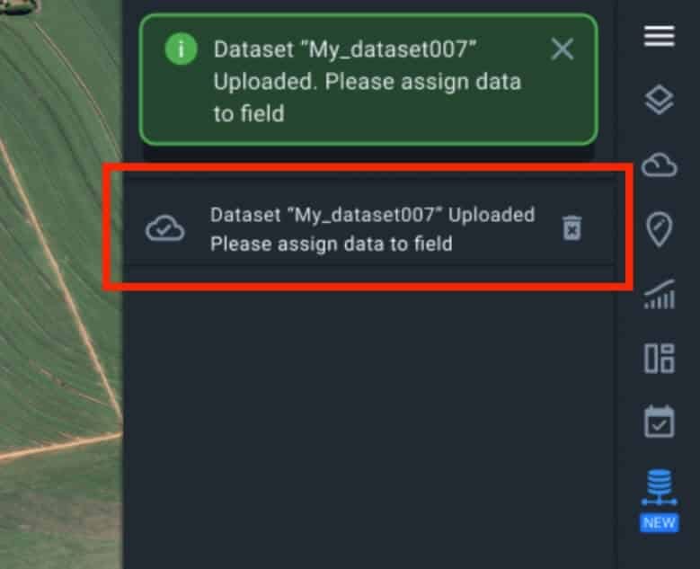
Once the data is successfully processed, a green notification will pop up.
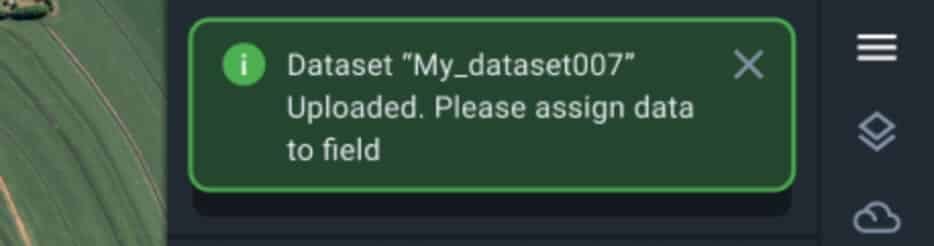
To continue working with the uploaded data, click on the name of the processed ZIP archive in the Data field of the Data Manager.
Assigning Data to the Field
There are two scenarios of assigning data to the field, depending on whether the uploaded data matches any field you already have in the system. If the uploaded data doesn’t match the contour of any field, a “Create and Assign Field” form will pop up, offering you to create a new field.
Note: The field you created, will automatically appear in the system.
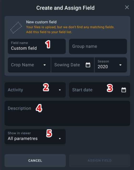
1. Name the field
2. Select the type of activity
3. Select the start date of the activity
4. Leave a short description if necessary
5. Select all the necessary parameters on the map (from those that were set up in the on-board computer of your equipment)
Note: You can always edit this information later.
If the uploaded data matches the contour of one or several fields, an “Add Activity” window will pop up.
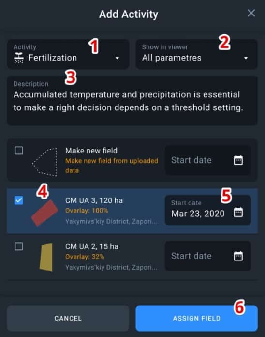
1. Select activity
2. Select parameters (from those that were set up in the on-board computer of your equipment)
3. Leave a description if necessary
4. Select one or several fields that match the uploaded data (check the Overlay value)
5. Select the start date of the activity
6. Click on Assign Field
Data Visualization
The activities you have assigned to the field will be displayed in the Data field. To see the visualised data on the completed activity, click on the date of its completion.
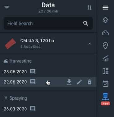
To switch between several parameters (types of data), click on the necessary parameter in the legend.
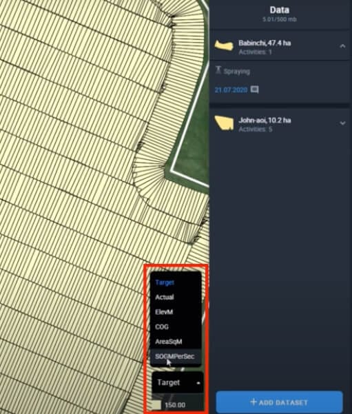
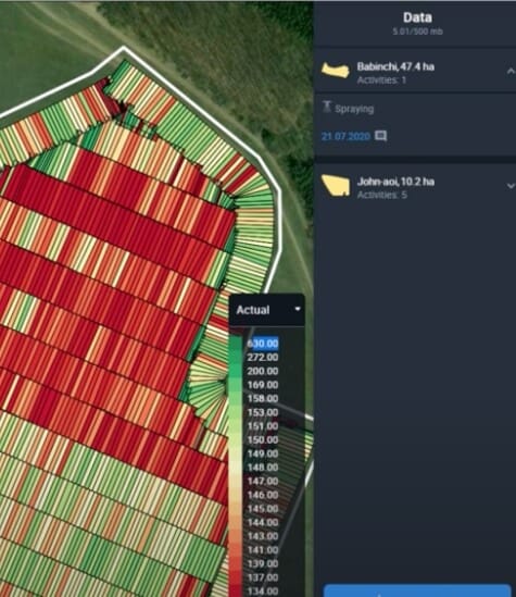
Note: Parameters and their numeric values are uploaded from the data file and cannot be changed. You can only switch between parameters to compare them with each other, or choose only the one parameter you need.
Team Accounts are accounts that can be shared among multiple users to provide everyone with the same source of information about the same fields or groups of fields, ensuring a more efficient cooperation between various users and a better control of employees by the farm owners.
Delegating, completing, and reporting scout tasks is considerably faster and easier when a Team Account is used. Every team member gets 24/7 access to the satellite monitoring of fields and can react to crop issues according to the permissions defined by the role that the Team Owner has assigned to them.
A problem with the crops can be noticed by any team member who can then create a scout task and either complete it themselves or assign a team member who is available at the moment. When the check-up is completed and the online report is generated in the scout task, the field owner will be able to access it any time via the Team Account.
Who else can benefit from using the Team Management feature?
For the agro-cooperative members:
- Strong partnerships between cooperative members and farmers
- Transparency and trust in working with data
- Improved communication between scouts and field owners
For agro-consultants:
- Increased customer loyalty thanks to providing them with full information about the state of their fields and about your activities
- Providing clients with the opportunity to visually assess the effectiveness of your activities in their fields
For agro-traders:
- Providing customers with data based on which you determine the range and volume of products offered
For insurance companies:
- Sharing the data based on which you made the decision on the insured event with the clients
- Showing the client based on which exact data you have estimated the damage
- Easily sharing data on climate patterns and risks in their region with the clients
How to add a user to the team
To increase the efficiency of tending to the crops growing on all of your fields on a regular basis, you need a larger team under your full remote control. By adding new users to your Team Account, you can build a team of employees that will help you cut costs on unnecessary field activities and reduce time waste.
You can add a new user to the team in three simple steps.
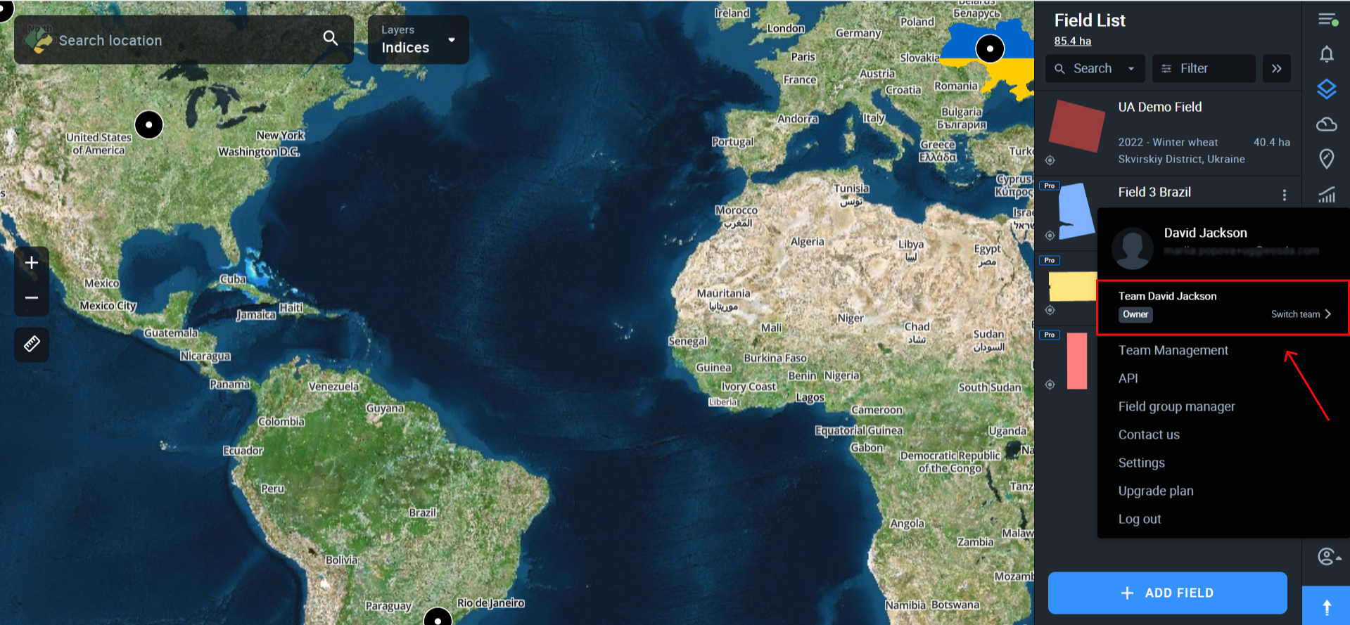
Step 1. Click on the name of your account in the bottom right corner of the side menu.
Step 2. Select “Team Management” from the drop-down menu.
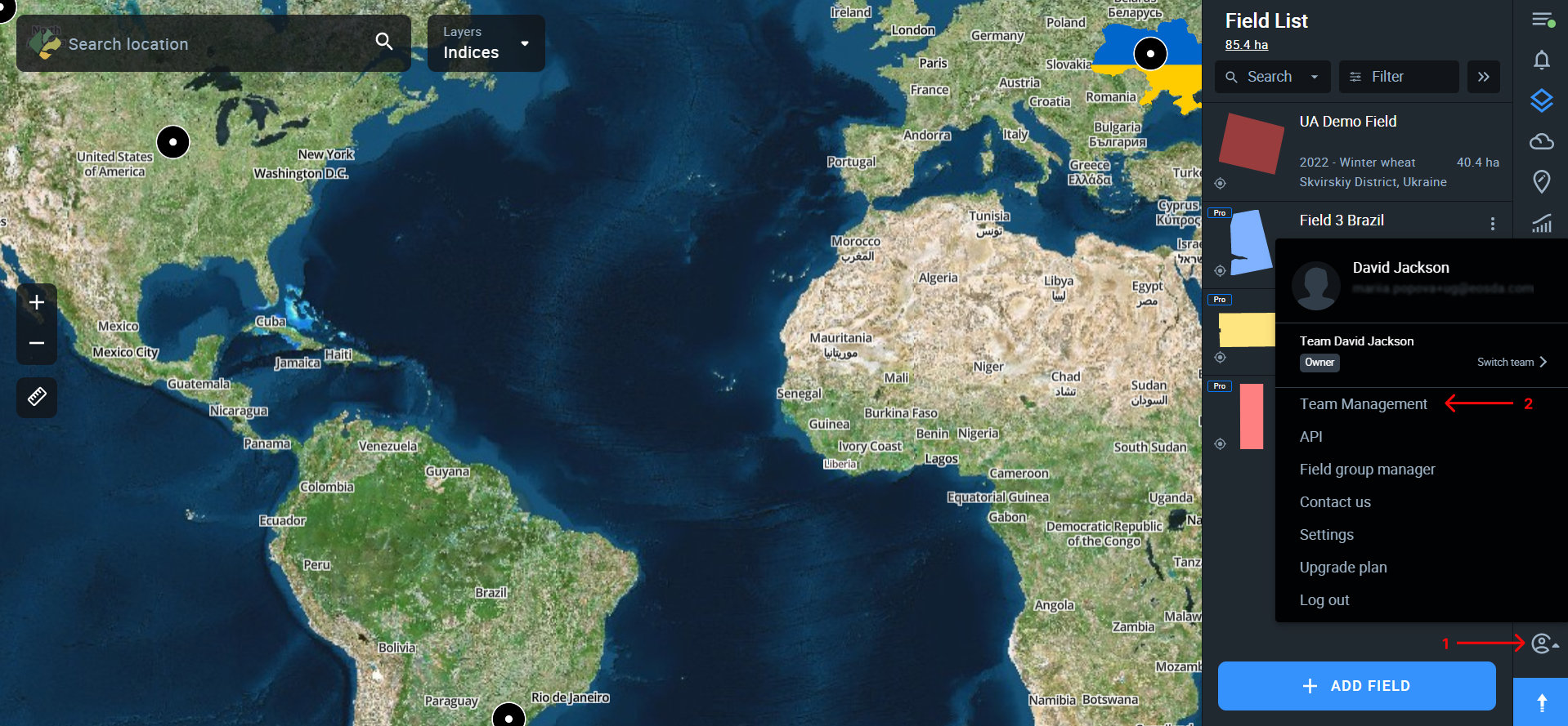
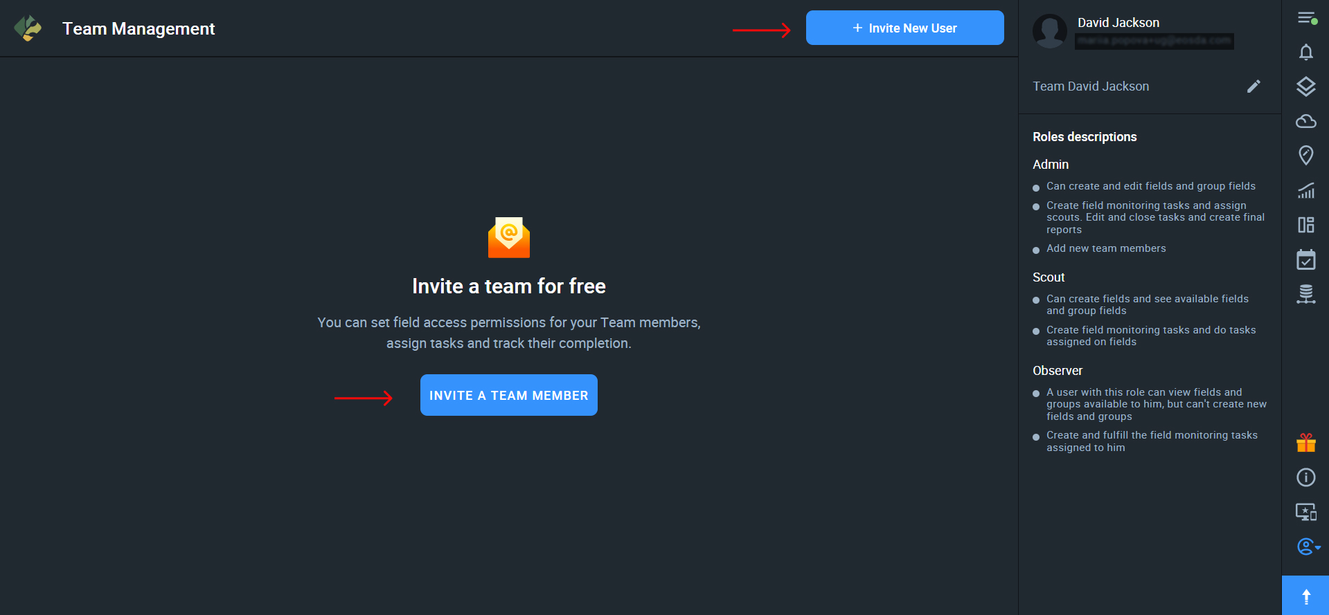
Step 3. Once in the Team Management dashboard, click on + Invite New User.
If this is the first time you’ve opened the Team Management dashboard, you can also click on the button “INVITE A TEAM MEMBER” located in the center of the screen.
Step 4. In the Invitation window, enter the email address of the user(s) you want to invite, select the fields or field groups that will be available to this user*, and assign the role. Then click Invite.
*A user can have access to only one field, several fields, one or more groups of fields, or all fields at once.
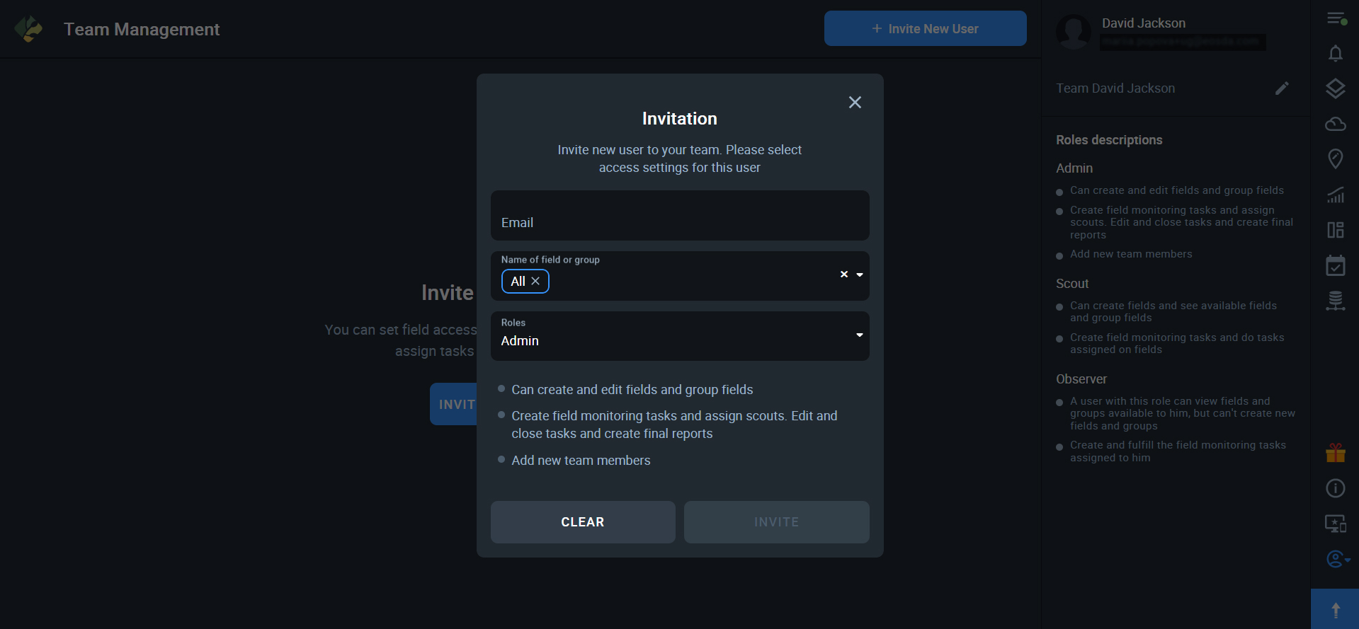
Note: Under the name of the role you’ll see the list of user access permissions the role entails.
The user who is being invited will receive an email with the invitation and the link to the Team Account*.
*The same user can be a member of multiple teams.

Team Management Roles
The practice of assigning roles with clearly defined accountability and access limitations is very important when it comes to team management. It means less worrying about what your employees might accidentally do to your crops or fields or even just messing up something in your EOSDA Crop Monitoring account.
This is why, currently, every Team Account Owner on EOSDA Crop Monitoring can assign one of the three roles to each team member: Admin, Scout, Observer.
Let’s see how these roles differ from one another in terms of accountability and access limitations.
Admin
The Admin user has permissions to:
- add fields to the Team Account
- edit all fields in the Team Account
- create field groups
- create scout tasks
- assign team members to the scout tasks
- edit current scout tasks
- close scout tasks
- create scout reports
- add new team members
Scout
The Scout has permission to:
- add fields to the team account
- view fields and field groups
- create scout tasks
- assign team members to the scout tasks
- complete the scout tasks
Observer
The Observer has permissions to:
- view fields and field groups
- create scout tasks
- complete the scout tasks*
*The observer can only complete those tasks that have been assigned to him or her.
How to use the Team Management dashboard
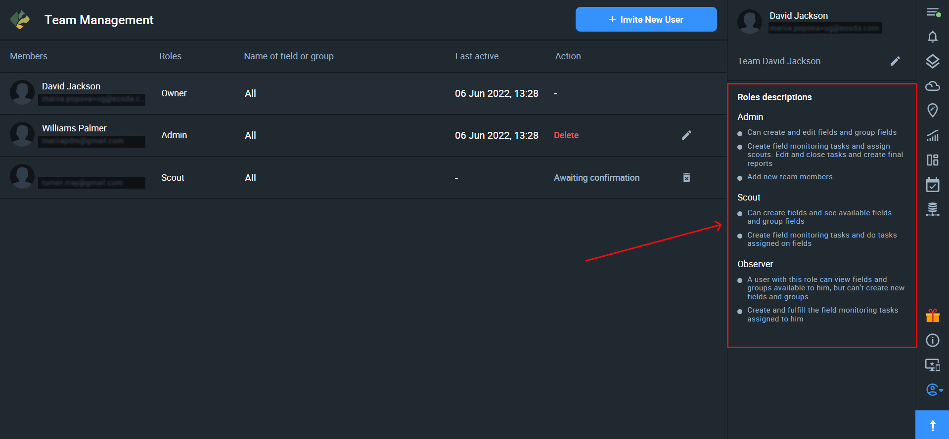
If you have a EOSDA Crop Monitoring account, you are automatically an Owner of a Team Account. Owners and Admins can view all the relevant information about their teams on the Team Management dashboard.
The Team Management dashboard displays:
- the list of all the team members + users who have been invited to the team but haven’t accepted the invitation yet (members)
- the role of each team member (roles)
- the fields and/or groups of fields available to each team member (name of field or group)
- the time and date of the user’s latest activity in the Team Account (last active)*
- the actions that the team owner or admin can perform with respect to each user (actions)
*The “last active” information provides the Owners and Admins with more control over each team member.
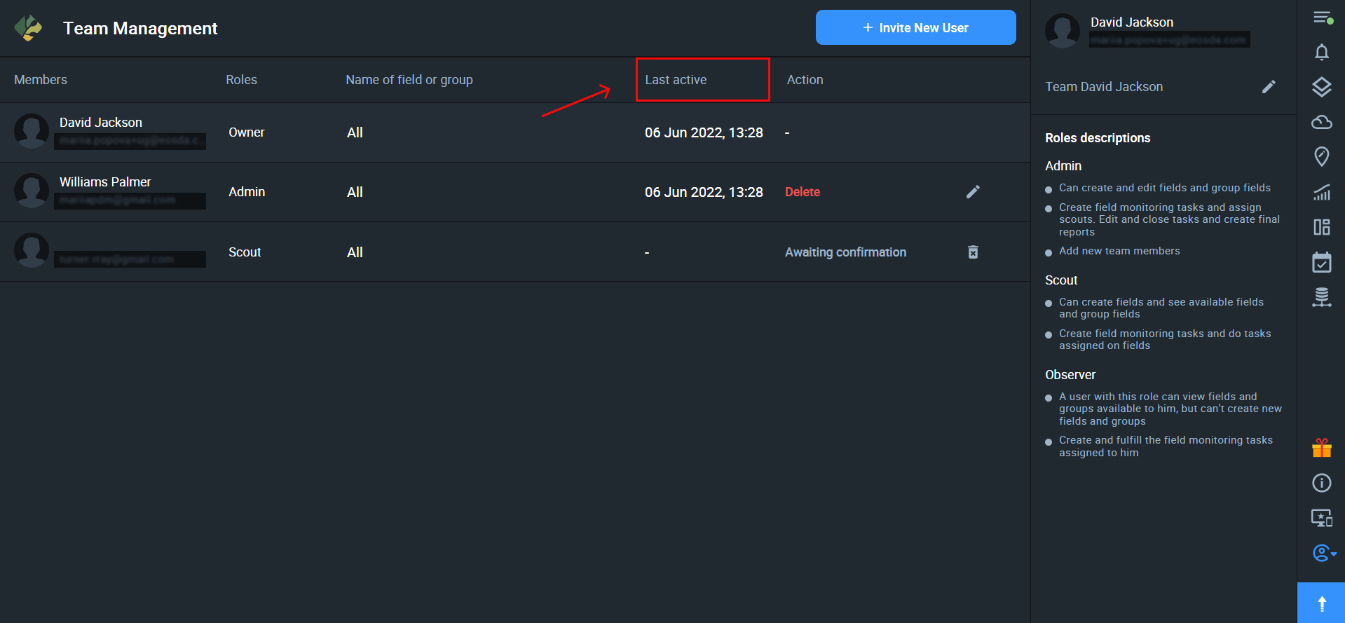
Actions
The Team Owner or Admin can edit the user’s access to the fields and/or reassign their role.
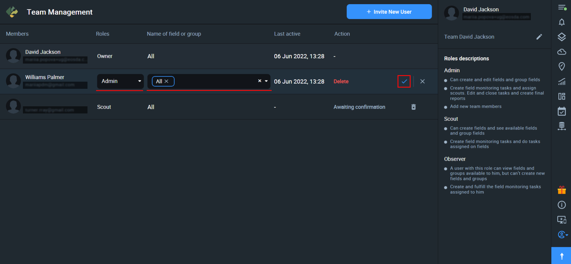
Team Owners and Admins can also delete/remove users from the Team.
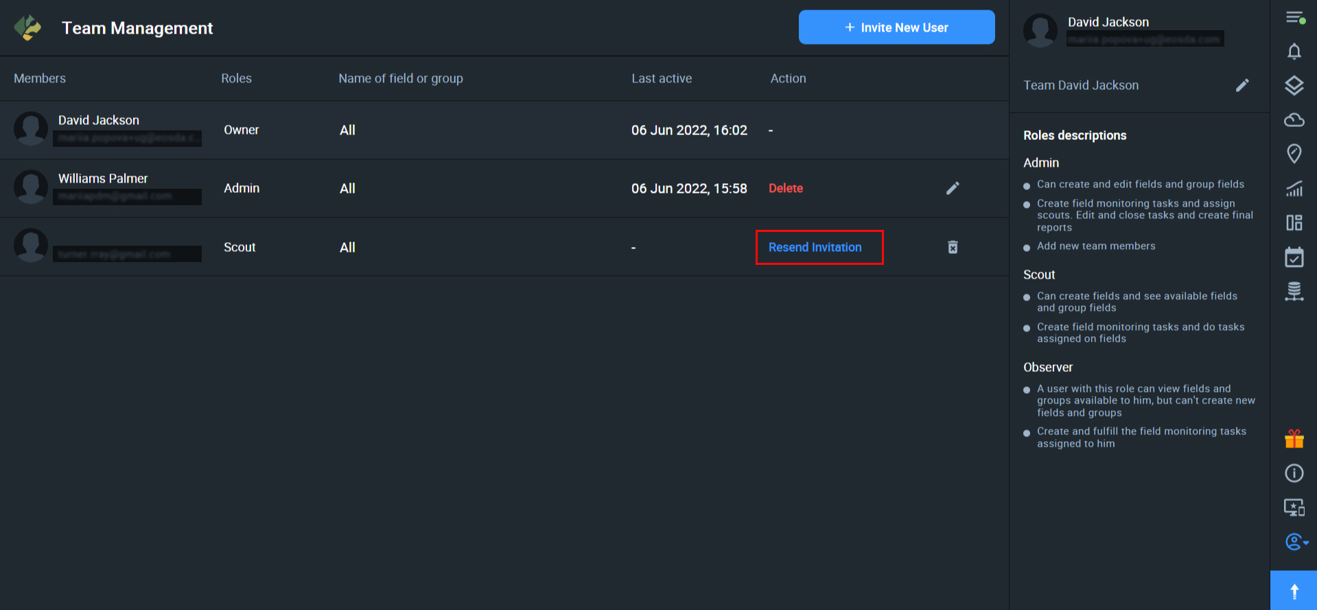
If the user has not accepted/confirmed the invitation, the Owner or Admin will see the “resend invitation” action that needs to be performed for this user.
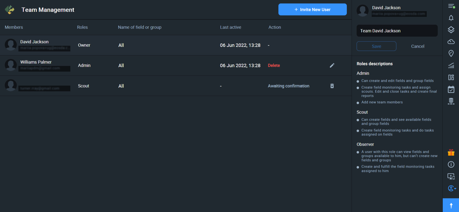
Edit Team name
If you are the Team Owner or Admin, you can edit the name of the Team Account by clicking on the pencil icon next to the name.
Tip: Keep the name of the team short and simple so it can be more easily recognized by the team members when switching between multiple teams.

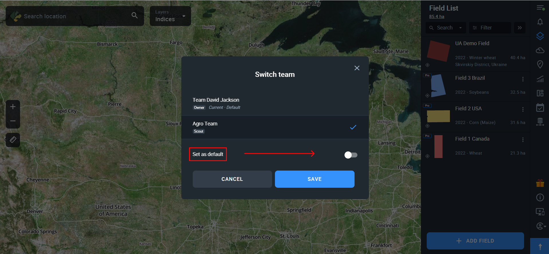
Switch Team
If you are a member of more than one team, you can easily switch between the teams. All you need to do is to click on the My Account icon and select “Switch team”.
You will see the list of your teams. Click on the one you want to switch to and then click SAVE.
If you are a member of multiple teams, the system will automatically show you:
- which team you are in at the moment (current)
- which team you have set as the default team (default)
In the list of your teams, you can also see the roles you have been assigned in each Team Account.
Default Team
While switching teams, you can also set one team as the default. Whenever you log into EOSDA Crop Monitoring, you’ll see the fields available to you in the default Team Account.
To set the team as default, use the toggle switch in the “switch team” menu.
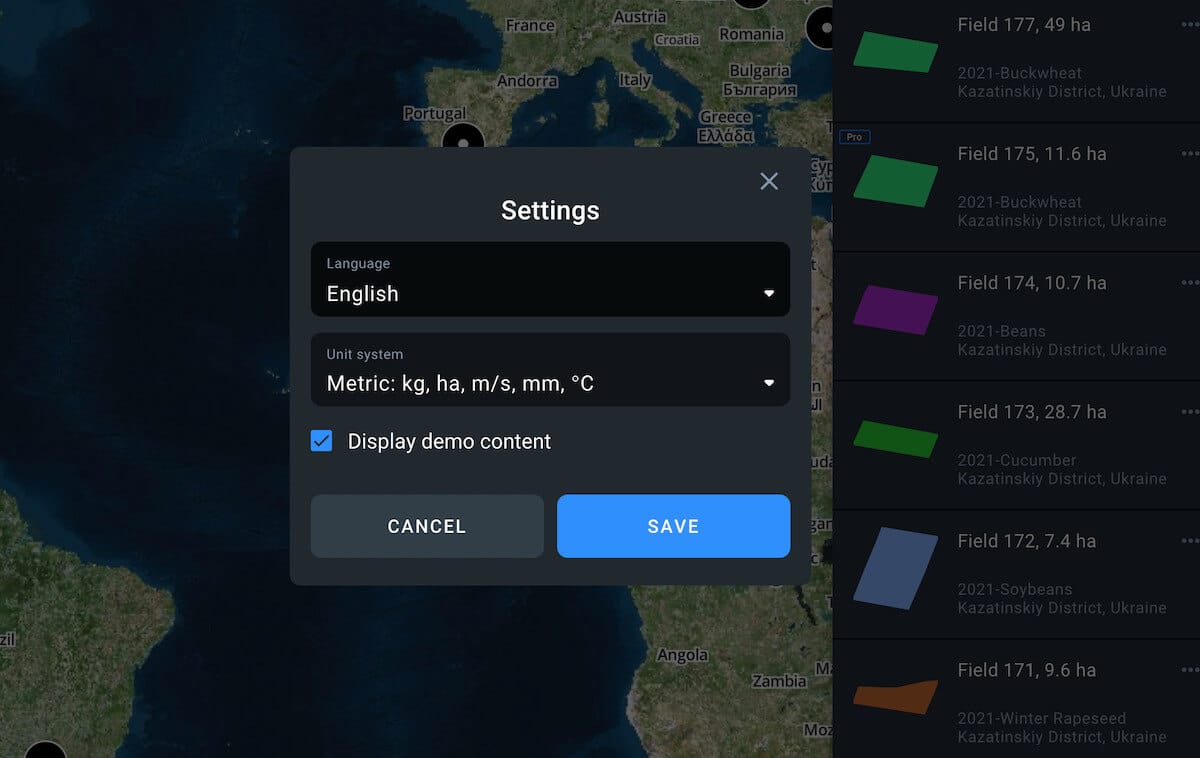
Use Settings to select interface language, metric system, and whether demo content will be displayed. The ability to hide demo content is available for Pro users only.
Note: Demo content includes a demo field, demo scouting tasks, and a dataset for the Data Manager feature.
To get access to the paid features of EOSDA Crop Monitoring, upgrade your plan to Essential or Professional. You can learn more about the specific functionality available within each subscription plan on our Pricing page.
To view the Pricing page, click or tap on the arrow button in the bottom right corner of the screen.
![]()
Plans
If you’re using the Essential plan, you can monitor up to 1000 ha.
For the Professional plan, you are free to choose how many hectares you would like to monitor and you can always add more hectares for an additional price.
We also offer a more personal approach with the Enterprise plan containing custom solutions and tailored prices for farms of over 5000 ha, agricultural cooperatives, advisors, IT companies, and other customers.
Add-ons
To explore more solutions, refer to our add-ons store. You can access it by clicking or tapping the appropriate icon on the right side menu.
![]()
Another way to access the add-ons store is directly from the Pricing page.
Among other advantages, users can access the tool through the API.
Current API capabilities
- Extended satellites (Sentinel-2, Sentinel-1, Landsat 8, Landsat 7, Landsat 5, Landsat 4, MODIS, NAIP, CBERS-4) as data sources
- Extended vegetation indices (NDVI, EVI, GNDVI, CVI, NDRE, MSAVI, RECI, NDSI, NDWI, SAVI, ARVI, GCI, SIPI, NBR, MSI, ISTACK, FIDET, CCCI)
- Weather data archive dating back 20 years
Get access
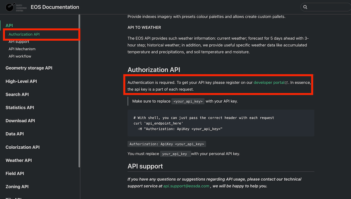
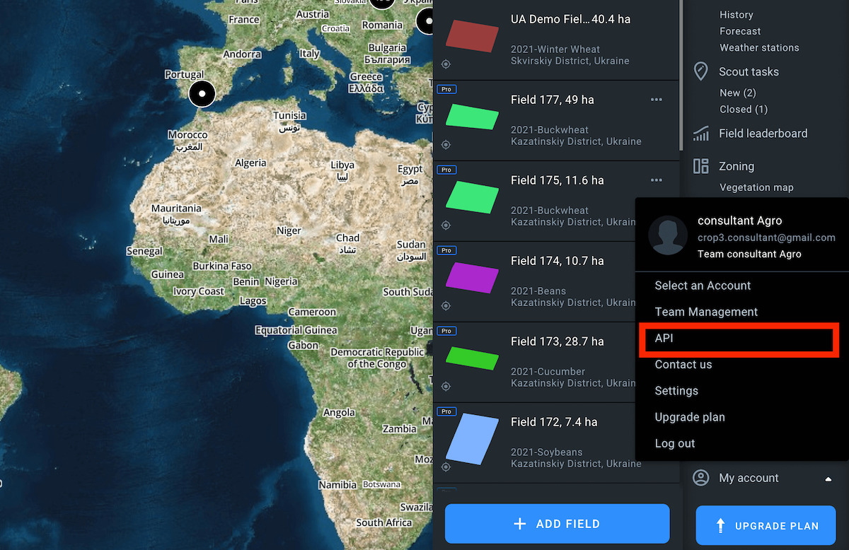
To get access to EOSDA Documentation you need to click My account on the sidebar menu and then on the API icon. Once on the API page, click Get started.
Now get the API key by registering at the developer portal.